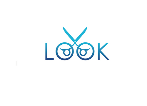
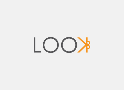
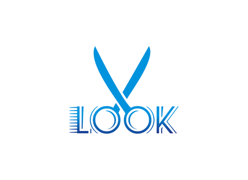
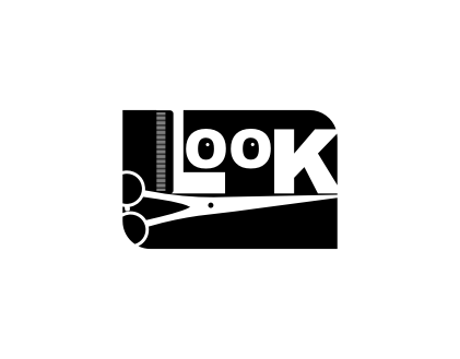
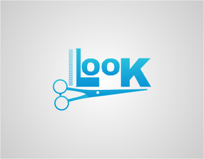
SALES / SUPPORT : +1-877-525-5646   |  


LOOK

LOOK

Contest Holder sweeybb1 ?

Last Logged in : 4547days16hrs ago

Concepts Submitted

67

Guaranteed Prize
200
Winner(s)

1

A Logo, Monogram, or Icon veildAll design entries can be viewed by other designers.
tick_gray

Live Project

tick_gray

Deciding

tick_blue

Project Finalized


Project: LOOK
Industry: Salon & Spa Logo
Contest Launched: Sep 06, 2011
Selected: 1 winning design from 67 concepts
Winning Design by: Designelicious
Close Date: Sep 23, 2011


LOOK - Salon & Spa


Awarded as a winner
Project Report    

Sort by:


#43

#28

#27

#26

#25

#24

#17

#16

#14

#6


Creative Brief


LOOK

LOOK

Yes

We are a studio dedicated to great hair color and cuts, manicures & pedicures, waxing and make-up. We are in an eclectic neighborhood of art galleries, antique galleries and restaurants. We are surrounded by a very affluent neighborhood of old money and very educated mostly liberal people---yet not pretentious. Our street is a thoroughfare to downtown work, plays or concerts. We will also feature local artists and be extremely community oriented and environment conscience.

Salon & Spa

Logo Type
Logo Type

Abstract Mark
Abstract Mark

Web 2.0
Web 2.0


Unique/Creative
Clean/Simple
Sophisticated
Modern

Black, terracotta, apple-green and pale blue-gray will be used in studio. Can use some or all.

not sure

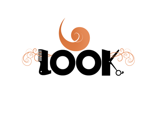
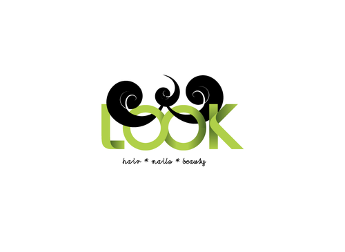
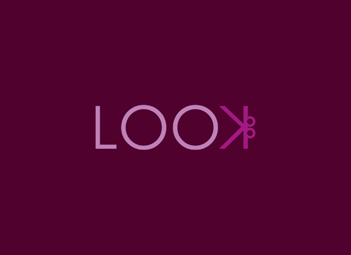
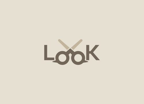
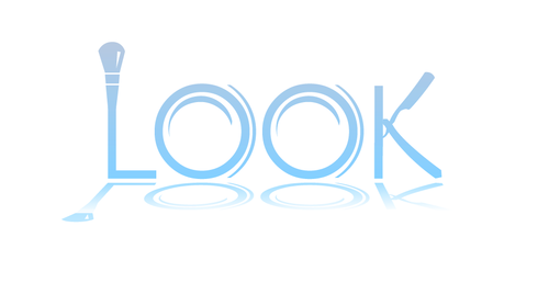
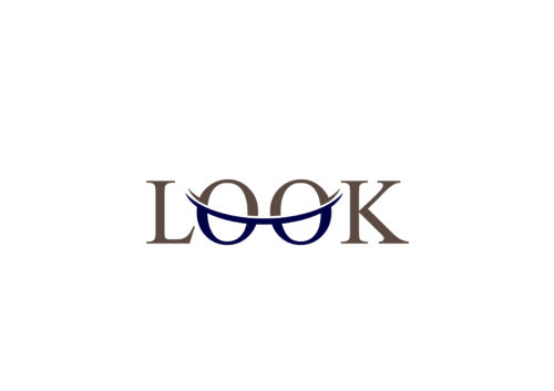
Keep it simple. Played with a font named Seaside Resort because the "O" looked like eyes but not too obvious. Thought of incorporating symbols instead of words to say what LOOK is ie. scissors, polish,make-up implement.

Related Contests


Logo for new online shampoo shop
$399
Prize Money
242
Concepts
Beachy Logo for a Beachwear Clothing Line
$200
Prize Money
111
Concepts
Logo for independent artist
$200
Prize Money
66
Concepts
M & Co. Hair an d Nails
$200
Prize Money
163
Concepts

Discussion


Comments

  • September 23, 2011 8:38 AM
    sweeybb1 sweeybb1
      Project Holder
    Thank you to everyone. This was quite an exciting experience. Starting a new business is stressful enough,it was nice to hand off this project to experts and get a variety of views. Thanks again. Best of luck in your careers.

    Like Icon 0   DislikeIcon 0
  • September 21, 2011 11:16 AM
    sweeybb1 sweeybb1
      Project Holder
    We are going to go with #61. I did not receive it til the end of the contest and did not get a chance to ask for changes. Can I still work with the designer on a few tweaks.Make the scissors pointy and a bit shorter...too much dead space between LOOK and what is going on with the hair. Hair should be maybe a bit less "curly Q" looking on the ends. What about a colored background like a box shape? to make it pop more. Thanks I knew I liked it the moment I saw it...just too late to discuss variations at time of contest.

    Like Icon 0   DislikeIcon 0
  • September 13, 2011 8:40 AM
    sweeybb1 sweeybb1
      Project Holder
    I like the interesting new direction. #29 how about more of a suggested image than a solid obvious head---we have to appeal to men also---but great changeup! #28 interesting but the scissors have to look more like haircutting shears and maybe less "bold and intimidating". #27 I like it within the box and how the symbols are not all inside the box more in that direction. Really appreciate the efforts.

    Like Icon 0   DislikeIcon 0
  • September 12, 2011 6:43 PM
    sweeybb1 sweeybb1
      Project Holder
    Hey everyone!! How about a new direction? How about some kind of icon---next to , over, below, behind? the word LOOK. Should the LOOK be in upper and/or lower case letters? Think artsy, eco-friendly, eclectic. Something that pops and can look good on a sign, cards and be re-produced on a shirt yet be simple. I have always liked the logo for Alfred Hitchcock---the simplicity yet it pops. Something that suggests a scissor or comb perhaps? Hope I am being helpful and not confusing. Thank you all so much!

    Like Icon 0   DislikeIcon 0
  • September 12, 2011 6:24 PM
    sweeybb1 sweeybb1
      Project Holder
    Oops!! A bit of a feud going on. I believe we will not use a razor. Everyone says it looks too threatening. As far as font goes---it is simply a font I saw and used---if you see another font you like try it. #20 the comb is interesting---but do not like the "smile" under letters.

    Like Icon 0   DislikeIcon 0
  • September 11, 2011 1:42 PM
    emilyking emilyking
     
    Thank you for your input! Great idea to share the ideas on facebook. I've added some new drafts. #16 has a bolder blue color and the added comb as your client suggested, and #17 has the more "simple but slick" look you liked in my URBAN design. Let me know what other changes I can make to turn my drafts into your favorite.

    Like Icon 0   DislikeIcon 0
  • September 11, 2011 7:25 AM
    sweeybb1 sweeybb1
      Project Holder
    I shared some designs on my facebook page and this is what one very good client had to say and I thought it was very helpful.In reference to #10 and #15 "I like the direction this one is headed in the best of all the ones on the site. I like the color (and this blue is much better than the blue version of the green one with straight razor). It has a clean, modern, cool and "cool" look to it, and it entertains the eye. Have you tried to incorporate a comb into the design. It seems to me the main icons of a studio such is this are a comb and scissors. You're trying to identify the business, not describe its entire menu of offerings (i.e with polish, brush, etc.). I realize the colors of the building are green and so maybe you are partial to green, but the green above feels weak to me. Maybe this one in a different green."

    Like Icon 0   DislikeIcon 0
  • September 10, 2011 8:27 PM
    sweeybb1 sweeybb1
      Project Holder
    #15 Emily---looked at your portfolio and I really liked the URBAN design---think along that line. simple but slick.

    Like Icon 0   DislikeIcon 0
  • September 10, 2011 8:23 PM
    sweeybb1 sweeybb1
      Project Holder
    #13 too one color--don't know what the shadowy shape in letter boxes are. I would like more of a one box logo. #15 really like the color and use of icons---great direction.Thanks

    Like Icon 0   DislikeIcon 0
  • September 09, 2011 8:16 PM
    sweeybb1 sweeybb1
      Project Holder
    #12 too much like FORD symbol

    Like Icon 0   DislikeIcon 0
  • September 09, 2011 5:41 PM
    sweeybb1 sweeybb1
      Project Holder
    #11 Interesting idea, but I don't like that the "L" and "K" are so different from the "O"s. The squares containing the letters seem to separate things too much. Is there a way to unify things better? Love the highlights on the squares! #10 Really like the changes, especially the scissor treatment on the "K". Is there a way to perhaps imply a makeup brush on the top of the "L"? Still try to work in the other icons, if possible. Love the reflections!

    Like Icon 0   DislikeIcon 0
  • September 09, 2011 5:24 PM
    sweeybb1 sweeybb1
      Project Holder
    #9 and #10 you found the font. I like where it is going. I like the reflection. maybe some 3-D. Perhaps using green. What about the words being in a box or something like that. I had thought about using scissors,polish bottle and makeup brush below word. Simple-but says what we do. FYI we are going to be very eco-friendly.I like the "eye effect"in #10. I like the scissors--I had not thought of them there, maybe longer blades? Thanks great direction!

    Like Icon 0   DislikeIcon 0
  • September 09, 2011 8:42 AM
    sweeybb1 sweeybb1
      Project Holder
    #8 seems too techy, we want more sophisticated thanks

    Like Icon 0   DislikeIcon 0
  • September 08, 2011 9:18 PM
    sweeybb1 sweeybb1
      Project Holder
    # 6 I like the thought. interesting idea of eyes. Perhaps more interesting font.

    Like Icon 0   DislikeIcon 0
  • September 08, 2011 9:14 PM
    sweeybb1 sweeybb1
      Project Holder
    #7 It needs to be easier to read the name and understand what the symbol is. It reminds me of a face.Thank you.

    Like Icon 0   DislikeIcon 0
  • September 07, 2011 10:59 AM
    sweeybb1 sweeybb1
      Project Holder
    A bit too cutesy and child-like on draft #1 and #2. Has to be more sophisticated and if using hair cutting scissors they must look like hair shears. Thanx.

    Like Icon 0   DislikeIcon 0