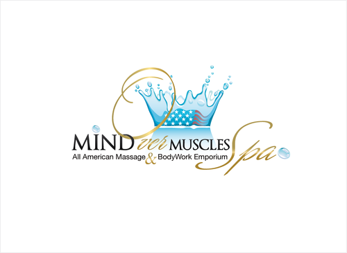
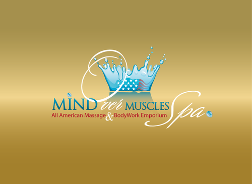
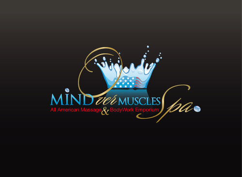
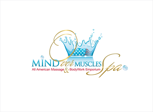
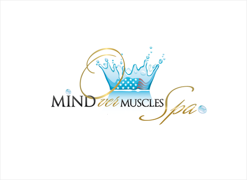
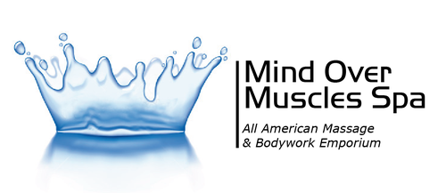
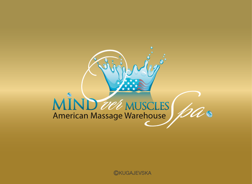
mind over muscles logo
Mind Over Muscles Spa
|
Contest Holder
mindovermuscles
?
Last Logged in : 4935days22hrs ago |
Concepts Submitted
139 |
Guaranteed Prize
190 |
Winner(s) | A Logo, Monogram, or Icon |
|
Live Project
Deciding
Project Finalized


Creative Brief
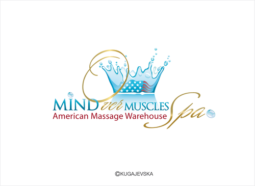
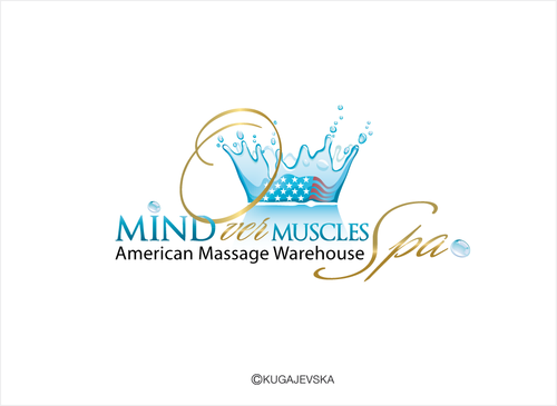
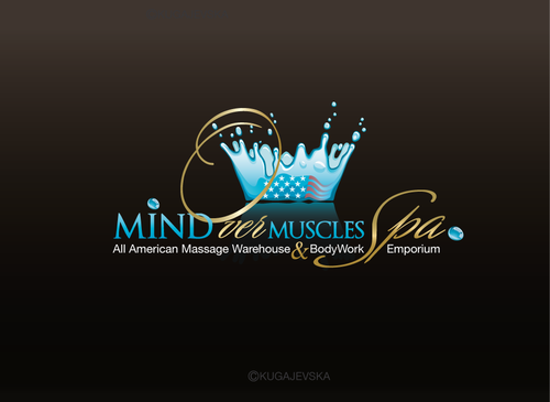
mind over muscles logo
Mind Over Muscles Spa
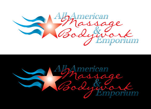
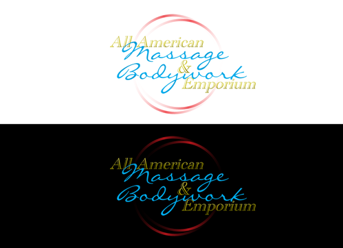
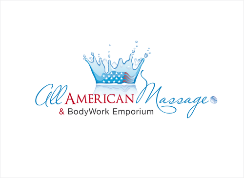
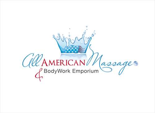
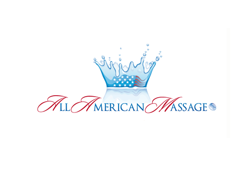
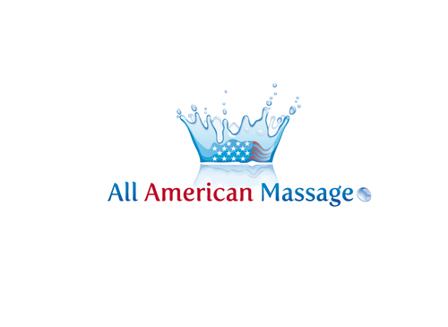
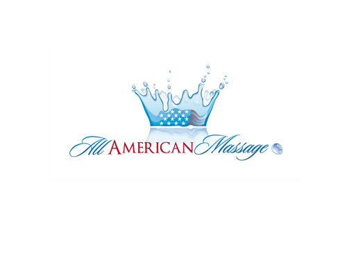
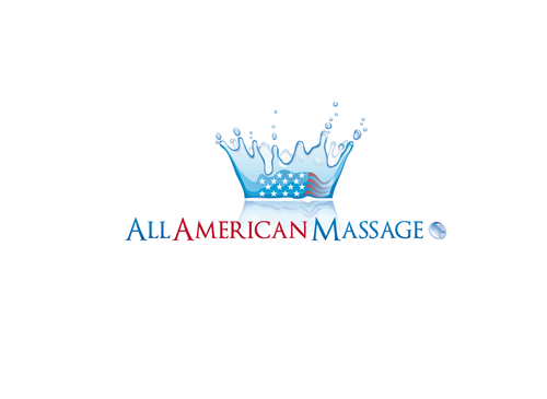
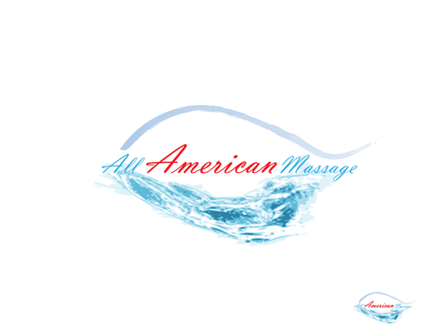
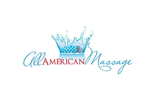
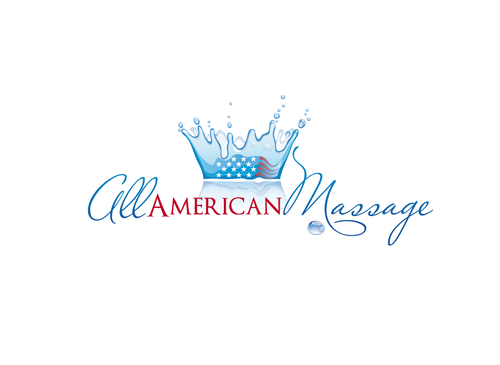
All American Massage & Bodywork Emporium
Yes
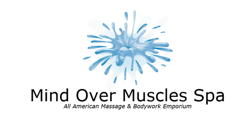
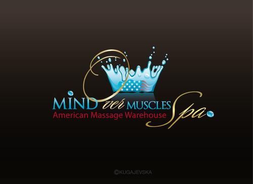
this is for a upscale massage spa and retail massage supply store. Mind over muscles spa and american massage are important key words as well as i need to inc that we sell a complete stock of massage supplies in our spa. the name mind over muscles spa & all american Bodywork emporium seems long. i need mind over muscles spa and American massage foresmost-im flexible with a creative design logo.i have an pic of the blue water crown we use but am open to new ideas that relate to american spa & massage supplies- a brain, crown pic etc.i dont want red white blue theme. classy elegant
Health
Logo Type
![]()
Cutting-Edge
Unique/Creative
Clean/Simple
Sophisticated
Modern
Traditional
High Tech
WHITE blue black /white /gold combo- http://www.google.com/search?tbm=isch&hl=en&source=hp&biw=1676&bih=898&q=blue+water+crown&gbv=2&aq=f&aqi=&aql=&oq= http://www.google.com/imgres?imgurl=http://4.bp.blogspot.com/_v0R1XzKIMWk/S85wgg-R-4I/AAAAAAAAAM4/GcQKoy8Hc9c/s1600/mind.jpg&imgrefurl=http://real-and-raw.blogspot.com/2010/04/power-of-mind.html&usg=__pGo8JFJaYkHvme_YNMpkavnB6yQ=&h=750&w=1050&sz=75&hl=en&start=0&sig2=Hvt9U9v7weMmQPxCw3h2ZQ&zoom=1&tbnid=uYehITeTmnW0QM:&tbnh=139&tbnw=169&ei=MrS5TcqPLejfiAKfnJQu&prev=/search%3Fq%3Dmind%2Bbrain%26hl%3Den%26biw%3D1676%26bih%3D898%26gbv%3D2%26tbm%3Disch&itbs=1&iact=rc&dur=61&page=1&ndsp=44&ved=1t:429,r:29,s:0&tx=81&ty=66
2
WE WERE USING A BLUE WATER CROWN IMAGE I WANT SOMETHING CATCHY TO THE POINT TO KNOW WE ARE AN AMERICAN SPA AND MASSAGE STORE
Related Contests


