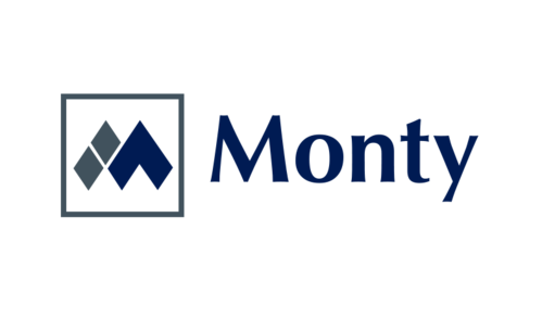
Multi National Company - Monty Group
"Monty" or "Monty Group" or "The Monty Group"
|
Contest Holder
MontyGroup
?
Last Logged in : 1994days13hrs ago |
Concepts Submitted
1444 |
Guaranteed Prize
750 |
Winner(s) | A Logo, Monogram, or Icon |
|
Live Project
Deciding
Project Finalized
Concept
Awarded as a winner


Creative Brief
Multi National Company - Monty Group
"Monty" or "Monty Group" or "The Monty Group"
No
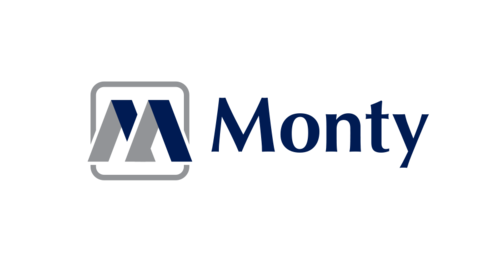
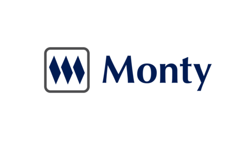
This logo represents the change of our company from a manufacturer to a multi national corporation. It is important to respect our history and we would like this logo to respect our history while being more modern and differentiate from our old logo. See photo attached. Thank you for your attention!
Business Opportunities
Logo Type
![]()
Symbolic
![]()
Modern
Simple
Professional
Blue pantone 654 C and U
2
Font originally is CG Omega. Would like to recycle this but open to new fonts. Must retain professional look.
Would like to see the logo represent an "M" or "MG" with the font coupled together. Open to suggestions.
Related Contests