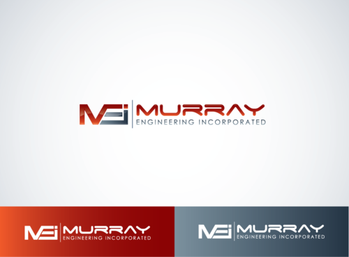
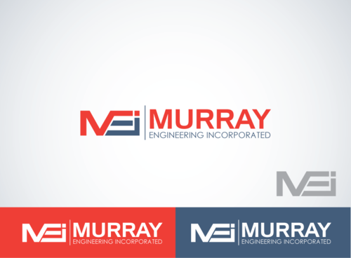
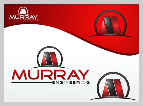
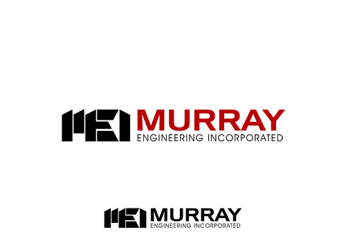
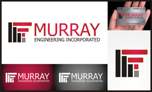
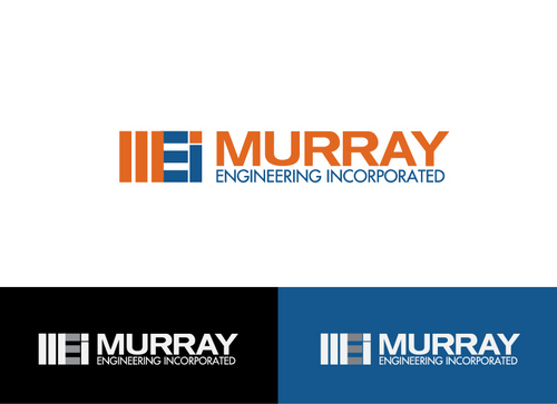
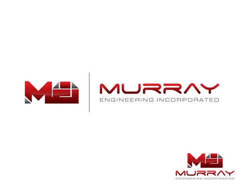
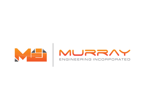
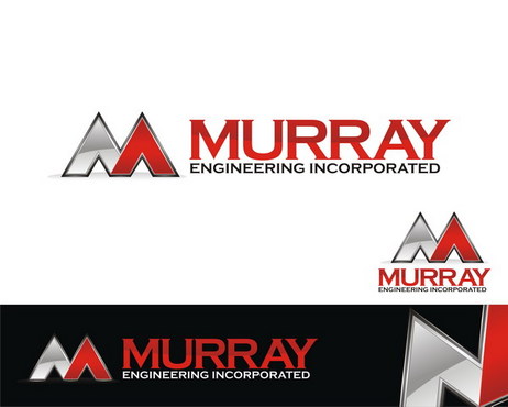
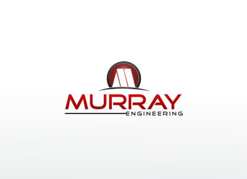
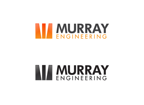
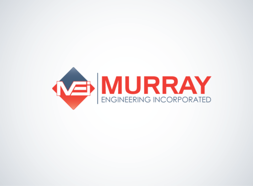
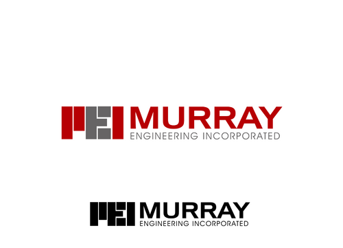
Murray Engineering business logo
Murray Engineering
|
Contest Holder
bmurray
?
Last Logged in : 5260days37mins ago |
Concepts Submitted
100 |
Guaranteed Prize
200 |
Winner(s) | A Logo, Monogram, or Icon |
|
Live Project
Deciding
Project Finalized


Creative Brief
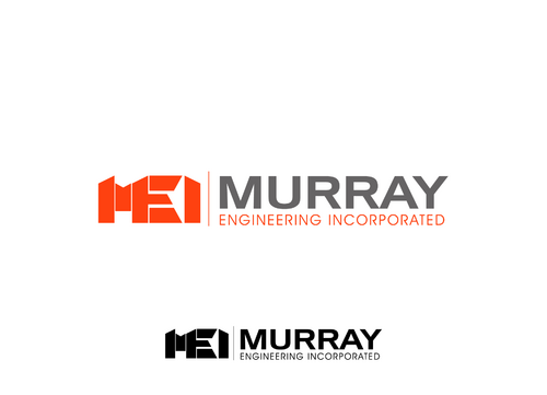
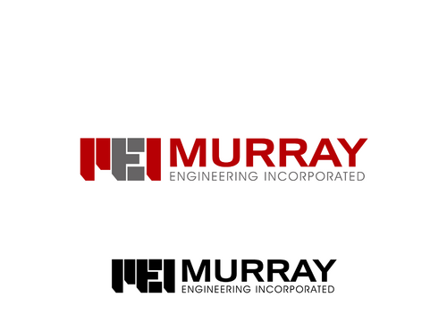
Murray Engineering business logo
Murray Engineering
No
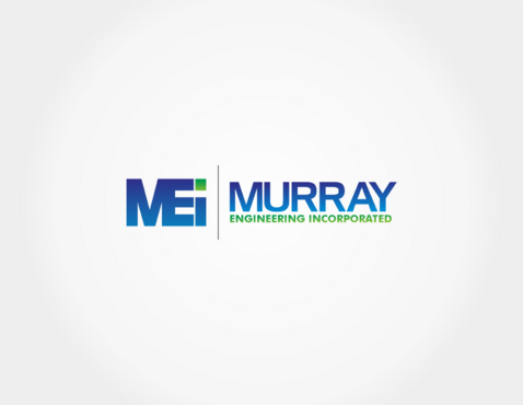
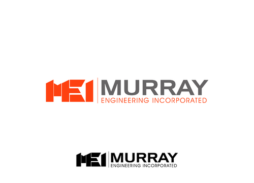
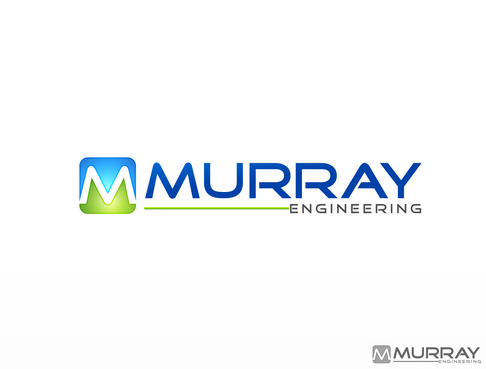
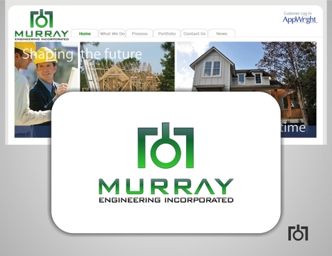
We are a structural engineering design firm specializing in the design of residential structures. We do business for construction companies.
Our website is www.murrayengr.com
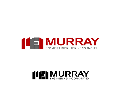
You can see our current logo which we would like to change to a more professional look.
Engineering
Logo Type
![]()
Abstract Mark
![]()
Clean/Simple
Corporate
Modern
Serious
Masculine
Blue Green is OK Would like to see Orange/Black and Red/Black I'd open for suggestions on color. The logo should look good when printed in black/white no matter what color.
2
some logos I like
www.haskell.com
http://www.mycroburst.com/contests/engineering-firm-logo/users/sldesign
http://www.mycroburst.com/contests/engineering-firm-logo/users/xtive
Related Contests