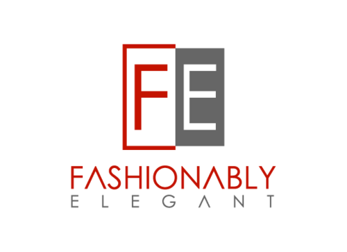
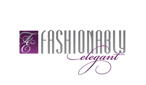
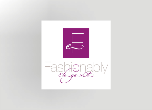
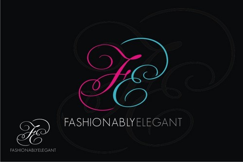
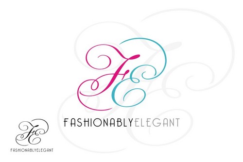
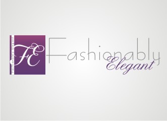
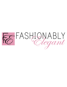
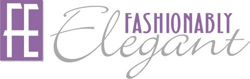
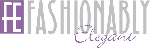
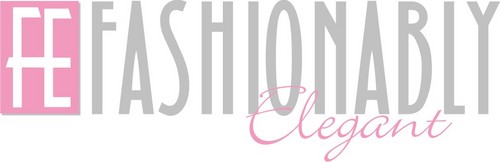
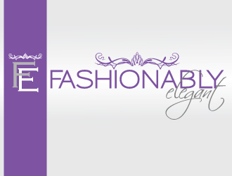
New company logo design
Fashionably Elegant
|
Contest Holder
FE2010
?
Last Logged in : 4977days16hrs ago |
Concepts Submitted
285 |
Guaranteed Prize
350 |
Winner(s) | A Logo, Monogram, or Icon |
|
Live Project
Deciding
Project Finalized

Creative Brief
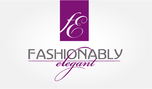
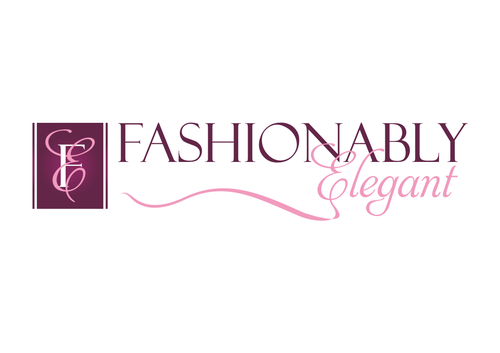
New company logo design
Fashionably Elegant
No
Fashionably Elegant is going to be a high end wedding stule and design maagazine in the Tampa Bay Market. We will showcase different facilities for a monthly spotlight. We will have very highend advertisers and photography. It will be trend setting for the wedding industry.
News and Media
Logo Type
![]()
Symbolic
![]()
Abstract Mark
![]()
Initials
![]()
Cutting-Edge
Unique/Creative
Sophisticated
Modern
Feminine
3
Related Contests