Live Project
Deciding
Project Finalized

Creative Brief
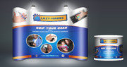
New Product Packaging
Revolver Electronic Cigarettes
We are redesigning our brand image and need help with new product packaging. We are an electronic cigarette company called Revolver. Our current website is revolvercig.com. We currently offer quite a few models and instead of focusing on the brand itself, we created sub-brands for each model. Big mistake. We want to just keep it simple, it's the brand and the different types of ecigs. What we want is a universal packaging design that can be applied to any box of any size (by just moving around and resizing components). Think about the way Marlboro cigarettes all have essentially the same box design, but then they make a minor change such as color to identify the different types like Lights or Menthols. Same concept, all Revolver brand products with just a minimal change to signify which type it is. Read requirements for exactly what we are looking for. Here is the download for our logo files: http://revolvercig.com/downloads/RevolverLogoFiles.zip We want the exact colors used in the logo as they are used in the file 6.jpg which is located inside the zip folder. I say that because the illustrator file flame isn't as red as that jpg. We want the look from 6.jpg. The other thing about this brand relaunch is that we have a new website in the works. This will indicate the direction we are moving towards with design. The new site being built can be previewed here: http://revolv.dev4.webenabled.net/# Obviously it has work to be done. To get an idea of the model name change concept, here are the models we have and what they will be called from now on: "Current Sub-branded Name" / "New Name": "LIGHT" / "Disposable eCigarette" "G2" / "Portable eCigarette" "Talon" / "Advanced eCigarette" "Magnum Volt" / "Variable Voltage Mod" "Magnum Compact" / "Compact Variable Voltage Mod" "Evic" / "Intelligent eCigarette" You can browse our website to see how we package our starter kits. The designs are for the starter kit packaging.
Consumer Electronics
Our main target audience is male age 18-36. We want something modern, edgy, eye popping, simple, and unique to us. Please explore our website in development to get a feel for who we are as a brand.
What we want is a design that seems edgy and pops! It must be modern and fit our brand image. We are like the Monster Energy Drink of electronic cigarettes so consider this when making the design. The box design must have black as the base/backing color and work from there. It should be kept fairly simple but look really good. The only thing that should be on the design should be the logo as described in the Details section, Possibly the Tagline, and the "New Name" as listed in the Details section. Don't make the "New Name" too big though, the focus should be on the brand logo. Do not worry about submitting any of the other details on the box design such as the website, we will add that later. The design is going to be printed so my guess is it should be made in CMYK mode? I still want to see the red in the logo POP out though. This should grab your attention and retain the edge. Speaking of edge, in the tagline the word "Edge" we usually do in a different color than the text. So maybe it could also be red that matches the red in the logo. As for the background design, do not let it stand out too much. Also we don't want to see things like tribal art or clipart or anything generic such as dragons or lions or whatever other symbols you would see on cigarette or cigar packaging. We don't want to be like those other brands, we want our OWN packaging and image.
Related Contests