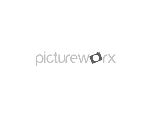
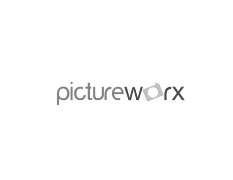
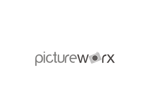
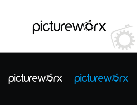
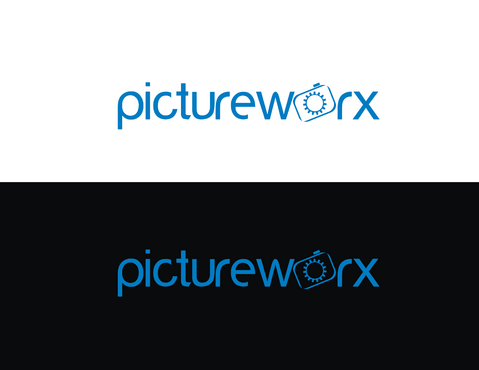
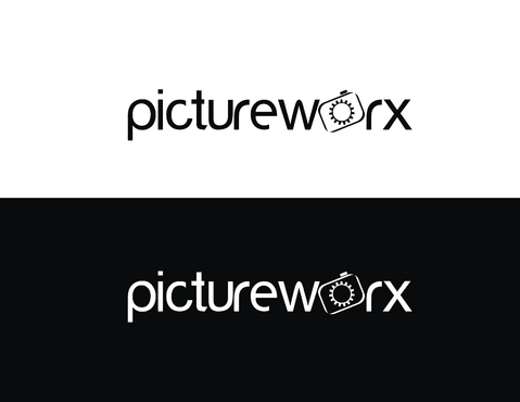
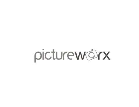
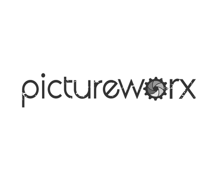
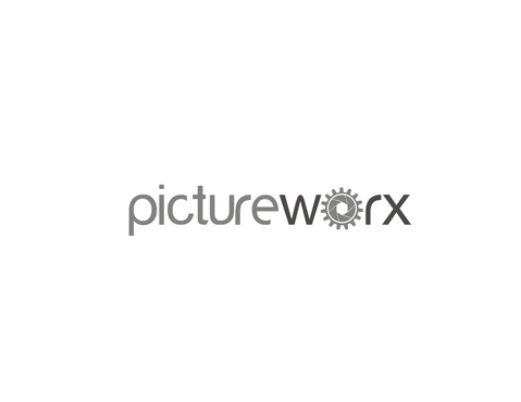
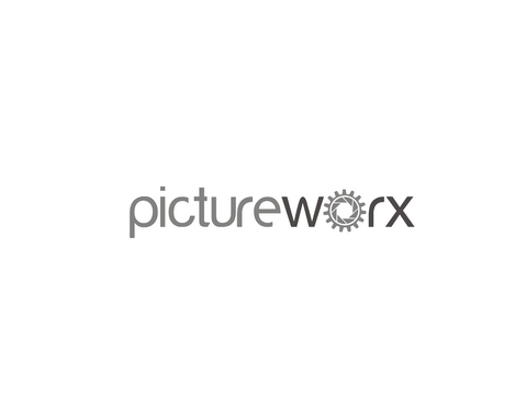
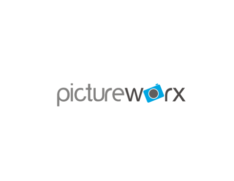
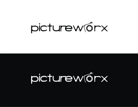
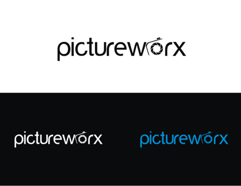
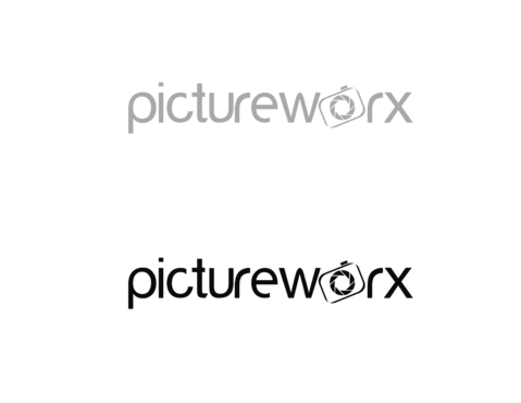
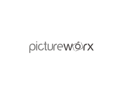
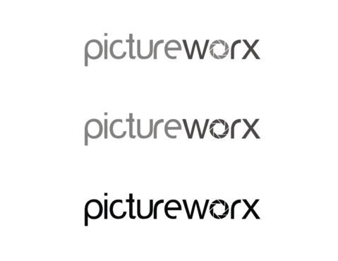
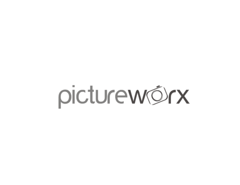
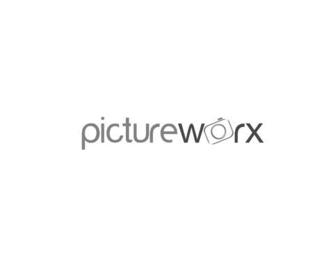
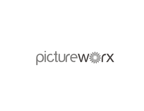
pictureworx/the pictureworx - logo for photography business
'pictureworx' or 'the pictureworx'
|
Contest Holder
dlhenry414
?
Last Logged in : 3983days3hrs ago |
Concepts Submitted
152 |
Guaranteed Prize
200 |
Winner(s) | A Logo, Monogram, or Icon |
|
Live Project
Deciding
Project Finalized
Creative Brief
pictureworx/the pictureworx - logo for photography business
'pictureworx' or 'the pictureworx'
See yourself differently
No
modern boutique photography and film company specializing in high school senior, corporate, and small event capture photography and short films. Primarily focused on the High School Senior portrait market
Photography
Symbolic
![]()
Abstract Mark
![]()
Web 2.0
![]()
Cutting-Edge
Clean/Simple
Modern
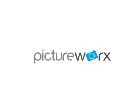
Defintely white or black with the additioanl color being a candy blue or industrial grey for the abstract element. The colors should be able to be switched back and forth between the abstract element and the font. I really see the logo itself as being white letters then the color object on various dark backgrounds. Really like the apple logo how it could be semi three dimensional transparent blue against white background and white against dark backgrounds.
2
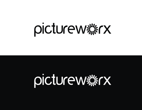
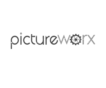
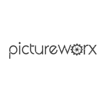
I have a very specific design element I want incorporated into the logo. In he word pictureworx, I want a gear gear element to take the place of the letter 'o' - more specifically, I want a gear element that changes into a camera aperture or a gear element that surrounds a camera aperture. This is particularly important. While the design is simple, I need people to get the idea that it stands for photography and an industrial approach to work hence 'picture WORX. the fonts can be either completely lowercase or uppercase but definitely sleek and modern looking. The graphical element, the combined lens aperture, can either be industrial looking, three dimensional transluscent (like candy) but also needs to be able to easily be converted to flat line art for printing on t-shirts in a single color (like completely black entire logo or compeltely black) Primary logo can be two colors, but want it to be able to easily convert to flat line art for screening as well - so need variation.
Related Contests