Poker Chip Golf Ball Alignment Tool Design and Logo
MilSpec
|
Contest Holder
marcussnyder
?
Last Logged in : 4583days18hrs ago |
Concepts Submitted
17 |
Prize Money
150
|
Winner(s) | Other |
|
Live Project
Deciding
Project Finalized

Creative Brief
Poker Chip Golf Ball Alignment Tool Design and Logo
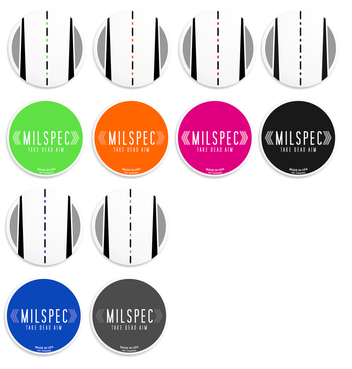
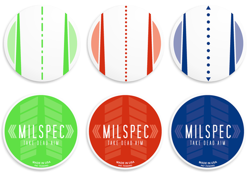
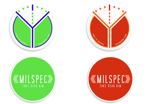
MilSpec
I am in need of a design for a golf ball alignment tool and marker. A golf ball alignment tool is used as a ball marker and helps you to align your golf ball to the cup. For additional information on golf ball alignment tools and how they are used please refer to the following links. http://www.scottycameron.com/studio/articles/details.aspx?id=31 http://www.aimprogolf.com/ http://www.puttingtool.com/live/
Sports
Target audience is professional and casual golfers. The golf trend is becoming much more designer. So feel free to use bright colors. You may gather some unique design ideas by looking at watch faces but keep in mind that the alignment marks need to be functional.
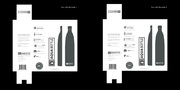
The alignment design will be placed on one side of a double sided ceramic poker chip. On the back side I would like a simple logo design. The poker chip is 39mm in diameter. The image needs to be atleast 300 DPI. I will attach a PhotoShop template for the chip. Please utilize it when submitting designs.
Related Contests