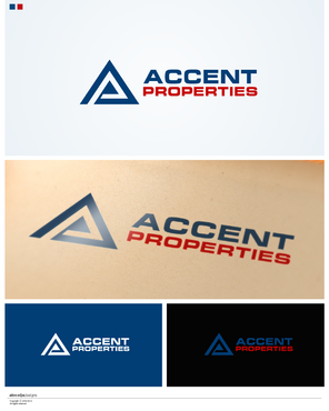
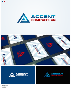
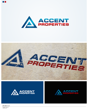
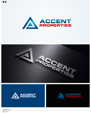
Professional Logo for Real Estate Company
Accent Properties
|
Contest Holder
dander49
?
Last Logged in : 4481days18hrs ago |
Concepts Submitted
365 |
Guaranteed Prize
250 |
Winner(s) | A Logo, Monogram, or Icon |
|
Live Project
Deciding
Project Finalized


Creative Brief
Professional Logo for Real Estate Company
Accent Properties
No
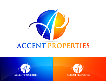
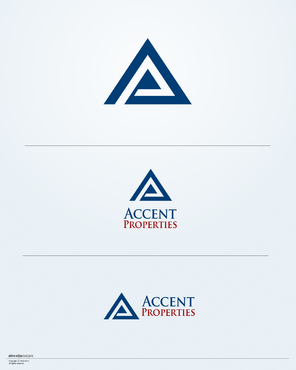
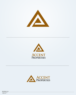
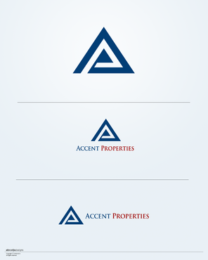
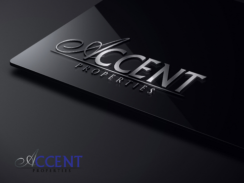
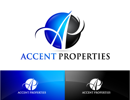
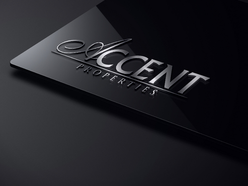
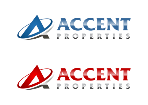
This logo will represent my real estate business which primarily revolves around renting properties either residential or commercial but could be expanded into other areas of real estate in the future. The logo should convey professionalism and strength. The logo should give a sense that the company is established and reliable .
Real Estate
Logo Type
![]()
Symbolic
![]()
Initials
![]()
Illustrative
![]()
Cutting-edge
Traditional
Simple
Professional
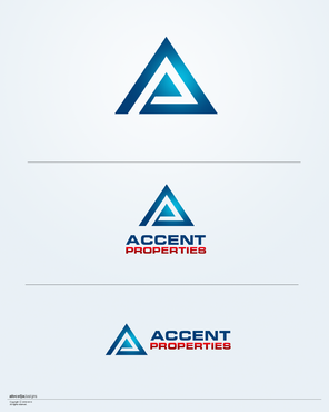
I was thinking Navy Blue, Silver, and Black, but I am not tied to any particular color scheme. I am open to any colors that the designers think conveys the overall theme or message that I am going.
not sure
First what I do not want. I do not like images of houses, roofs, windows, skylines, apartments etc. Any use of imagery should not be an obvious picture of real estate. I simply find that too casual and limiting. I do not want a highly complex or elaborate logo. That does not mean it should necessarily be super simple or plain, but any use of imagery should not be so complex as to lose clarity when reduced to smaller sizes.
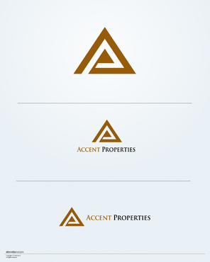
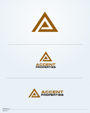
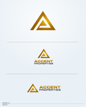
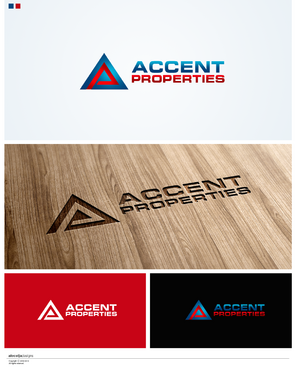
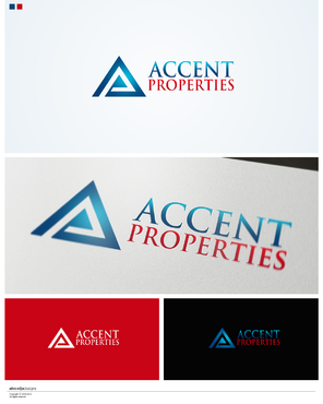
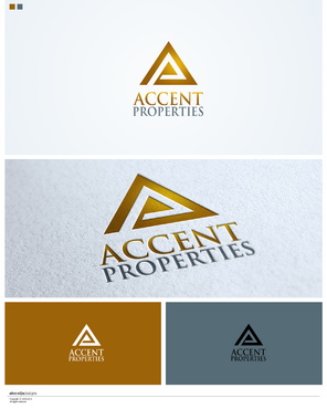
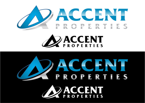
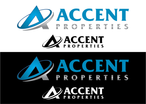
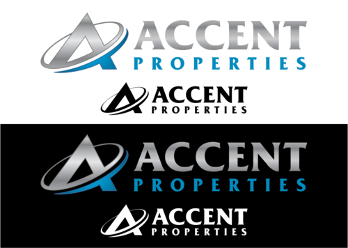
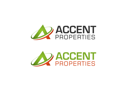
I am open to the use of initials as part of the logo or simply the full company name in the logo or a combination. Unless the logo turns out to revolve around the use of the full name as a central theme, I would like any initials/imagery to be able to be separated from the name of the company and stand alone. For instance, suppose there was a logo with the letters AP and some kind of imagery surrounding it, with the words Accent Properties to the side or underneath that imagery and initials. I would like to get a version combined and a separate version that has just the initials and imagery to be used in smaller venues.
As to any imagery that would be incorporated into the logo, it could be abstract, it could be a simple image, it could be some kind of extension of the initials AP, it could incorporate the concept of some form of "accent" namely some kind of emphasis or prominence, or it could be something all together different. I am interested to see what ideas the designers come up with. It just cannot be imagery that is an obvious picture of some form of housing.
Related Contests


