Real Estate Team Branding Logo
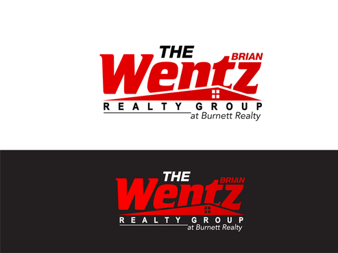
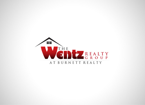
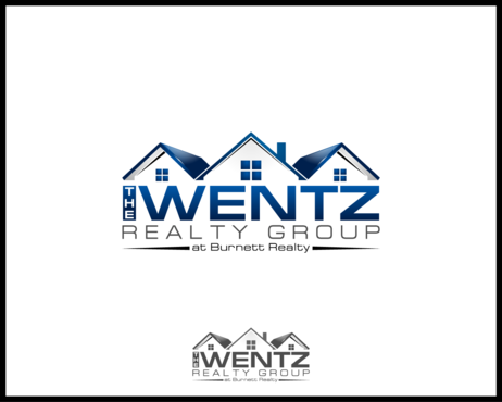
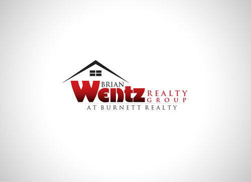
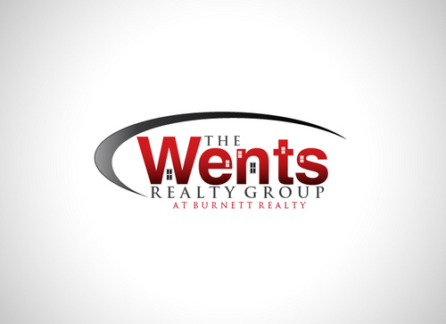
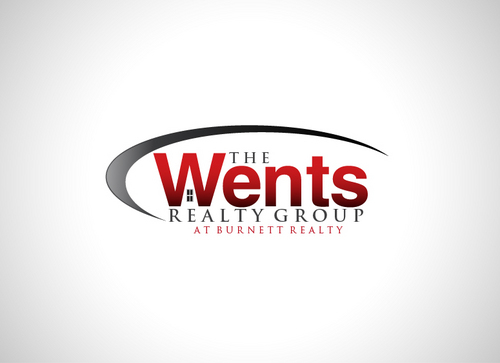
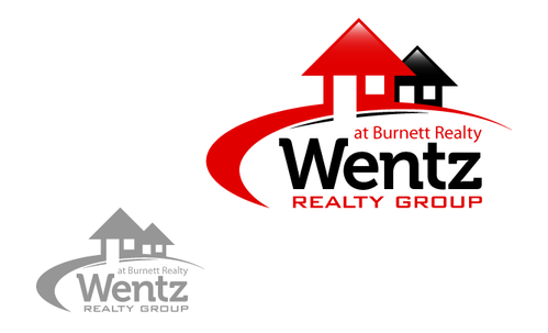
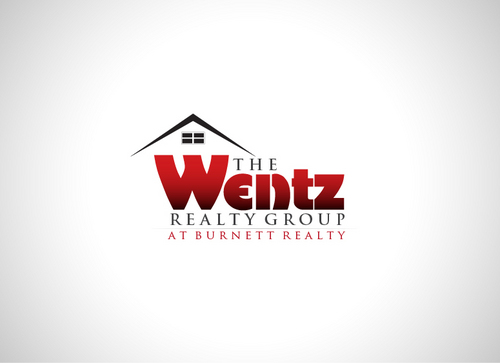
The Wentz Realty Group
|
Contest Holder
bwentz
?
Last Logged in : 5250days13hrs ago |
Concepts Submitted
61 |
Guaranteed Prize
300 |
Winner(s) | A Logo, Monogram, or Icon |
|
Live Project
Deciding
Project Finalized


Creative Brief
Real Estate Team Branding Logo
The Wentz Realty Group
at Burnett Realty
Yes
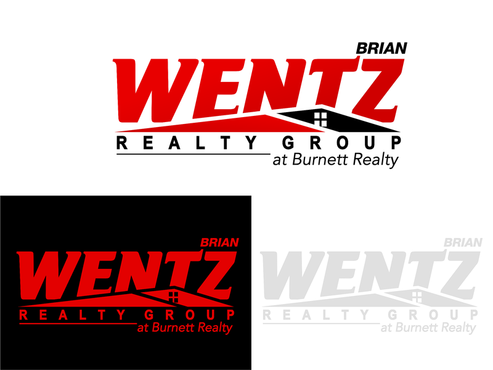
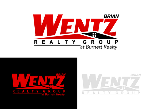
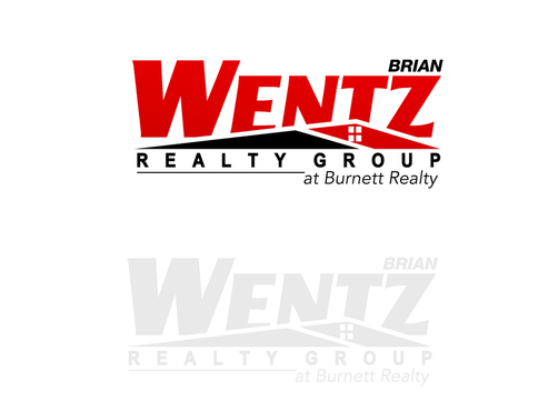
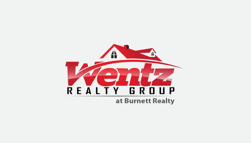
This is for a Real Estate team of 15 years, with a well established client base. But our team is expanding to add new members and sales volume, and we need one image for the group. We develop life long relationships with customers, and deliver high quality of service. We sell service, not homes. Brian Wentz was the initial team member, and serves as the pillar for the rest of the team. This will be used on the branding from business cards, to websites and note cards, etc.
Real Estate
Logo Type
![]()
Abstract Mark
![]()
Initials
![]()
Unique/Creative
Clean/Simple
Sophisticated
Corporate
Modern
Industry Oriented
Playful/Cartoonish
Company colors are black and red. But logo can compliments that scheme. We are open to creativity.
not sure
Roof or house is over used. If the team leaders name "Brian" fits in somewhere- using the first name in smaller print would be great. If not, focus on the Wentz name.
Related Contests


