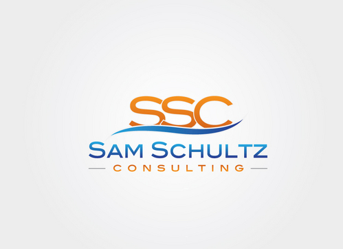
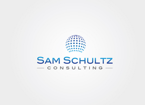
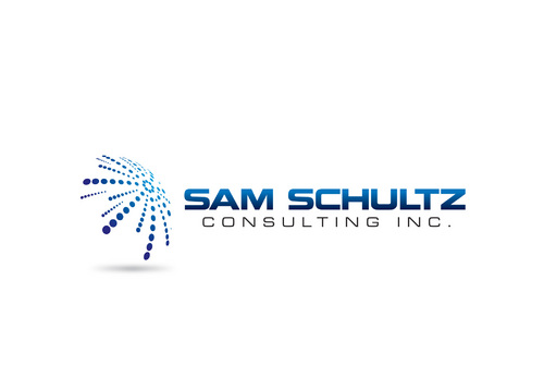
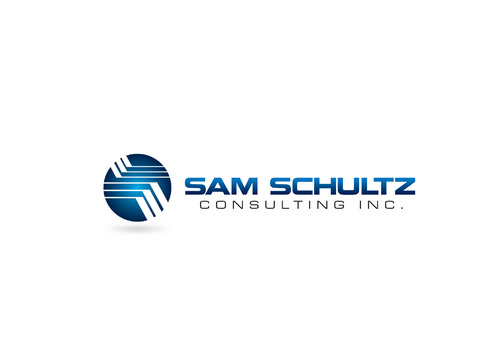
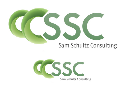
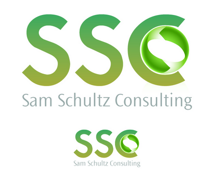
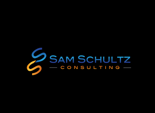
Sam Schultz Consulting, Inc logo for small IT consulting firm
Sam Schultz Consulting, or maybe SSC, open to ideas
|
Contest Holder
samsks
?
Last Logged in : 3555days17hrs ago |
Concepts Submitted
86 |
Guaranteed Prize
300 |
Winner(s) | A Logo, Monogram, or Icon |
|
Live Project
Deciding
Project Finalized


Creative Brief
Sam Schultz Consulting, Inc logo for small IT consulting firm
Sam Schultz Consulting, or maybe SSC, open to ideas
No
Small IT consulting firm servicing mostly small business clients with 50 employees or less. Logo will be used on invoices, proposals, business cards, and website. Wish to project a professional, no-nonsense business feel, and not overly geeky, but some nerdiness is OK!
Information Technology
Logo Type
![]()
Symbolic
![]()
Abstract Mark
![]()
Initials
![]()
Clean/Simple
Corporate
High Tech
Serious
Colors would be great, but not required. I am going to use this on laser printed invoices and proposals, so I need something that would print OK in black/white or grayscale. Proposals can be printed on color laser, so color would be fine for that. Business cards can be color etc.
2
Clean designs usually appeal to me more. Modern look probably, but I've seen some retro looking designs that caught my eye. Don't want it to feel "stodgy," but I do want it to have a "grown up" feel even if it is modern looking. I am open to using my business name "Sam Schultz Consulting" or "Sam Schultz Consulting, Inc." , Initials SSC or SSCI, an abstract symbol with business name printed, maybe incorporate the website url www.samschultz.com or just about anything...
Related Contests