Scheduling Software Logo Facelift
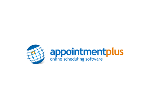
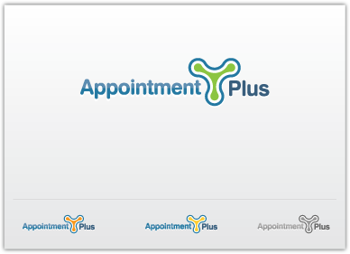
Appointment-Plus
|
Contest Holder
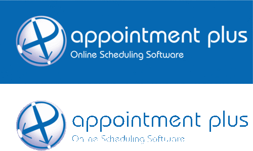
appointmentplus
?
Last Logged in : 5195days17hrs ago |
Concepts Submitted
105 |
Guaranteed Prize
300 |
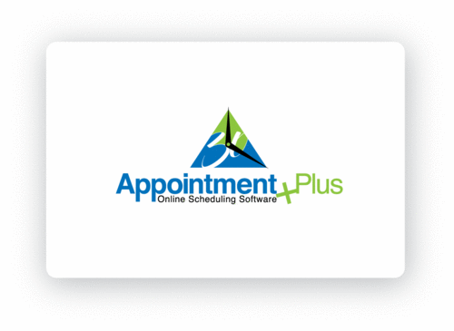
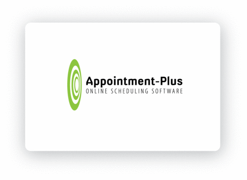
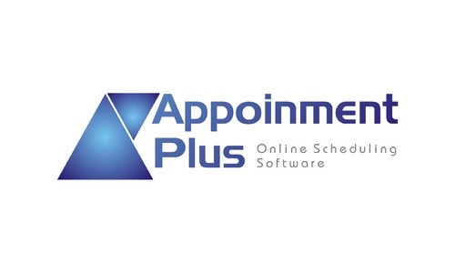
Winner(s) | A Logo, Monogram, or Icon |
|
Live Project
Deciding
Project Finalized


Creative Brief
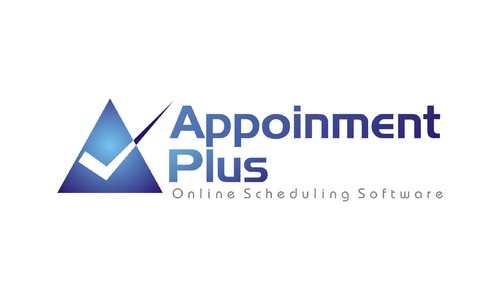
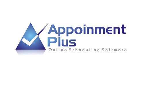
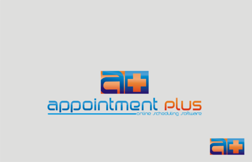
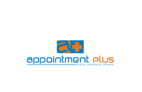
Scheduling Software Logo Facelift
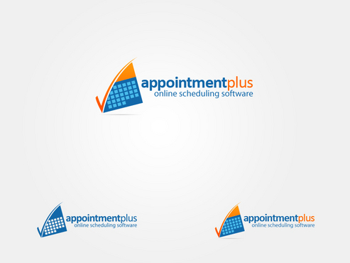
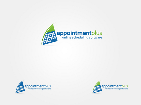
Appointment-Plus
Online Scheduling Software
Yes
We provide online scheduling to 100's of different type of companies. We work with both small businesses and organizations like doctors, salons, photographers and colleges/universities as well as larger organizations like Pepsi, Georgia Pacific and YMCA. The software is easy to use for both internal applications and to allow self scheduling.
Software
Symbolic
![]()
Abstract Mark
![]()
Web 2.0
![]()
Cutting-Edge
Clean/Simple
Modern
We are open to color schemes, but prefer one of the colors to be a shade of blue. The other color(s) should pop a little to highlight a feature of the design.
not sure
We don’t just want a standard image, such as a clock, next to the product name (Appointment-Plus). It has to be more artistic or abstract.
The phrase "Online Scheduling Software" can be used in the logo under the letters or icon to describe better what it is.
Related Contests