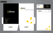
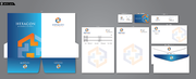
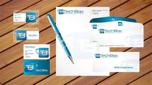
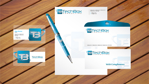
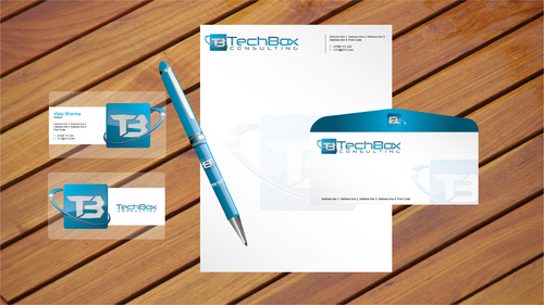
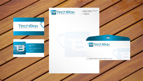
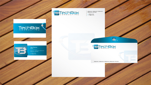
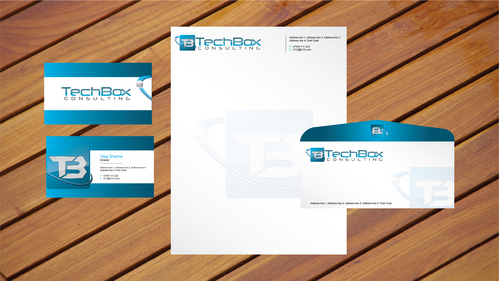
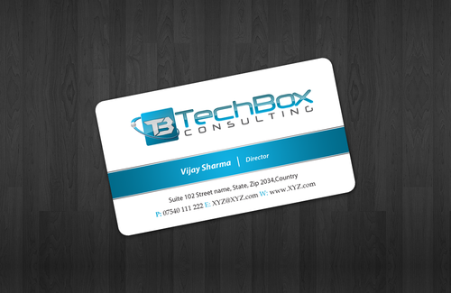
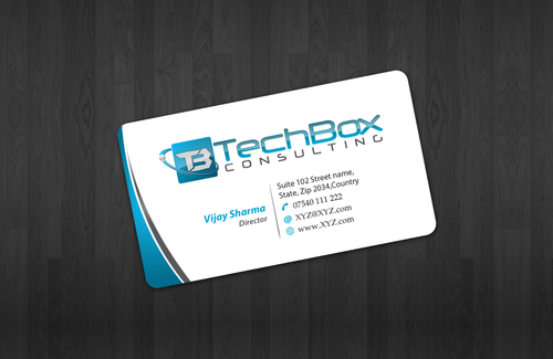
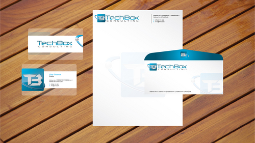
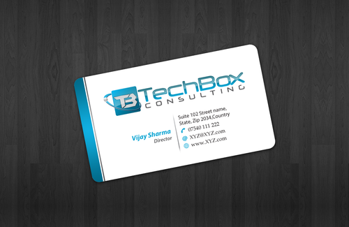
Stationary - TechBox Consulting
Business Card, Letterhead & Pen Design
|
Contest Holder
wijman
?
Last Logged in : 5075days3hrs ago |
Concepts Submitted
68 |
Prize Money
150
|
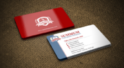
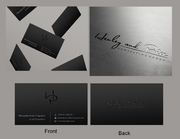
Winner(s) | Business Cards and Stationery |
|
Live Project
Deciding
Project Finalized


Creative Brief
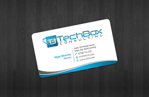
Stationary - TechBox Consulting
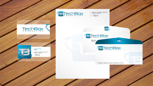
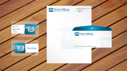
Business Card, Letterhead & Pen Design
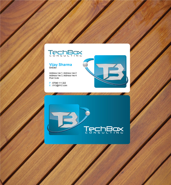
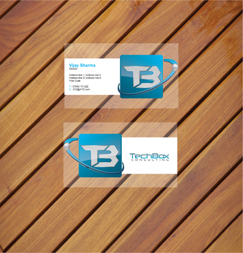
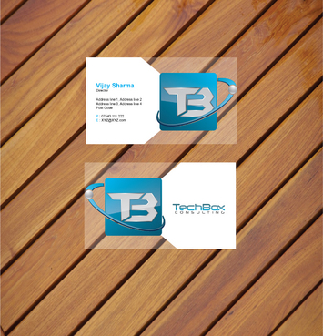
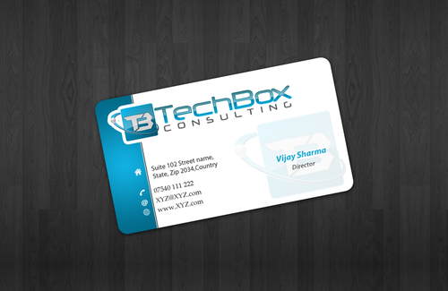
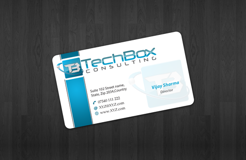
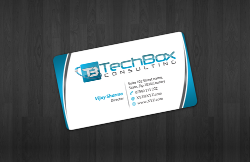
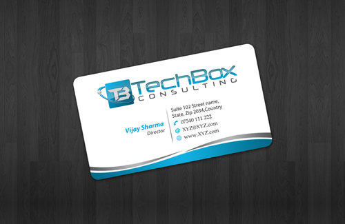
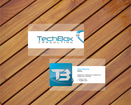
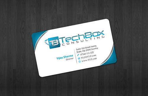
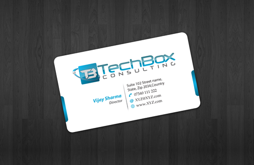
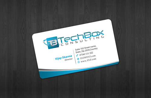
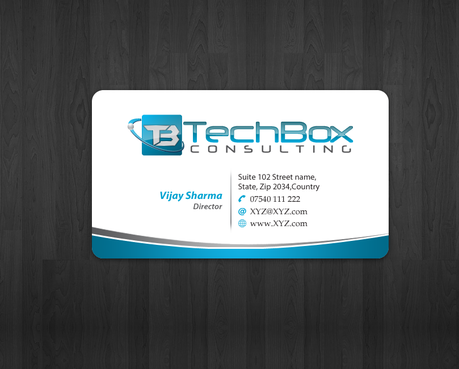
I need double sided standard sized Business Card [3.5" x 2"]
Use same font as used in my logo
Cutting-Edge
Corporate
Modern
Professional
Vijay Sharma
Director
Address line 1 Address line 2 Address line 3 Address line 4 Post Code
07540 111 222
XYZ@XYZ.com
For the business card I like the idea of front/back designs, where either there is something which joins the front and back or there is a slightly modified logo on the back... You're call, I'm open to anything here, so if you come up with something just try it out, I'll give everyone feedback where possible! Please don't just stick my logo on a pen and say "hey, here you go...", for the pen design I'm looking for colours etc and where they are placed on the pen too!
Anything you think would look good!
Consulting
Related Contests