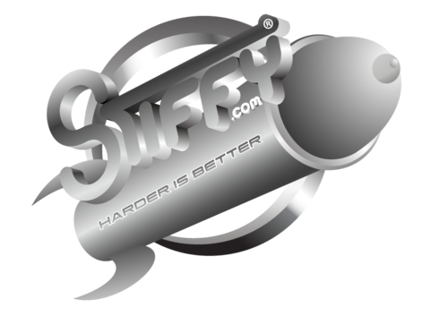
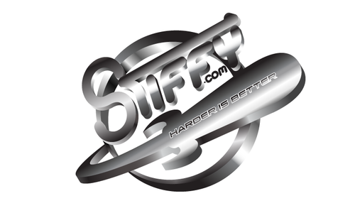
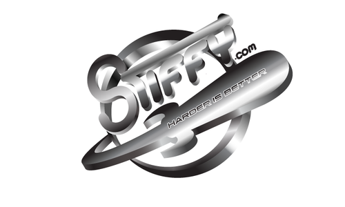
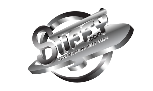
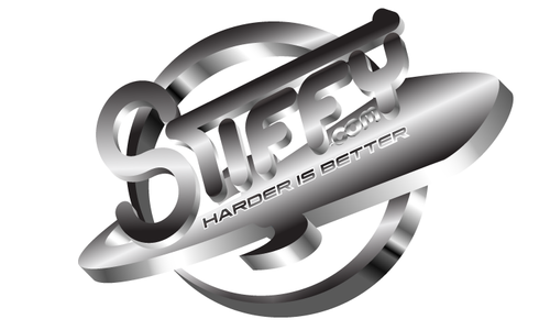
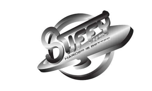
STIFFY LOGO ENHANCEMENT
STIFFY STIFFY.COM STIFFY "Harder is Better"
|
Contest Holder
MaxStiff
?
Last Logged in : 4893days14hrs ago |
Concepts Submitted
94 |
Guaranteed Prize
299 |
Winner(s) | A Logo, Monogram, or Icon |
|
Live Project
Deciding
Project Finalized


Creative Brief
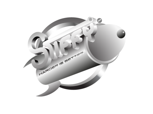
STIFFY LOGO ENHANCEMENT
STIFFY STIFFY.COM STIFFY "Harder is Better"
Harder is Better, Stiffy in a Jiffy, Get Stiffy, Free Stiffy Rides, Instant Stiffy,
No
We Like Our Current STIFFY Design Concept and Theme, However, we need more Verieties and more advanced versions of our artwork and graffics and LOGO'S
Advertising
Symbolic
![]()
Abstract Mark
![]()
Initials
![]()
Character
![]()
Web 2.0
![]()
Cutting-Edge
Unique/Creative
Corporate
Modern
Industry Oriented
High Tech
Illustrative
Masculine
ALL COLORS
not sure
WE NEED REFLECTIVE AND 3-D TUBE STYLE OR BLOCK STYLE, ALL STYLES, BUT WE LIKE OUR CURRENT DESIGN THEME AND DONT WANT TO CHANGE TO FAR AWAY FROM ORIGINAL, JUST IMPROVEMENTS AND VARIATIONS
Related Contests