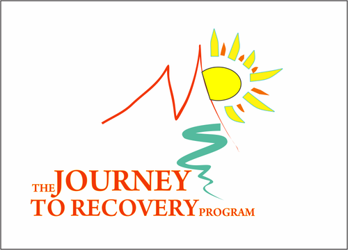
THE JOURNEY TO RECOVERY PROGRAM
THE JOURNEY TO RECOVERY PROGRAM
|
Contest Holder
manyrains
?
Last Logged in : 4077days9hrs ago |
Concepts Submitted
77 |
Guaranteed Prize
300 |
Winner(s) | A Logo, Monogram, or Icon |
|
Live Project
Deciding
Project Finalized


Creative Brief
THE JOURNEY TO RECOVERY PROGRAM
THE JOURNEY TO RECOVERY PROGRAM
No
Logo for substance abuse treatment curriculum. Logo for book cover and relative materials.
I am changing the name to an existing curriculum current title The START Recovery Program.
www.startrecoveryonline.com
Health
Unique/Creative
Clean/Simple
Illustrative
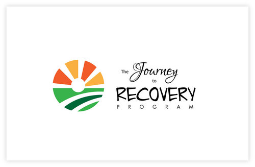
I like the color scheme here www.startrecoveryonline.com
not sure
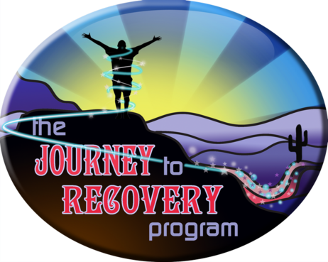
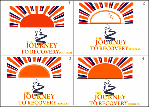
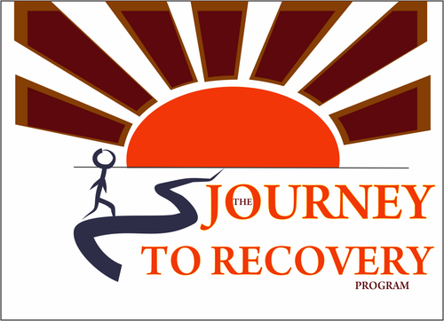
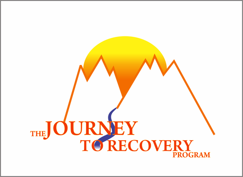
While it feels really old and cliche, the proverbial "winding road to the sunrise" is really appropriate for the content of the program. An old logo I made included a mountain with silhouette figure sitting on top with sunrise behind; the program actually included clients doing Vision Quest- going to top of hill and "finding themselves". I don't know how to display that image for you to see s it's not on any site now.
Much more helpful information can be found on my other website:
www.jimsavage.net
particularly this page:
http://www.jimsavage.net/THE_JOURNEY.html
The Journey musical is a separate component that has its own logo- the Medicine Wheel- and you will see the photo of the sunrise/silhouette which is part of the stage production of The Journey.
I'm sort of partial to the silhouette/sunrise image.
Don't really want it to be Native American looking- southwestern color scheme is close enough to satisfy that.
These pages provide a good overview of content and images:
http://www.jimsavage.net/LEVEL_I.html
http://www.jimsavage.net/LEVEL_II.html
If someone can come up with a new twist, or simply a better version of what I've created in the past that would be great.
Related Contests


