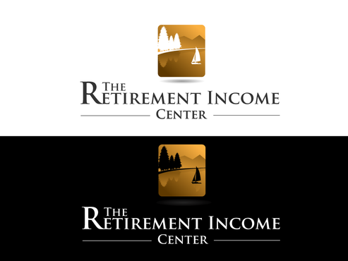
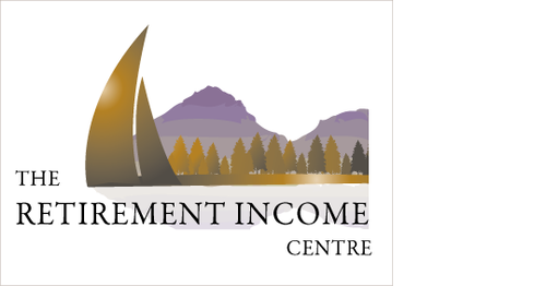
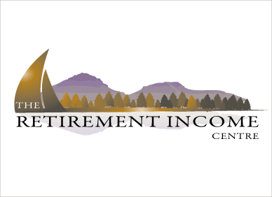
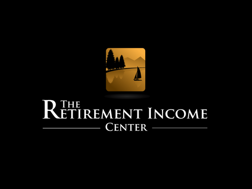
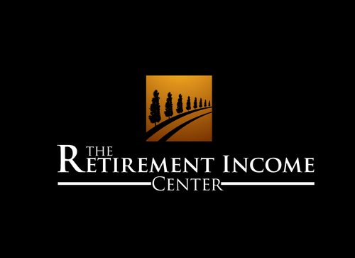
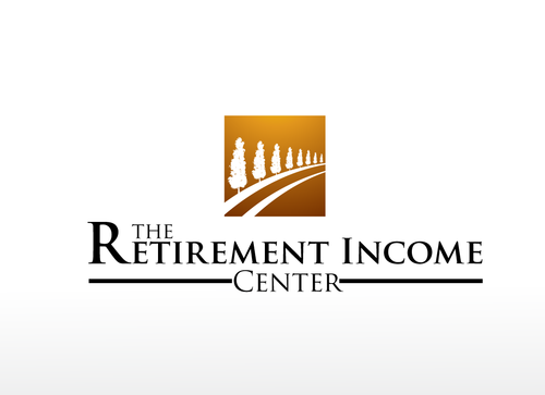
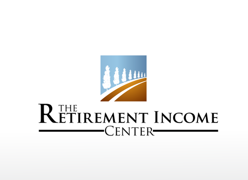
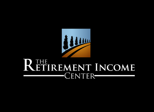
SALES / SUPPORT : +1-877-525-5646   |  


The RIC

The Retirement Income Center

Contest Holder TimPorter ?

Last Logged in : 4792days53mins ago

Concepts Submitted

120

Guaranteed Prize
300
Winner(s)

1

A Logo, Monogram, or Icon veildAll design entries can be viewed by other designers.
tick_gray

Live Project

tick_gray

Deciding

tick_blue

Project Finalized


Project: The RIC
Contest Launched: Feb 17, 2011
Selected: 1 winning design from 120 concepts
Winning Design by: lakshmiks
Close Date: Mar 02, 2011


The RIC - Financial Services


Awarded as a winner
Project Report    

Sort by:


#56

#120

#117

#114

#113

#112

#111

#110

#109

#108

#107

#106

#105

#104

#103

#101

#100

#99

#98

#94

#93

#90

#89

#88


Creative Brief


The RIC

The Retirement Income Center

Put more interest in your retirement

Yes

Registered Investment Advisory Firm in Portland, OR. The name says it all, we specialize in conservative income investing for retired people. We turn nest eggs into paychecks (but we don't want the logo to show that please).

Financial Services

Logo Type
Logo Type

Abstract Mark
Abstract Mark

Web 2.0
Web 2.0


Cutting-Edge
Clean/Simple
Sophisticated
Modern
Outdoors/Natural
Traditional
Serious
Masculine

We're pretty open but maybe earth tones to soften us up a little...gray and brown or orange?

not sure

We like clever and negative space stuff. Might be hard with our long name though: http://www.toxel.com/design/2010/06/09/24-cool-logos-with-hidden-symbols/

Related Contests


Logo for a wealth management firm
$350
Prize Money
295
Concepts
Logo for Wealth Management Firm
$200
Prize Money
66
Concepts
Logo design for a stock investing product called Options Trader Elite
$200
Prize Money
84
Concepts
health insurance website for business professionals
$200
Prize Money
138
Concepts

Discussion


Comments

  • March 01, 2011 1:21 PM
    TimPorter TimPorter
      Project Holder
    On # 89 can you put our business abbreviation (RIC) in black capitals (matching the font with our spelled out name) on the lower right of the graphic where the sailboat was? Or, can you shape the initials to look like an abstract of a sailboat? Thanks for your work.

    Like Icon 0   DislikeIcon 0
  • February 27, 2011 4:39 PM
    TimPorter TimPorter
      Project Holder
    #89 is close...can we tweak the graphic....maybe make the art a little more centered or add a sailboat on the lower right to balance the fir trees? Maybe modify the mountains behind to be a little more prominent. Thanks again.

    Like Icon 0   DislikeIcon 0
  • February 27, 2011 8:26 AM
    SiteAdmin SiteAdmin
     
    Draft #96 and variation by bhanu are derivative of #93 and variation by jaggu, therefore have been taken down.

    Like Icon 0   DislikeIcon 0
  • February 25, 2011 10:27 PM
    TimPorter TimPorter
      Project Holder
    We liked the sailboat idea but so far it's just not working for us. How about keeping the wording format (font and position) and just changing the graphic to be a small group of silhouetted fir trees mirror imaged in water similar to this: www.clipartof.com/details/clipart/27905.html. If we can show these silhouetted trees on islands we'd love it. The islands here in the Northwest have staggered hilltop lines (like the varied tops of fir trees) rather than the smooth straight lines of a volcanic peak. Please forgive our obsession with detail...we'd like to get this right before we build a lot of advertising around the logo.

    Like Icon 0   DislikeIcon 0
  • February 24, 2011 11:11 AM
    TimPorter TimPorter
      Project Holder
    We're happy with the wording style, font and positioning. We'd like to tweak the graphic. An ideal Retirement in the Northwest region includes sailing in our San Juan Islands northwest of Seattle. How about changing the tree to Douglas Firs and put a sailboat in there. Maybe it looks like the sailboat is in front of an island with firs on the hills. Google Orcas Island Chamber of Commerce to give you an idea of the scenery in this area. Thanks...we like your work.

    Like Icon 0   DislikeIcon 0
  • February 23, 2011 6:25 PM
    TimPorter TimPorter
      Project Holder
    Nice work. Our only problem is that "Retirement" alone is not our focus. Our focus is on "Retirement Income." Therefore we'd like to tweek the design to make each of these two words be seen with equal status...equal font size no matter how the words have to be positioned. Thanks so much for your work.

    Like Icon 0   DislikeIcon 0
  • February 23, 2011 2:21 PM
    TimPorter TimPorter
      Project Holder
    Lakshmiks - It looks like 19 and 21 are close, but we need to increase the size of Income and keep The and Center the same size. Feel free to move the graphic if that helps.

    Like Icon 0   DislikeIcon 0
  • February 23, 2011 10:09 AM
    Risky12fahmi Risky12fahmi
     
    thank you for your response...

    Like Icon 0   DislikeIcon 0
  • February 22, 2011 11:54 PM
    SiteAdmin SiteAdmin
     
    Source: Mycroburst Winning Deign: http://www.mycroburst.com/drafts/display/contest/19307/draft/177891 Drafts #22, #23 and #24 by lakshmiks have been taken down.

    Like Icon 0   DislikeIcon 0
  • February 22, 2011 1:15 AM
    TimPorter TimPorter
      Project Holder
    Lakshmiks - 19 - 24 are great. One question is how could we incorporate the idea of Harvesting? New possible byline could be "Helping you harvest the fruits of your labor". Maybe someone in the graphic picking fruit from the tree? Or something else? Also, we like the gray in the graphic with the rows or road, but we like the simplicity of the graphic w/out the rows. We also would like to see the sun out of the tree and maybe a touch larger in 19 - 22. Thanks for posting the black background too. Thanks!

    Like Icon 0   DislikeIcon 0
  • February 21, 2011 11:17 PM
    TimPorter TimPorter
      Project Holder
    Risky - I like the two drafts, but in #15 could I see the text sharpened, changed to all caps and could we reduce the size of "the" and increase the size of "income"? Also, in #15 can you use the text color from #17? Thanks!

    Like Icon 0   DislikeIcon 0
  • February 21, 2011 11:08 PM
    TimPorter TimPorter
      Project Holder
    Adriel - Could I see what #16 would look like with green changed to gray and the other color a softer, less red, orange? Also, with the graphic, I like where your're going with that, but could we see the plant shrunk a little and the graphic either incorporated into the text or the shape of it changed from the diamond to something different? Thanks!

    Like Icon 0   DislikeIcon 0
  • February 21, 2011 2:50 PM
    TimPorter TimPorter
      Project Holder
    If you do a graphic here are a few ideas: -Portray us collaborating with our clients -Show growth or fruit from our labor (in terms of a plant or tree) -Try to incorporate a sunset (sunset of life)

    Like Icon 0   DislikeIcon 0
  • February 21, 2011 12:42 PM
    JaxDesign JaxDesign
     
    Thank you, sir. Don't mind the elimination...just wanted to know what you did or in this case, did not like about it. Thank you again.

    Like Icon 0   DislikeIcon 0
  • February 21, 2011 12:27 PM
    TimPorter TimPorter
      Project Holder
    Jax - I like fact that retirement income is bolded but we're looking for something that has an overall cleaner look. Also I think it would help if the graphic was more abstract. The % is not what we're after.

    Like Icon 0   DislikeIcon 0
  • February 21, 2011 12:14 AM
    JaxDesign JaxDesign
     
    Feedback and opportunity for improvement is always appreciated.

    Like Icon 0   DislikeIcon 0
  • February 20, 2011 11:59 PM
    TimPorter TimPorter
      Project Holder
    Lakshmik - I like draft #3 but would like to see a different graphic and could I see it inversed too (black background)?

    Like Icon 0   DislikeIcon 0