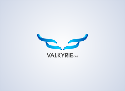
SALES / SUPPORT : +1-877-525-5646   |  


VALKYRIE logo

VALKYRIE.ORG

Contest Holder dmuhr ?

Last Logged in : 4584days11hrs ago

Concepts Submitted

99

Guaranteed Prize
200
Winner(s)

1

A Logo, Monogram, or Icon veildAll design entries can be viewed by other designers.
tick_gray

Live Project

tick_gray

Deciding

tick_blue

Project Finalized


Project: VALKYRIE logo
Contest Launched: Aug 01, 2011
Selected: 1 winning design from 99 concepts
Winning Design by: mnorth
Close Date: Aug 08, 2011


VALKYRIE logo - Information Technology


Awarded as a winner
Project Report    

Sort by:


#80

#79

#54

#53

#46

#99

#98

#97

#95


Creative Brief


VALKYRIE logo

VALKYRIE.ORG

Yes

This is for a technology/hobby/personal purpose.

Information Technology

Symbolic
Symbolic

Abstract Mark
Abstract Mark

Illustrative
Illustrative

Character
Character

Web 2.0
Web 2.0


Cutting-Edge
Unique/Creative
Modern
High Tech

Green, blues, metalic

3

Related Contests


Logo for software developement company
$250
Prize Money
124
Concepts
IT Company Logo
$200
Prize Money
173
Concepts
Program logo - ITSAS
$225
Prize Money
117
Concepts
Logo for exonik compagny
$300
Prize Money
119
Concepts

Discussion


Comments

  • August 05, 2011 10:55 PM
    dmuhr dmuhr
      Project Holder
    I really like the way #15, 19, 22, 27 and 28 incorporated a special design/logo to replace the letter "V" in "Valkyrie". I also like the contrast options of #16 and #17 to see what design would like like with a solid color background and a white background. The same goes for seeing the logo in full color and then a 1 to 3 color example, like #15, 27 and 28. Please do not put "Information Technology" in the design. For the logo itself, I would prefer it without ".ORG". However, if I go the route of business cards, letterhead, etc, I will probably like ".ORG" on it.

    Like Icon 0   DislikeIcon 0
  • August 05, 2011 11:54 AM
    dmuhr dmuhr
      Project Holder
    I like 2, 5, 7, 8 and 10/11 and how a logo/design is added or incorporated into Valkyrie and not just the text VALKYRIE.ORG. While I like #2, #5 and #7, I find them a little softer and not as eye catching or as modern as #8 and #10/11.

    Like Icon 0   DislikeIcon 0
  • August 04, 2011 10:25 AM
    dmuhr dmuhr
      Project Holder
    I am looking for something with more of a design in the logo besides just the name of the domain name.

    Like Icon 0   DislikeIcon 0