Valu + Pawn 2
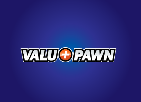
Valu + Pawn
|
Contest Holder
valupluspawn
?
Last Logged in : 4120days11hrs ago |
Concepts Submitted
769 |
Guaranteed Prize
350 |
Winner(s) | A Logo, Monogram, or Icon |
|
Live Project
Deciding
Project Finalized


Creative Brief
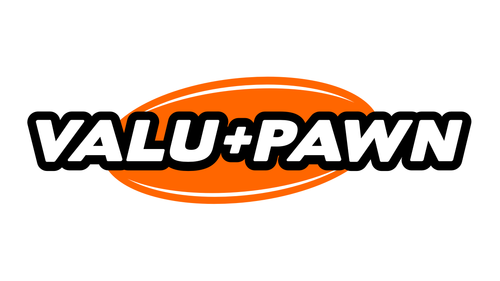
Valu + Pawn 2
Valu + Pawn
No
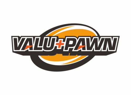
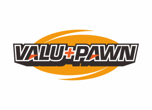
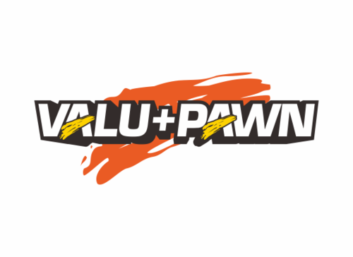
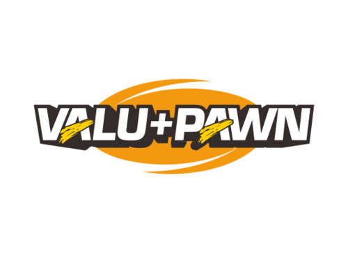
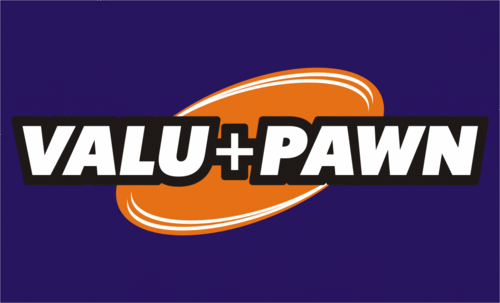
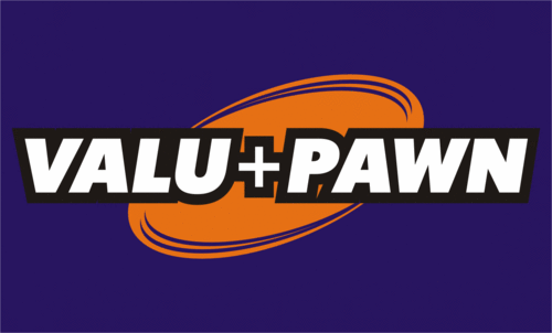
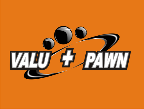
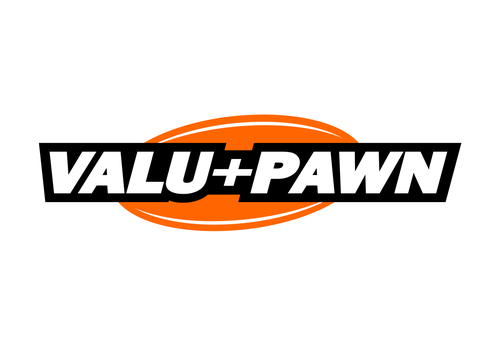
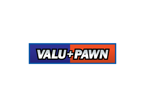
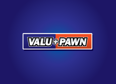
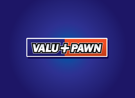
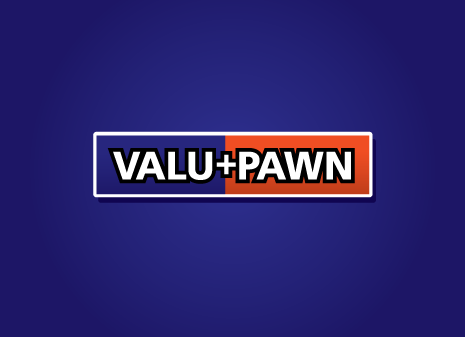
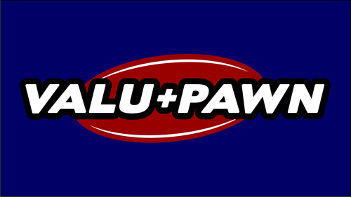
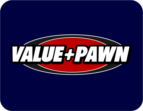
We're a pawnshop that has multiple locations. Sell used merchandise including jewelry and electronics.
Retailers
Logo Type
![]()
Unique/Creative
Clean/Simple
Modern
Masculine
White, black, blue, red
3
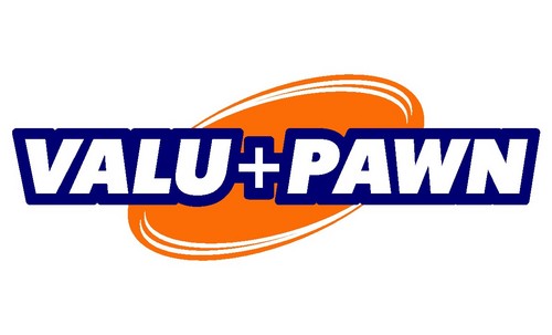
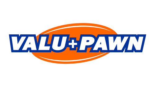
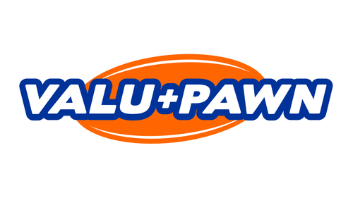
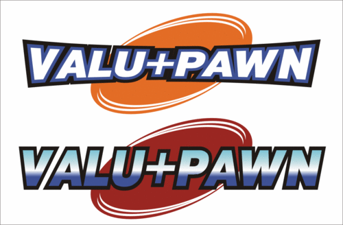
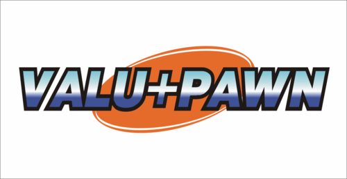
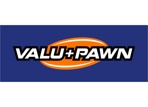
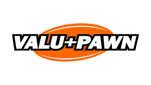
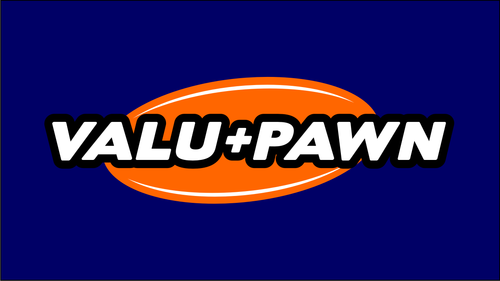
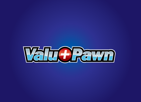
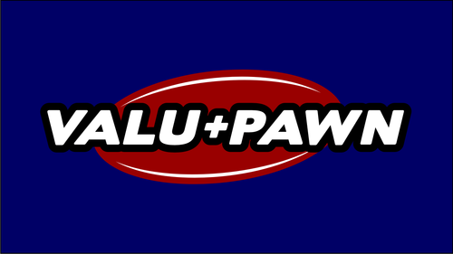
We ran a contest that ended Jan 12th won by causkey. Liked the design but had trouble adapting it to signage due to the inconsistency of lettering. Like someone to cleanup this design so we can use it or open to another design
Related Contests