SALES / SUPPORT : +1-877-525-5646   |  


Vandehey Investment Partners Website

Website Design

Contest Holder toddvandehey ?

Last Logged in : 4658days19hrs ago

Concepts Submitted

184

Guaranteed Prize
450
Winner(s)

1

Web Design veildAll design entries can be viewed by other designers.
tick_gray

Live Project

tick_gray

Deciding

tick_blue

Project Finalized


Project: Vandehey Investment Partners Webs ...
Contest Launched: Apr 10, 2011
Selected: 1 winning design from 184 concepts
Winning Design by: macroads
Close Date: Apr 25, 2011


Vandehey Investment Partners Website - Financial Services


Awarded as a winner
Project Report    

Sort by:


#164

#159

#156

#148

#147

#146

#145

#133

#131

#129

#125

#124

#123

#118

#117

#116

#97

#96

#94

#92

#60

#51

#50

#48

#34

#167

#161

#152

#151

#144


Creative Brief


Vandehey Investment Partners Website

Website Design

Financial Services

viphedgefund.com

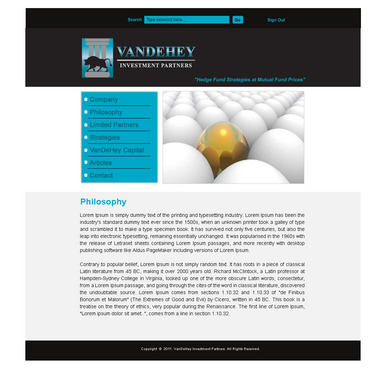
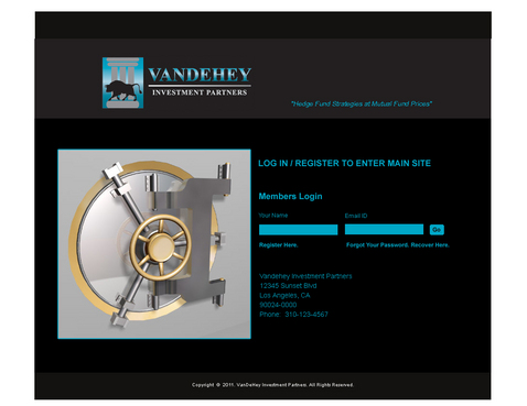
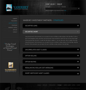
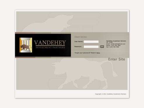
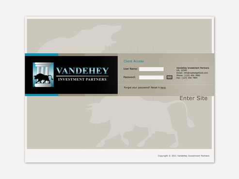
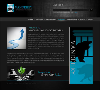
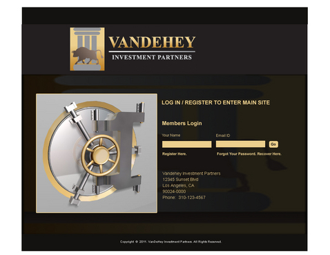
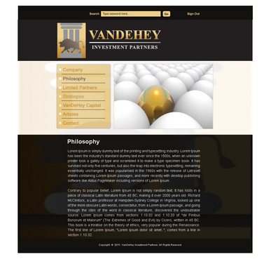
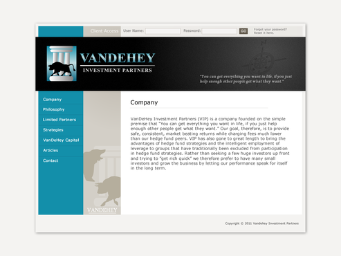
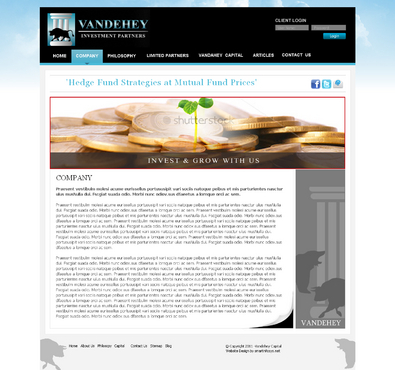
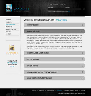
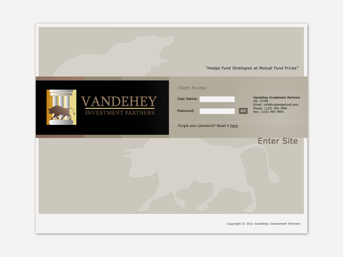
The company is an investment fund. The site must inspire trust and confidence yet have style. It must be VERY professional.

I like things simple and elegant. Rich and classy in appearance. I don't care too much about colors, but it's probably easiest to use the colors already used in my logos.

Clean/Simple

Professional

Content Driven

Conservative

Sophisticated

Corporate

Modern

Elegant

Traditional

Masculine

Black

Blue

left side

https://www.jpmorganfunds.com/cm/Satellite?pagename=jpmfVanityWrapper&UserFriendlyURL=home

http://www.ozcap.com/

http://www2.blackrock.com/US/individual-investors

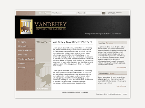
The site doesn't need to be terribly complex nor work as a stand-alone source for sales. It is mainly a source for further information for people I have talked to about the fund personally. It should also be a place for current clients to check on performance of their portfolios. Of the websites listed above: I like JP Morgan's appearance I like Och-Ziff's layout and simplicity blackrock I like in general I also made a mock up of how i saw the site, which I'll upload once the contest is up and running.

Related Contests


Design a killer mainpage for a crowdsourced stock investment website
$350
Prize Money
57
Concepts
one web page for a high end wealth management company. the name of the company is Family Tree Wealth
$350
Prize Money
25
Concepts
New corporate website, particularly including a new energy sector.
$450
Prize Money
179
Concepts
Web design for a brogerage co.
$351
Prize Money
160
Concepts

Discussion


Comments

  • April 23, 2011 4:40 PM
    toddvandehey toddvandehey
      Project Holder
    @smartinfo I like the designs, but there are TOO many bulls and bears on each page... it's like hitting someone in the face with the logo. that's a main reason why i like the lighter gray version on the opening the world with a key logo because it makes the bull nad bear less "in your face." the bull and bear in front of the windows works better than the other background by far. the money and plant is interesting, but can we make it more plant and less money?

    Like Icon 0   DislikeIcon 0
  • April 23, 2011 4:07 PM
    toddvandehey toddvandehey
      Project Holder
    @ artos your designs for the main pages are simple, direct and effective. The login page needs work though. for the main pages... make the slogan "hedge fund strategies at mutual fund prices" more visible for the login page -cut the column out of the background silhouette. it is unnecessary. -the bull and bear in background might work better against a darker background... I find that negative images do in general. -on the border around the login box, can we extend the blue on the outside of the black area so that it goes the entire length of the design? Or at least until the edge of the black part?

    Like Icon 0   DislikeIcon 0
  • April 23, 2011 3:23 PM
    niftyits niftyits
     
    Dear PH, I do believe you are not interested in other designer's work this is unfair but i'll have to live with that, will take care in future job. Thanks

    Like Icon 0   DislikeIcon 0
  • April 23, 2011 7:00 AM
    niftyits niftyits
     
    Dear PH, Thanks for your valuable feedback. If you could please suggest me the areas where i can improve that would be great and help me to come closer to your actual requirement. Regards Abhieet

    Like Icon 0   DislikeIcon 0
  • April 23, 2011 5:58 AM
    toddvandehey toddvandehey
      Project Holder
    @ macroads Overall, though it loses a little bit of the style with the change in color, I think it's more readable by far, and therefore probably more effective. - the login page can probably remain all black. there isn't a lot of content there to be concerned about. - as for the other pages, they look much more readable, but they look like they were designed in black then converted to white... some things just don't make sense the white. For example, the shadow along the border between the black and white parts at the top of the page, should either go all the way across, or not be there at all I think. The way it is seems unnatural. -Similar to above, can we make some kind of border around the VanDeHey Capital logo so that it stands out slightly more than it does white on white? I know this is kind of vague, but pretend you are designing it from scratch in white, rather than converting it to black. Things you wouldn't do in that case should be eliminated. I'm also very curious to see the homepage in white still. Thanks for the good work. Keep it up!

    Like Icon 0   DislikeIcon 0
  • April 22, 2011 2:21 AM
    toddvandehey toddvandehey
      Project Holder
    I have re-opened the project. The three designers whose web pages I really like are: macroads willtech and smartinfo thank you to the rest of you for your participation, but I would like to focus my efforts on giving feedback to these 3 designers. Here is what I like/dislike about each of your respective designs: Feel free to read each others' comments for inspiration, however do stay within the ethical constraints of the contest. smartinfo: Your designs have a lot of promise and potential, but there are a lot of things to iron out yet, which is to be expected since you didn't enter the contest until late. Key changes I'd like to see: 1. The slogan "providing safe, consistent market beating returns" is an illegal thing to advertise on an investment company website. slogans to use are "hedge fund strategies at mutual fund prices" and "invest and grow with us" 2. Please get rid of the blue around the outside of the page. It's unnecessary and honestly too much blue. I do like the silhouetted bull and bear in the blue on the content pages, but perhaps you could silhouette them INTO the page instead of out of it. 3. On the bottom right of the home page, where it looks like a page turning, can we try the part under the upturned page in black rather than blue? 4. Can we try the bull and bear logo on the right side of the page in a light gray rather than blue? On both the login page and the home page, as it is, it sort of blends into the blue of the design above it I think. 5. On the informational page, can you look for other bulls. That one is pretty good, and would suffice, but we might be able to do better. 6. Your pages are the most clean and functional of the three designers' pages, but can you add just a little bit more in terms of stylish elements? As an example, I really like the silhouettes and watermarks in macroads' designs. What I like about your designs: 1. The bull and bear with the building windows behind them is GREAT. 2. The key unlocking the world is a GREAT concept. 3. The pages are clean and functional. 4. I like that you included ways to add via facebook/email/twitter. That is a REALLY good idea. Willtech: You have some of the most compelling and interesting graphics, and I really like your creative concepts. I think there is a TON of potential here, but we need to do some things to bring it out. Some changes I'd like to see: 1. Add some stylistic elements and TEXTURES. The site just looks a little to boxy and unsophisticated. Stuff like silhouettes and watermarks would add a lot in my opinion. The column silhouette you added almost works, but it's buried behind the logo at the top of the page, and doesn't appear at the bottom of the page at all. The text watermark is a decent idea, but isn't really working in its current form. 2. The white area on either side of the picture and navigation bar has always kind of bothered me in this design. Can we either add a border around that space or make the image extend over a wider area or something? Things I like about your site: 1. The silhouette man in front of the world is absolutely FANTASTIC. Maybe my favorite of all the images in this contest. 2. The egg concept is excellent as well and quite compelling. Though I wouldn't mind seeing a slightly different version of the gold egg itself just for comparison. 3. The design is clean, simple and readable. macroads: in many ways your design is my favorite in terms of artistic appeal. It is stylish and I LOVE looking at it. But this website must also be functional. So we need to make sure it is readable, and the white letters on black are a problem in this regard. A lot of people I've shown it too have said the same. That the like the look, but for an informational page, black just doesn't work. So, things to work on/try out: 1. Can you make the middle section with the text white with black lettering, rather than black with white? Just the middle section. it is ok to leave the top and bottom as is I think. 2. Can we make the bull and bear logo on the lower right side of the homepage a bit more rigidly aligned with the rest of the page? It seems to just be floating, which give a bit of an overly artistic unreliable feel for this type of website. 3. Can we make sure that the bull logo and the bear logo on the left side of the screen are aligned horizontally? Things I like about it: 1. I love the subtle details. You've done a really good job with textures and subtle designs that give it class, but don't draw one's attention too much. 2. The layout is professional and stylish. 3. I like the graphics. Both the hands with the plant, and the arrow. I also like how you blended the bear into the rest of the page on the bull/bear logo on the homepage.

    Like Icon 0   DislikeIcon 0
  • April 18, 2011 11:41 PM
    macroads macroads
     
    @ PH Yes. Of course. I’ll upload revised samples shortly. Thanks

    Like Icon 0   DislikeIcon 0
  • April 18, 2011 4:42 PM
    toddvandehey toddvandehey
      Project Holder
    To everyone: Please include somewhere on the page the phrase "Hedge Fund Strategies at Mutual Fund Prices"

    Like Icon 0   DislikeIcon 0
  • April 18, 2011 12:16 PM
    toddvandehey toddvandehey
      Project Holder
    @macroads I like your pages, but I find them slightly difficult to read. Can we make the text bigger, or can we maybe try the page as a lighter color instead of black?

    Like Icon 0   DislikeIcon 0
  • April 18, 2011 7:31 AM
    toddvandehey toddvandehey
      Project Holder
    To EVERYONE: Please DO NOT Include "Latest News" or "News" on any of the web pages. Thank you.

    Like Icon 0   DislikeIcon 0
  • April 17, 2011 9:56 PM
    toddvandehey toddvandehey
      Project Holder
    @artos on the login page, can we make the box around the black area more consistent? is it possible to add a third related design so that i'll have -login page -home page -template for other pages the home page should be a little more artistic/complex than the template page love the work so far. thanks

    Like Icon 0   DislikeIcon 0
  • April 17, 2011 9:51 PM
    toddvandehey toddvandehey
      Project Holder
    @smartinfo #70 is by far my favorite of your designs. It is clear, simple, and direct. More in this style please. The pages I need are 1. Login 2. Homepage 3. Template for other pages and OPTIONAL 4. Simple page for strategies page or other pages with lots of text on them thanks

    Like Icon 0   DislikeIcon 0
  • April 17, 2011 9:39 PM
    toddvandehey toddvandehey
      Project Holder
    @megamax.. -I like the golden egg design in general, though it might be a bit much on EVERY page. -I like black gold and silver as colors, along with white -Ideally the writing would be on a lighter colored background so it's easy to read -I like the marble background in #71 -please use the "Vandehey Investment Partners" bull logo instead of the "Vandehey Capital" pegasus.

    Like Icon 0   DislikeIcon 0
  • April 17, 2011 9:33 PM
    toddvandehey toddvandehey
      Project Holder
    @macroads -I like the additional bull and bear symbol on the bottom left of pages. -78 is a better template page. -Can you try a picture of a bank vault instead of the handshake for the login page? Some people seem to think the handshake is a bit cheezy.

    Like Icon 0   DislikeIcon 0
  • April 16, 2011 4:56 PM
    toddvandehey toddvandehey
      Project Holder
    hey guys, sorry i haven't been around to comment. i promise i'll get back to u with feedback, and i'm going to extend the contest as i really like a lot of the recent designs. keep up the good work and i promise i'll give feedback soon.

    Like Icon 0   DislikeIcon 0
  • April 14, 2011 3:26 PM
    toddvandehey toddvandehey
      Project Holder
    also @macroads... can you change the bull logo to the same one the other's are using... the one that DOES NOT have the black line underneath. Thanks.

    Like Icon 0   DislikeIcon 0
  • April 14, 2011 3:25 PM
    toddvandehey toddvandehey
      Project Holder
    not a lot of time to comment at the moment, so i'll add more detail later, but briefly. @macroads I really like #55, #57 is just simple clean and functional which is what he strategy page needs to be. #56 is a good concept but it's a little too literal. For example I like the hands in black and white like in #55 better than in color on #56 but that's not the whole thing. Not sure what to suggest specifically, but hopefully by the time I return I'll have some ideas. @willtech I like that vault much more than the earlier locks and keys. I still don't like the logo in the background behind the whole page to have gold in it. It should be MUCH MORE SUBTLE. Hopefully I'll have further comments for you as well when I return and have had some time to think about it. @MeGaMax... The page looks strong secure and elegant, as a financial services firm should project, however a building doesn't really make sense as a symbol for my company since as a small start up, I don't own one, nor do I even really live near any. Could you use a different symbol please.

    Like Icon 0   DislikeIcon 0
  • April 14, 2011 7:13 AM
    Willtech Willtech
     
    #51 Login page with a different image. Do let me know your feedback. Willtech

    Like Icon 0   DislikeIcon 0
  • April 14, 2011 6:14 AM
    toddvandehey toddvandehey
      Project Holder
    @ willtech I actually kind of like that golden egg theme. as for the lock, I was thinking something more like these: http://www.google.com/search?q=picture+bank+vault&hl=en&prmd=ivns&tbm=isch&tbo=u&source=univ&sa=X&ei=GtWmTefBHYPCsAPpp-T5DA&ved=0CCoQsAQ&biw=1366&bih=575

    Like Icon 0   DislikeIcon 0
  • April 14, 2011 4:14 AM
    Willtech Willtech
     
    #49 Login Page with a different image resembling the page. #50 Template Page with a different image. Do let me know your feedback. Willtech

    Like Icon 0   DislikeIcon 0
  • April 14, 2011 2:37 AM
    toddvandehey toddvandehey
      Project Holder
    @ artos. I like the subtle bull and bear background in #46, but can we darken the whole background area while still keeping those silhouettes relatively subtle? Also, can you do something along the lines of #10 with a little something extra. Kind of like what you were doing in #2 and #3, but with a different picture instead of a building? Thank you for your great work and effort so far

    Like Icon 0   DislikeIcon 0
  • April 14, 2011 2:31 AM
    toddvandehey toddvandehey
      Project Holder
    @ willtech. I like the lock and key concept in #39, but that lock and key is way too feminine. Can we make it more masculine, or better yet a safe or bank vault? The bull and bear silhouette is a concept that could work for the template page, but THAT bull and bear look a little too "modern art" Could you make them more normal looking and less artistic. Also you don't necessarily have to have a symbolic picture on every page... you could do something a a bit less conspicuous, something that blends in a bit more. Or maybe even try the template page with NO picture at all? Thanks for your good work so far.

    Like Icon 0   DislikeIcon 0
  • April 13, 2011 6:10 AM
    artos artos
     
    I will work on the login (front) page to improve it. Thanks

    Like Icon 0   DislikeIcon 0
  • April 13, 2011 5:57 AM
    Willtech Willtech
     
    Yes, #34 is same as #18 with different logo. #39 login page with different image resembling the login. #40 Strategies Template page with a different image. #41 Philosophy Template page with same image as #40 but demo text content just to see if the image fits in all the template pages so that you do not have to change the image if you add more pages. Do let me know your feedback. Willtech

    Like Icon 0   DislikeIcon 0