Web Design Company - Zero Gravity
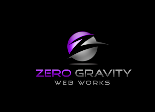
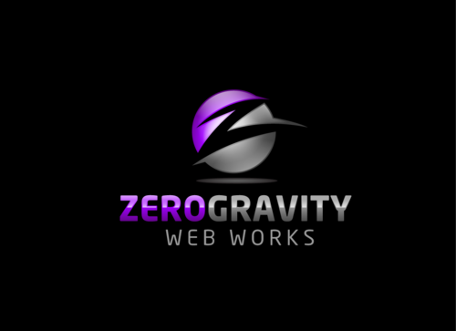
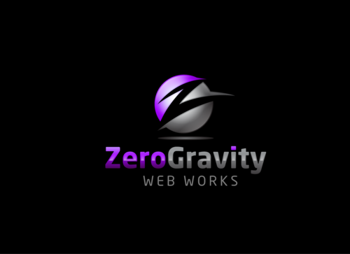
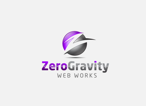
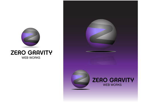
Zero Gravity Web Works
|
Contest Holder
ZeroGrav
?
Last Logged in : 5620days12hrs ago |
Concepts Submitted
89 |
Guaranteed Prize
203 |
Winner(s) | A Logo, Monogram, or Icon |
|
Live Project
Deciding
Project Finalized


Creative Brief
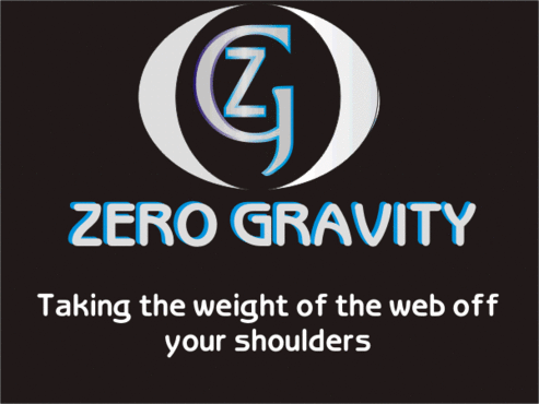
Web Design Company - Zero Gravity
Zero Gravity Web Works
Taking the weight of the web off your shoulders
No
We are a new company that offers web design and hosting
Internet Services
Logo Type
![]()
Symbolic
![]()
Abstract Mark
![]()
Cutting-Edge
Clean/Simple
Sophisticated
Modern
High Tech
Serious
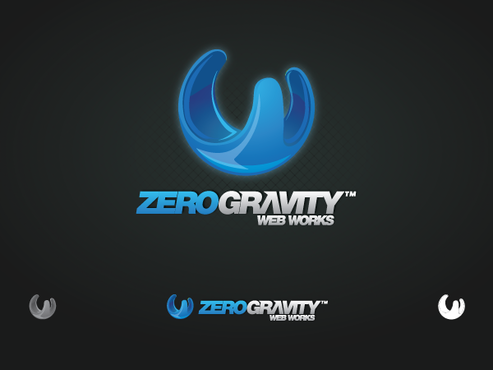
We have thought of having a black background. Colors we like are silver, white, purple, blue but are open to other colors. We would like to see it with a white background as well. We are leaning towards 2 or 3 colors. No brown, pink or green.
not sure
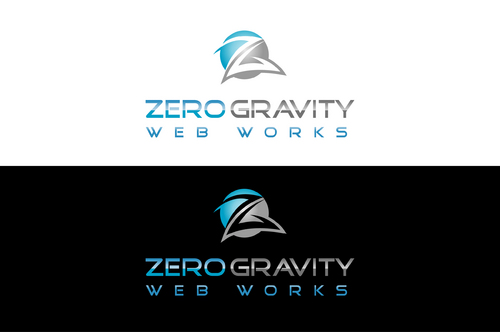
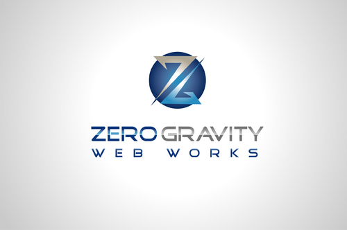
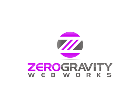
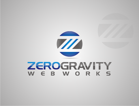
We would like a text/symbol combination with the symbol being stand-alone. We would like "Zero Gravity" to be prominent with "Web Works" smaller. While we did not request initials as part of our logo, we are open to ZG being a part of the symbol if it works.
Related Contests


