Best Cleaning Logos And Refreshing Color Palettes To Pick For Your Startup Branding

Featured Image: iStock/Bakhauaddin-bek Sopybekov
Repeatedly we emphasize the importance of having a professional logo design, and well we will do so today and in the future as well. The reason for this is that a logo is an eminent part of any startup branding, be it a cleaning or a sanitation business. This said, how you make one using a befitting and refreshing color palette is in fact an important thing to think about.
Best Cleaning Logos Collection
There are thousands of cleaning service logos online, but only a few attract the eye. Here are some cleaning logo designs we feel stand out from the rest or have design elements and design principles that contribute to making a winning logo design.
Let’s explore right away.
The unique thing about this cleaner logo is that it makes use of negative space for the text, leaf, and bubbles. This technique helps to break the monotony of colors. The main oval shape acting as a frame that nicely wraps the elements and the bubbles popping out of the frame is an interesting little technique.

This is a simple yet impactful duct cleaning business logo because of the warm color gradient of red with a hint of orange. The grey breaks the heat and represents the word ‘air’.

A feminine and cute design and color choice for a cleaning services logo. The combination of light and dark blue on the word ‘Jam’ resembles a glass-like texture and shine.
This commercial cleaning logo has a mascot and adding characters to your design livens it up plus gives it a humanizing appeal. Also, the use of cool colors like blue and green invites customers towards it.
Animating inanimate objects such as a dustbin in this case makes a logo entertaining, cartoony, and friendly. A dustbin with a smiley face sure looks welcoming. This cleaning and sanitizing logo is cheerful and sweet.

Sometimes you can use an icon that is unrelated to your business only to add humor or make people wonder why you chose that shape or character. This simplified animal logo adds a touch of humor to the design and if we focus on the teeth, they stand out and perhaps that’s the message here.
Bright colors add joyfulness to this cleaning brand logo. The clever use of combining two shapes to symbolize a house and a spraying bottle adds an interesting angle. Even if the designer removes the word ‘clean’ from the logo, the icon itself is self-explanatory. And elements like the shining stars give a sense of cleanliness and tapered lines represent the action of spraying.
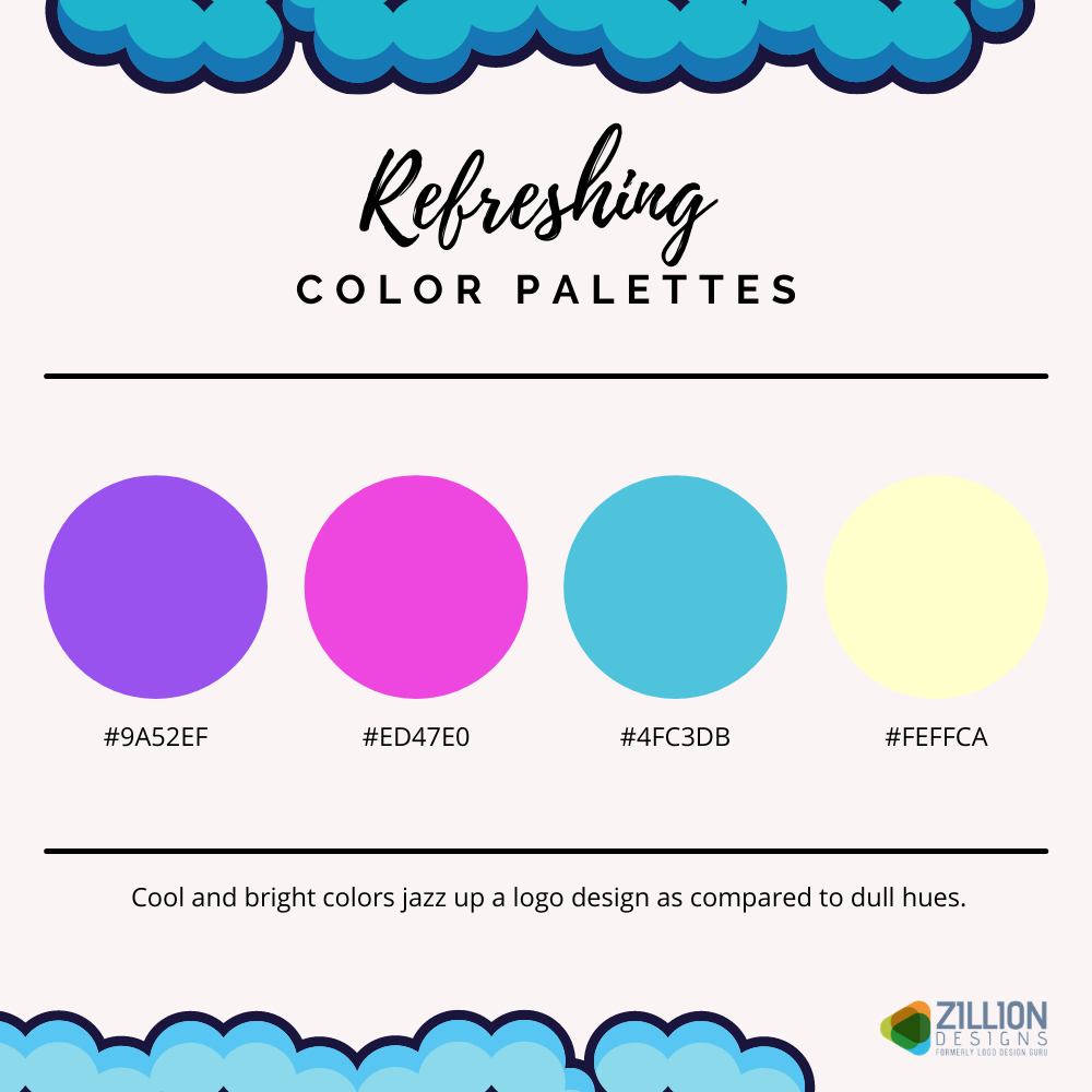
This cleaning business logo has a retro appearance because of the background shape, the color palette, and the design of the typography. The red color pops out the lady, her broom, and the text.

The shades of blue on this cleaning product logo and the green gradient give the overall design a fresh lemony look. This logo design has outlining and shadow, which make it almost pop out of the surface.
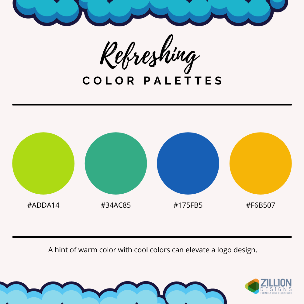
The trick to making a dishwashing or detergent cleaning logo design is to use design elements to emphasize the name of the brand or product. In this example, one of the professional designers has use the art of double outlining, shading, and shape overlapping to create an eye-catching composition.

To be honest, you don’t have to necessarily use symbols or objects with literal meanings for industry-related words. You can use shapes that symbolize something else like nature in this case rather than “cleaning services”. This residential cleaning logo is abstract and cleanly made.

Swooshes and stars are considered clichés but as long as they work and are used cleverly then it is alright. This household cleaning product logo is simple yet it gives an idea of what the business is about: cleaning. The elements in blue symbolize cleanliness, freshness, and shine.
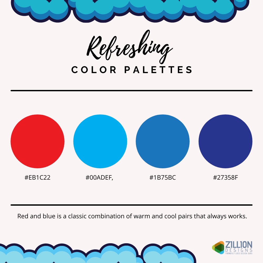
Most of these best cleaning logos have color palettes with blues, greens, and yellows. To understand why a particular industry uses the same colors over and over again requires people to understand the meanings of colors.


