10 Typography Tools In Illustrator To Make Mind-Blowing Wordmarks
Featured Image: Freepik
Wordmarks or text-based logos are a form of logo design where a feature of the logo – typography – is amplified and given center stage. Unlike logos that use pictures, symbols, or icons as their centerpieces, wordmarks only have a typeface to carry all the weight.
A logo has to communicate your brand’s identity in the first glance. What the brand is, what industry it belongs to, what’s its unique personality. Where pictorial logos have more features to convey all this information – a logotype only has words.
But we all know how potent words can be. Add in some creative styling, spacing, and lettering, and you’ve got yourself a wordmark logo that can be as influential as you want it to be. Some of the most popular logos in the world are wordmark logos, in fact.
Image Source: The Verge
Image Source: Variety
Image Source: Daniel Beadle
Image Source: Wikimedia
With wordmark logos, you’ve got an added advantage too. With your business name as your brand logo, you won’t have to work as hard to build brand recognition. Nifty, right?
So let’s discuss some awesome typography tools that are at every designer’s disposal, thanks to Adobe Illustrator. With these helpful tools you can add all the character, personality, and emotion you want in your wordmarks.
Note: Illustrator is a magnificent software and contains a number of typography tricks in its various nooks and corners. We are – specifically – only going to talk about those that’ll be most used and most useful when creating wordmark logos.
1. Type On A Path Tool
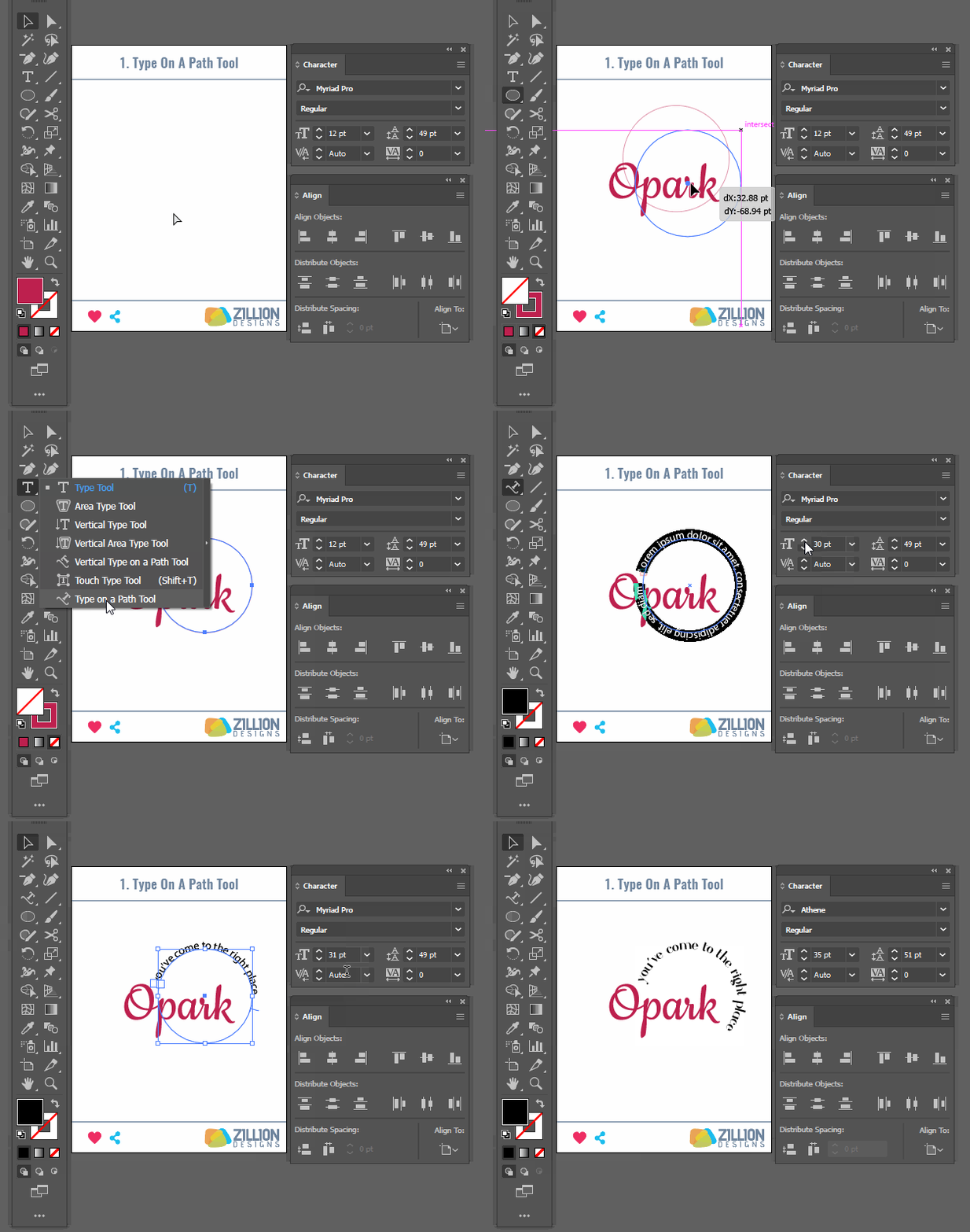
As we try to give personality to a logo through its wordmark, this tool comes in handy when you don’t want the letters to be placed flatly on a surface. The Type on a Path tool does exactly what it says: it lets you type words (company name in the case of a logo) along a path you’ve chosen.
You can create this path using any of the shapes from the Illustrator’s gallery or draw a custom path according to the need of the design. This tool helps you create wordmarks that are contained in or outside a shape, curved over a semi-circle, or most popularly, sitting on a shield. Badge logos, shield logos, emblem logos, and insignia logos mostly use this type of text placement style.
Steps To Access The Tool:
- In the Illustrator program, open or create the object or shape/path on which you want to place the text.
- Click on Type on the control panel (toolbar on top). A menu will appear.
- Click on Type on a Path option to access the tool.
- If you click on a tiny arrow in front of the tool, you can see different options (Gravity, 3D ribbon etc.) available under Type on Path tool for added effects.
- You can also find it on the left-side toolbar under T of Type options.
2. The Vertical Type Tool
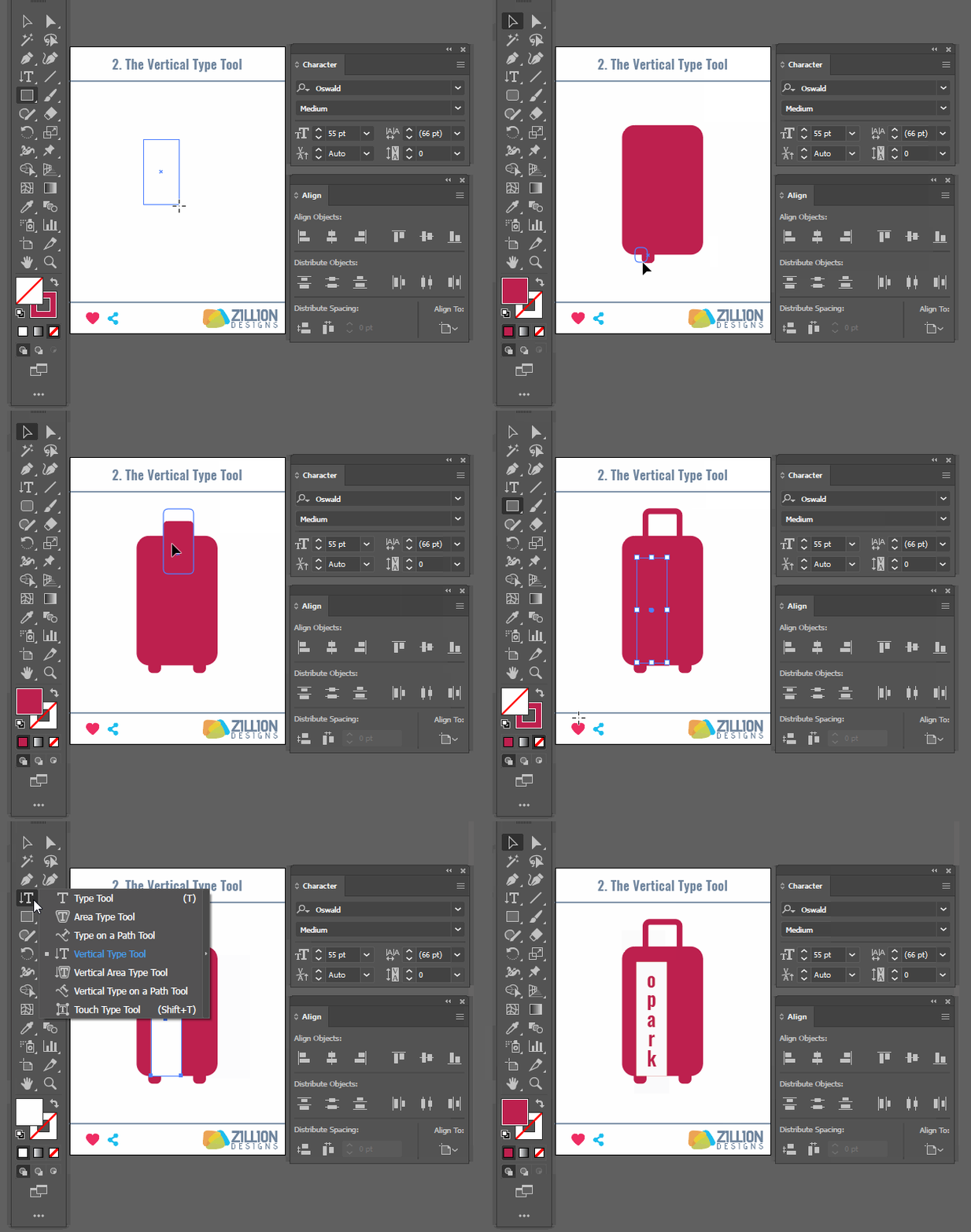
The Vertical Type Tool allows you to add words and letters in a text along the Y-axis. Instead of the letters following each other, they are stacked on top of each other, creating the vertical format.
Vertical Type tool is a great instrument to add contrast in the design through the size and placement of the text. You can also use it to align text a certain way to either add contrast, a bit of character or even to induce hierarchy and organization in the design.
Image Source: Pinterest
Steps To Access The Tool:
- In the Illustrator program, you’ll find a T for Type options on the toolbar on the left.
- Click on it to see the expanded menu.
- You’ll find the Vertical Type tool on the bottom of the menu, below Type of a Path option.
3. Kerning & Tracking
We all have seen texts in designs where there’s something just off about the letters. Sometimes they are squashed together. Other times they are so far apart you’re practically itching to jump into your screen and fix the mistake. It can be triggering for some (us!), to be honest.
Kerning is the design-speak for this spacing between the letters. It is paramount to get kerning right otherwise the design looks extremely amateur, lazy, and frankly, just bad. In worst cases, it makes the text absolutely illegible. But if done right, the logotype can stand out from rest of the logos in that particular market.
Image source: underconsideration.com
To fix such issues, we have Illustrator’s Kerning and Tracking tool under the Character Panel. It allows us to create an appropriate amount of distance between letters, rendering the text looking balanced and impacting. Not to say, readable.
There are two more Kerning tools in the Character Panel (Auto and Metrics) but Optical Kerning allows us to add only the amount of distance that’s needed and nothing more. The algorithm is designed to calculate the distance between each character and adjust the difference accordingly, leaving you with a design that looks put-together and perfect.
Steps To Access The Tool:
- Select the text on which you want to adjust the kerning.
- Use the Windows shortcut Ctrl+T (Command+T for Mac) to open the Character Panel. You can also access it via panel on the right.
- You will find Kerning option on the bottom right drop down menu. It has three options: Auto, Metric, and Optical. You will also find Tracking to the right, which can be manually adjusted.
![]()
4. The Envelope Distort
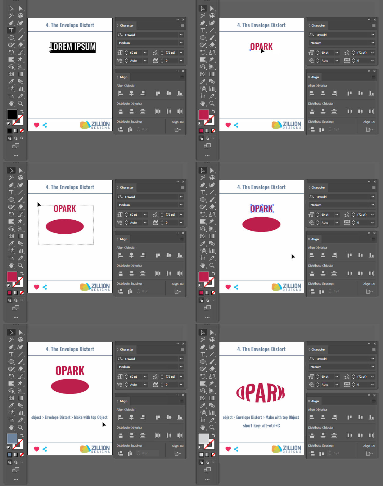
Envelope Distort is a really cool and fun typography tool. It basically allows you to add text to different shapes and objects in your illustrator or on any custom shape you’ve created. Using Envelope Distort, you place the text on top of the object, so the text takes the form of the object it’s placed on, wrapping around your selected object.
With Envelope Distort feature, you can shape your text any way you want: a fish, a bear, moon, bow-tie, wind, cars. The text adjusts itself to take on the silhouette of the object it’s being added to, giving you fluid, dynamic designs.
Steps To Access The Tool:
- Create or open the object you want your text to take shape of.
- Place the text on your canvas.
- Select both your object and the text. Make sure both of them are on the same layer.
- Then go to the Control Panel of your Illustrator and click on Object. A drop down menu will appear.
- Click on Envelope Distort from the list, go to the tiny arrow in front of it to view the list of options, and select Make with top Object.
- The shortcut key for Windows is Alt+Ctrl+C (Command+Option+C for Mac).
5. Special Characters And Glyphs
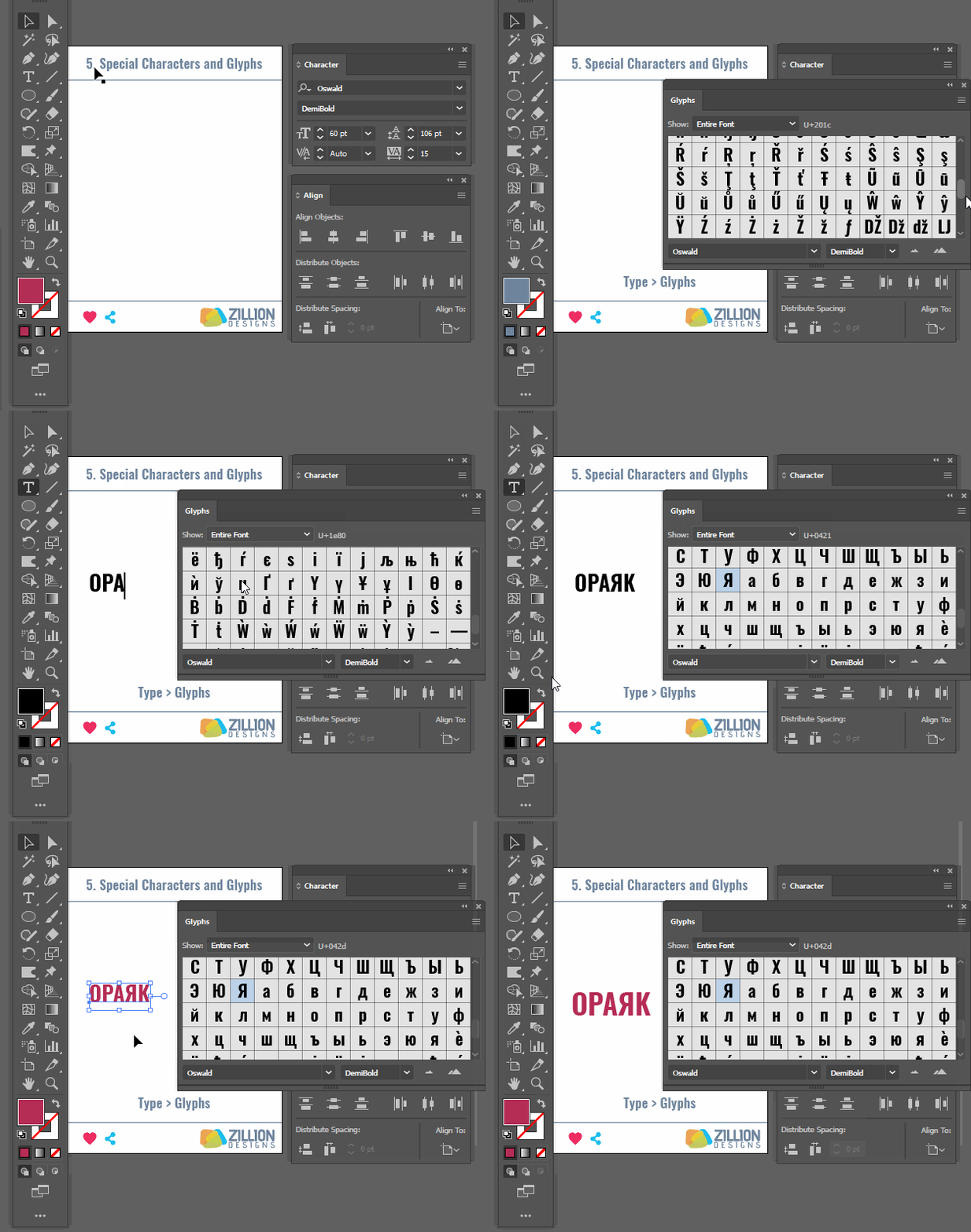
Glyphs are unique way letters and characters are presented within a typeface. To make a wordmark really stand out, you can change the style of just one letter (or more) in the whole text, directing the onlooker’s attention to that unique character.
You can find the glyphs of each typeface and their different variations under the Glyphs panel. As you work, you’ll see that if any letter/character within the family offers another style variation, it’ll be identified with a tiny arrow on the bottom of its box.
Additionally, you can also change the style of single letters by simply highlighting the one you want to change. The app will immediately display any variations available in that letter.
Steps To Access The Tool:
- Select the letter or character you want to change or modify for enhancement effect.
- Go to Type of the Control panel on top and click on it.
- From the list, select Glyphs.
- The Glyph window will open, containing character variations for the text and the selected portion.
- Select the variation you want to add.
6. Warp
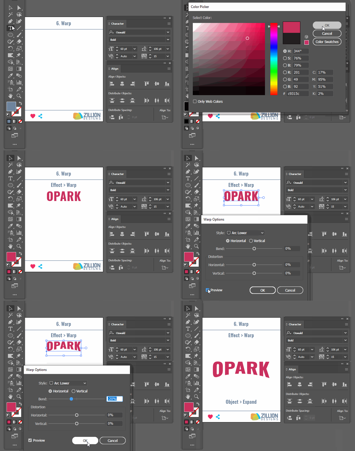
Warp is a pretty handy tool. A bit similar to Distort Envelope, it allows you to distort and change your text form into another. With ED you are mostly creating a custom shape, but the Warp effect makes things easier.
It comes with a selection of premade shapes and forms that you can quickly choose to warp your text into. You can give your text the shape of an arc, a bulge, a flag, a fish, or a wave…anything you want (within that list).
Again, like the Envelope Distort effect, the text remains editable. Meaning you can change the text as you are working with your shape without having to go back and lay it on the object again.
Steps To Access The Tool:
- Select the text.
- Click on the Effect tab from the Control panel on top.
- From the list displayed, access the Warp option and click on it to find options such as, Arc, Bulge, or Shell.
7. The Appearance Panel
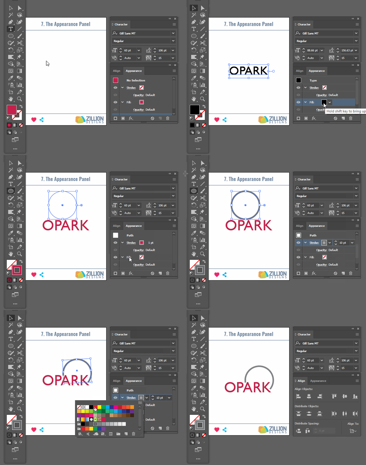
The Appearance Panel on your Illustrator is actually the treasure trove that contains all the magic you’re going to need to create a fabulous wordmark. Using different tools in the Appearance Panel, you can create any number of effects and styles for your logotype like retro, 3d types, texturing, shadows, wraps, you name it!
The options in the Appearance Panel work amazingly well with other type tools we’ve discussed on this list, such as Warp effect, Envelope Distort effect, Type on a Path effect, and such. Mixing and matching these tools, you can create pretty outstanding wordmark logos.
Just keep one tip in mind as you work with your Appearance Panel. The things/options that appear on top of the panel will override the changes you’re making to object using the options below it. So all the changes you want to keep in your object, make sure you drag them on top of the window as you continue your work.
Steps To Access The Tool:
- You’ll find the Appearance Panel on the left-hand side of the app with all its options.
- For keyboard shortcut key, use Shift+F6 for Windows and Mac, both.
8. The Pathfinder Tool
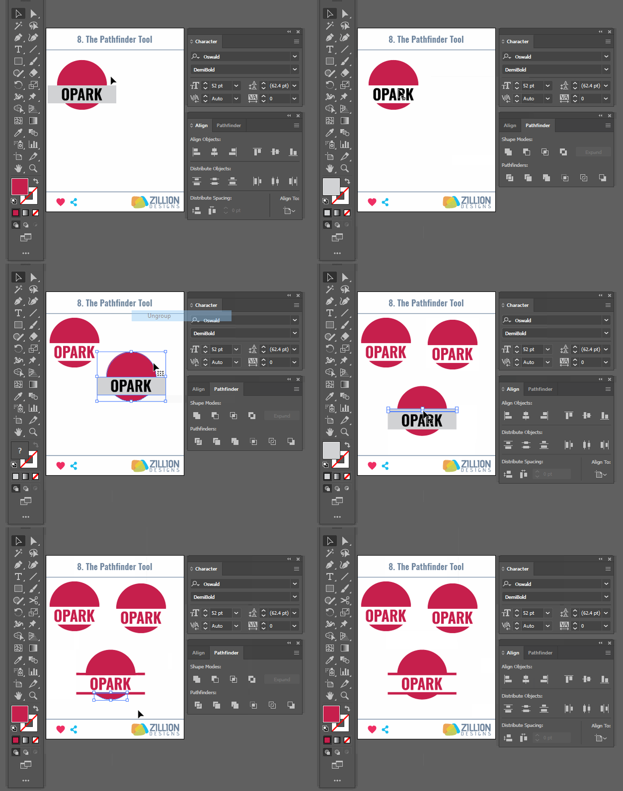
Why the PathFinder Tool is such a great idea for wordmark logos is it lets you work on the individual portions of each letter, allowing you to distort their shapes, cut out parts, and modify them. This tool is a design opportunity to add specific flavors to certain parts of the text – as per your desire.
You can combine different parts of letters, divide others, and subtract portions from some to create unique styles in your typeface. The Pathfinder tool is highly accurate and much neater than the eraser tool to remove portions of letters. With the Pathfinder, you get more precise cuts and subtractions, and much more wholesome additions, with very little effort.
Image Source: underconsideration.com
Steps To Access The Tool:
- You’ll find the Pathfinder on the left side toolbar and can also access it via Windows keyboard shortcut Ctrl+Shift+F9 – for Mac, use
- Once you do, the Pathfinder window will appear with all its additional tools.
9. The Direct Selection Tool
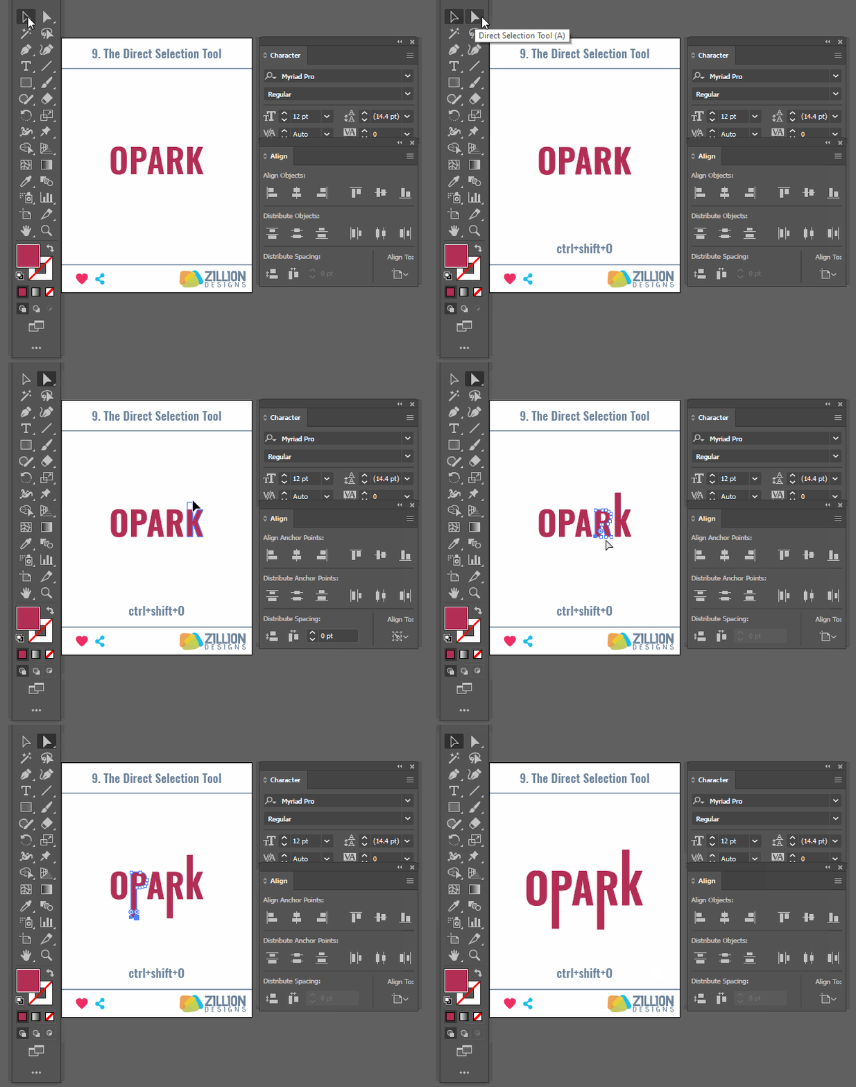
The Direct Selection tool also works great for typography. It enables you to modify curves, angles, and edges of individual letters by letting you work directly with the structure of the typeface.
By manipulating the anchor points in the type object, you can change the look and feel of individual letters. You can make the curve of a letter look rounder, or make it more angular, or extend the edges. You can also scale the type object as per the different effects you’re going for – to create more balanced designs.
With the Direct Selection tool, you get to work with your typography in a much more customized way than with preselected options.
Steps To Access The Tool:
- It is available on the right-side tool bar in the app.
- Select the shape whose points you want to modify and click on the tiny airplane shaped Direct Selection Tool.
- You can also access it by using the Windows shortcut key: simply press A. It’s the same for Mac.
10. The Gradient Tool
The gradient tool is not primarily a typography tool; it’s a color tool. To make type logos stand out more and be more reflective of their brand identity, the gradient technique is added into the letters. The Instagram logo is the most prominent example of a gradient logo.
You can use gradients in letters to convey brand personality and character.
Image Source: Wikipedia
In Illustrator, We Have Three Types Of Gradients To Work With:
- Linear: gives you gradient along lines and angles.
- Radial: fills the object with gradient colors in a circular shape.
- Freeform: lets you spread the gradient colors the way you want.
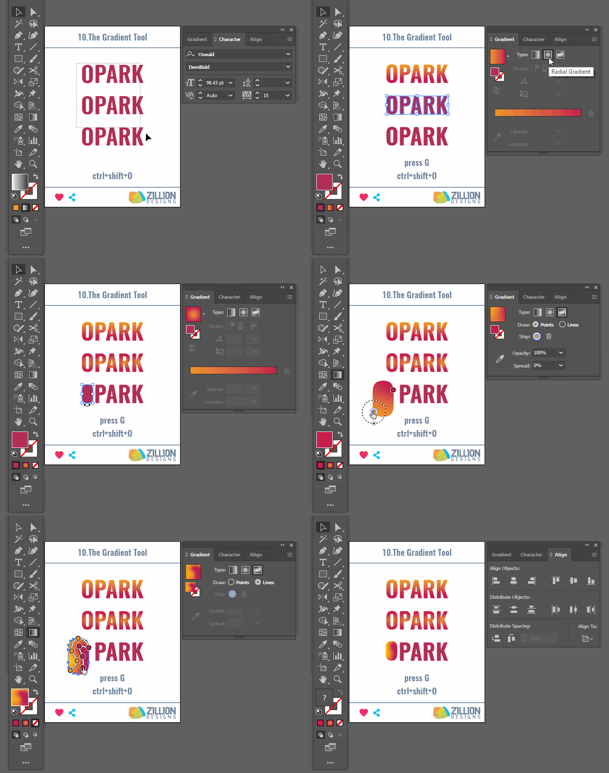
As a rule, try to keep colors limited in gradients when using in wordmarks as they can be hard to reproduce on a variety of surfaces and may look too cluttered and disorganized if you’ve used a whole bunch of contrasting colors. Tip to remember: use a color palette generator to create a scheme and work with those selected colors using the gradient tool.
Go with ‘less is more’ when working with gradient colors.
Steps To Access The Tool:
- Select the text.
- From the left-side panel, select the gradient tool.
- You’ll have three sub-menus there: Linear, Radial, and Freeform.
Select the gradient type you like.
Recap
So there you have it. Ten of the most fantastic tools in your Illustrator to create absolutely awesome wordmarks. You may be using some of these already and hopefully, with this list, you can do even more with them now. So what are you waiting for? Let’s start drawing!
Don’t have time to learn? Start a logo design contest.
