What Do Education Logos Have in Common?
Featured image: iStock/Jorgeantonio
Every university will use their logo design as a tool to attract new students with hidden symbolism and perceptions. Careful consideration is given to every aspect of the logo before it’s branded on everything the college owns.
All major educational institutions use education logos to help show and promote their reputation and their brand identity. Educational logo designs must demonstrate that these educational institutions work hard to impart to students knowledge, confidence, morals, values and discipline.
What I found fascinating in my research is that universities from all over the world follow the same five themes and build a visual identity from these logos!
1. The Shield
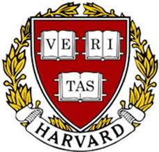
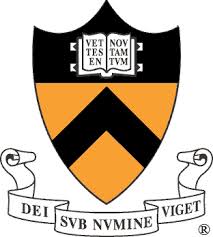

Most people automatically view shields as protection, security, and defense. You never think about how odd it is to associate shields with academics, but universities use the shield to represent strength, controlled environment, and safety.
This approach to creating a reliable and strong identity mirrors the way EssayService offers dependable essay writing services, ensuring students feel secure and supported throughout their academic journey.
However the shield portrays several different messages depending on the shape of the shield and the symbols on it. The most common symbol is the open book, indicating that knowledge is freely shared with you. If a university has one of these logos, it can also represent the age of the institution.
Either way, the university looks good with one of these logos.
2. Building structures
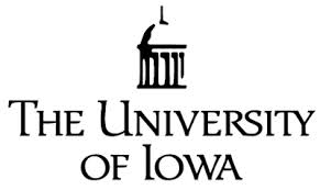


Universities want to look dependable, sturdy, and forever there for its inhabitants, long after the education has been imparted. The universities that use a building in their logo want to say they are professional and long lasting. These schools don’t plan on going anywhere and will be around when you need any help, direction or guidance.
The type of building represented will change based on the school’s reputation or what they want to say. A quick study of art history will tell you the meaning behind each structure, which culture and era it was popularly used in, and explain why the cultures built them that way.
3. Typeface only
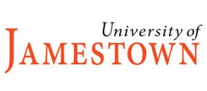
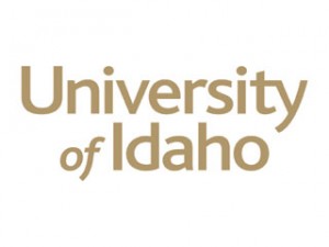
Typography choices will explain a lot about what the university is trying to say. Each typeface choice has an attached meaning or communicates what the school wants to express. Even the size and space of each letter or word are also carefully considered.
Having a pure text logo doesn’t mean that the university couldn’t come up with a symbol; but it does mean that color theory plays heavily in trying to decipher the meaning behind the logo. You also need to consider how your text logo will appear on your education website.
4. Overlapping letters

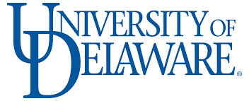
In logo design, bundling several messages into a single unit demonstrates the simplicity and clarity of image, and indicates the depth of a concept. In university logo designing, using the overlap technique adds depth and allows it to pop out for a 3D effect. The logo easily catches people’s attention.
While not a huge trend for the main logos of universities, you will still find overlapping letters used often.
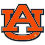
5. Animals in Motion
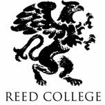
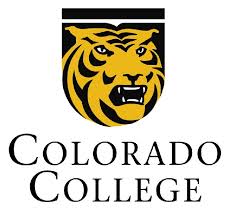

Animals have been a source of symbolism for ages for academic institutions! The animal featured shows stereotyped characteristics that represent what the school stands for. Careful consideration is given to the animal choice and a school will research on past public perception of the animal and the more modern perception before deciding on one.
This animal will most likely be the school mascot, and will function as a way to resonate with students, to help express a brand identity. Universities that use an animal will heavily feature it in their marketing tools, and use it as a way to gain a competitive edge as well.
What did your university’s logo look like? Did it have any of these common themes? Feel free to let us know on Twitter @ZillionDesigns or in the comments below!

