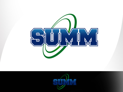
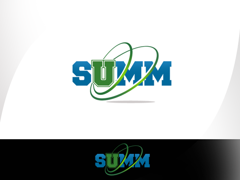
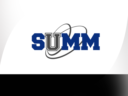
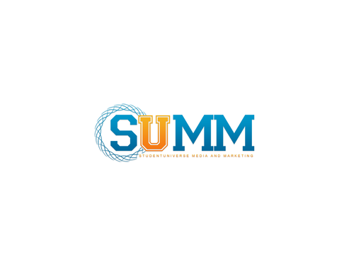
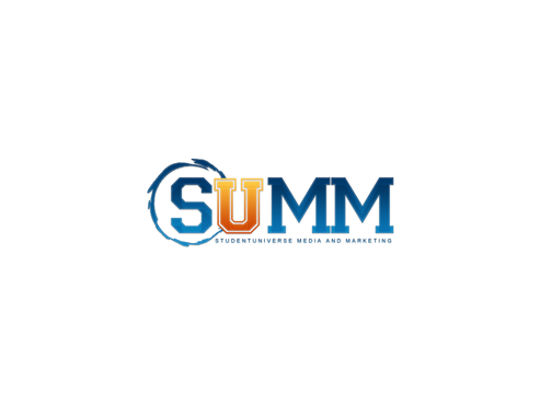
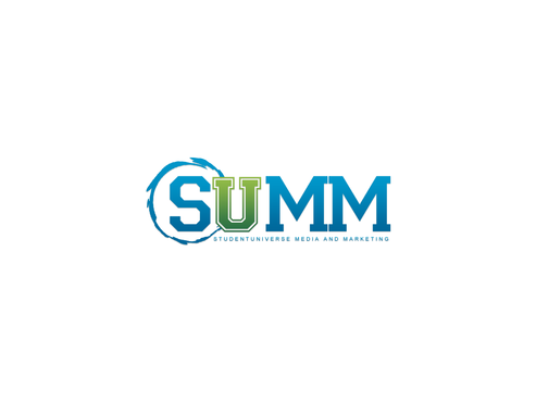
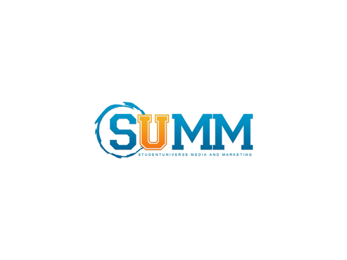
Business Logo for Marketing Agency, SUMM
SUMM
|
Contest Holder
MelissaSU
?
Last Logged in : 5230days15hrs ago |
Concepts Submitted
251 |
Guaranteed Prize
299 |
Winner(s) | A Logo, Monogram, or Icon |
|
Live Project
Deciding
Project Finalized


Creative Brief
Business Logo for Marketing Agency, SUMM
SUMM
Yes
SUMM (StudentUniverse Media and Marketing, a division of StudentUniverse) is a full-service media and marketing firm specializing in brand strategy and execution in the college market.
From concept inception to execution, SUMM designs, manages, and executes college marketing campaigns for its clients.
We are a boutique agency with over 20 years of experience and have a large network of sites as well as access to over a million college students.
We are experts in the college market.
Marketing
Logo Type
![]()
Symbolic
![]()
Initials
![]()
Web 2.0
![]()
Cutting-Edge
Unique/Creative
Clean/Simple
Modern
Industry Oriented
Fun
Illustrative
We like the idea of a blue or green as the core color.
not sure
We do not want a Plus sign (+) in our logo, but seeing one design with an equals sign (=) might be interesting (definitely not sold on this idea!)
Another idea is to be playful, yet professional with the college tone
We would like to steer away from the branding of this agency (http://www.sumagency.com/) to avoid any and all confusion or association.
Related Contests