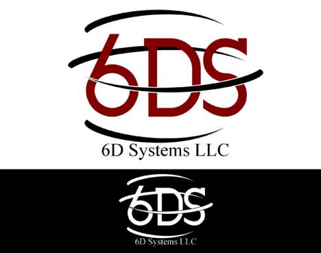
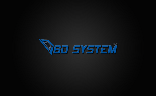
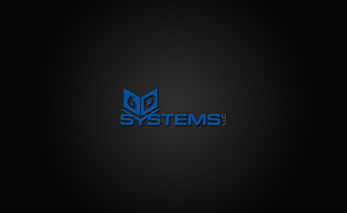
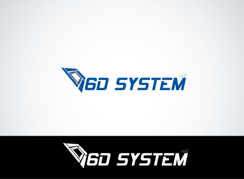
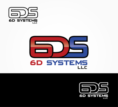
Business / Stationary Logo for 6D Systems LLC
6D Systems LLC
|
Contest Holder
6dsystems
?
Last Logged in : 5366days34mins ago |
Concepts Submitted
68 |
Guaranteed Prize
250 |
Winner(s) | A Logo, Monogram, or Icon |
|
Live Project
Deciding
Project Finalized


Creative Brief
Business / Stationary Logo for 6D Systems LLC
6D Systems LLC
Innovative Solutions
No
Our target customers are generally 35-55 years old and purchasing agents or engineers in industrial or marine environments. We are looking for a serious logo that conveys our focus on high technology and cutting edge solutions for our customers. The 6D in our name refers to 6 dimensional physics (multiverse theory) where every option of every decision exists simultaneously.
My website is http://www.6dsystems.com but I am not fond of that logo, so please don't use it as inspiration.
Software
Initials
![]()
Web 2.0
![]()
Cutting-Edge
Clean/Simple
Sophisticated
Modern
High Tech
Serious
Dark Greys, Deep Reds, Navy / Deep Blues, colors should be very rich, no pastels or bright colors.
3
Logo should be able to have either a clear (transparent) background or a black background.
Related Contests