Dive Centre Logo (Scooba Tank)
Scooba Tank
|
Contest Holder
scoobatank
?
Last Logged in : 4809days12hrs ago |
Concepts Submitted
60 |
Guaranteed Prize
400 |
Winner(s) | A Logo, Monogram, or Icon |
|
Live Project
Deciding
Project Finalized
Creative Brief
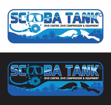
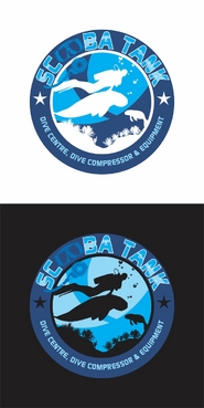
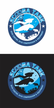
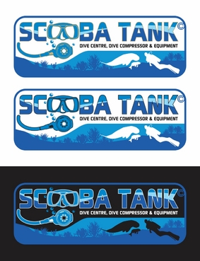
Dive Centre Logo (Scooba Tank)
Scooba Tank
Dive Centre, Dive Compressor & Equipment
Yes
This logo is for a diving business. We are dive centre, dive shop and service & maintenance centre for dive compressor and other equipments.
Sports
Logo Type
![]()
Symbolic
![]()
Illustrative
![]()
Character
![]()
Cutting-Edge
Unique/Creative
Clean/Simple
Sophisticated
Modern
Outdoors/Natural
Abstract
not sure
Perhaps use characters of a dugong or a diver.
We have a dive centre at Mantanani Island, Borneo.
The island is famous for it's dugongs and scoop owl. Just some thoughts. Otherwise feel free.
Related Contests