e2E Business Logo
e2E
|
Contest Holder
ShoutKC
?
Last Logged in : 3309days13hrs ago |
Concepts Submitted
189 |
Guaranteed Prize
275 |
Winner(s) | A Logo, Monogram, or Icon |
|
Live Project
Deciding
Project Finalized


Creative Brief
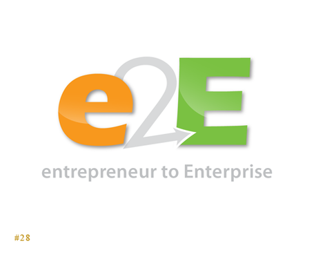
e2E Business Logo
e2E
Entrepreneur to Enterprise
Yes
This logo is for a new company that inspires and consults with other entrepreneur's, helping them manage and grow their businesses.
Consulting
Logo Type
![]()
Initials
![]()
Web 2.0
![]()
Modern
Simple
Client definitely wants orange to be included, but it doesn't necessarily have to be the main color. Orange can be an accent color.
not sure
Client desires a logo that is modern and simple, but that is unique and stands out - wouldn't mind having some "artistic flair" included. Needs to be a logo that can be easily reproduced and recognized whether in color, gray scale, or black & white.
Related Contests


