Event & Conference Planning Logo
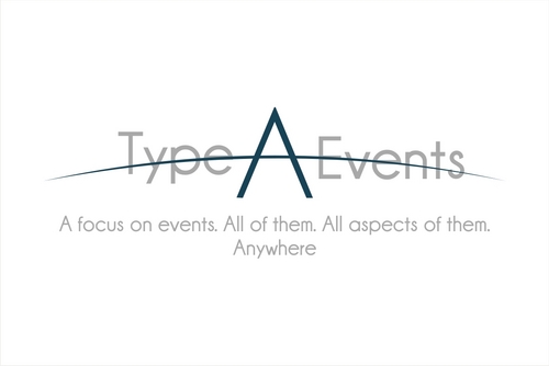
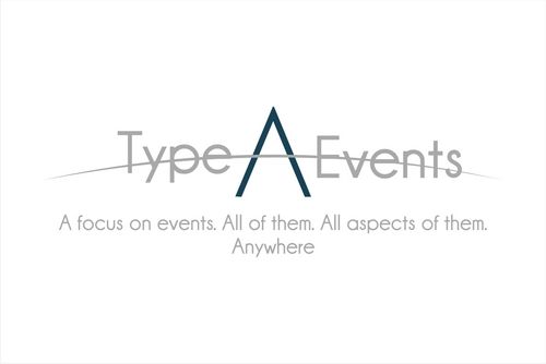
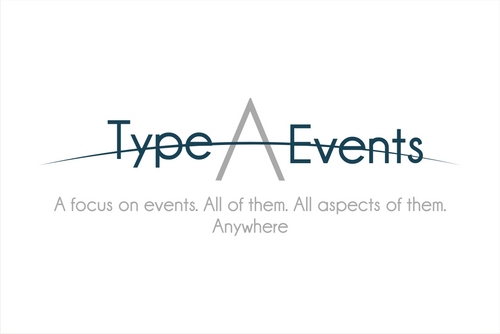
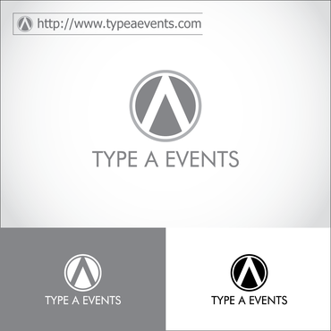
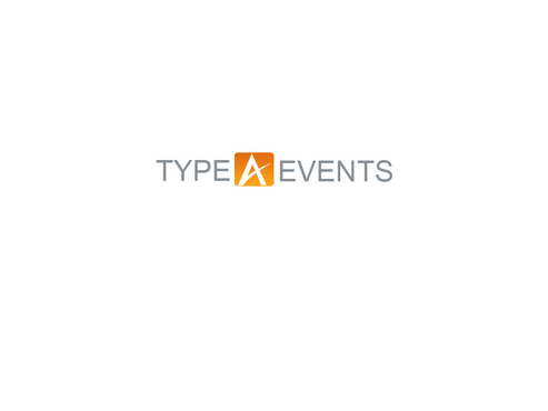
Type A Events
|
Contest Holder
TypeAEvents
?
Last Logged in : 3328days8hrs ago |
Concepts Submitted
203 |
Guaranteed Prize
200 |
Winner(s) | A Logo, Monogram, or Icon |
|
Live Project
Deciding
Project Finalized


Creative Brief
Event & Conference Planning Logo
Type A Events
A focus on events. All of them. All aspects of them. Anywhere.
No
We are a strategic meeting and event planning company.
A Focus...
There are differing opinions regarding whether the superior term these days is “event planner” or “meeting planner” or any of the other euphemisms.
We’ve settled that debate amongst ourselves and have gone with “event planning”. Meetings are events. Conferences are events. Galas and fundraisers, Incentive Trips, Employee Appreciation, Grand Openings, Sales Meetings, City-Wide Conventions….be they for 10 people or 10,000…are all events.
They are all experiences that should provide a lasting impact for the attendees and value for the stakeholders. (So, we could call ourselves “experience planners” but that’s a little fruity-sounding…even for us.)
We focus on events. All of them. All aspects of them. Anywhere.
We are experts in the development of new events, the re-invention of existing events, and the increased success of proven events. We partner with you and your team to elevate your events from a money-suck to a bona fide company investment with return. Sure, we manage all of the details along the way, but even more so, we help you make it along the way. We provide guidance and direction for your team—whether we are handling one aspect or the entire event
We don’t do widgets. We don’t deal in whatcha-may-call-its. We do events. And, cliché as it is, we do them really well.
A Philosophy...
In the 1950’s, doctors developed a personality classification that was supposed to help them identify predicators for heart disease. They grouped certain criteria together and labeled that personality, “Type A”. The term has come to have some negative connotations.
From our point of view, while we are an eclectic team of varied personalities and interests, we endeavor to provide type A service.
Does that make us a group of unlikable, over-bearing maniacs? No.
We think the so-called “symptoms” of type A are the same qualifications you want in your event planners:
Type A individuals can be described as time-conscious, competitive, ambitious, business-like perfectionists. They are usually over-achievers who derive a great deal of satisfaction from work and multi-tasking. They drive themselves with deadlines and are often “stress junkies”.
–Type A Behavior: Its Diagnosis and Treatment, Meyer Friedman
We proudly don the scarlet letter as a badge of our undying need to deliver services to you on time, in budget, and beyond your expectations. If that ends up leading to heart disease….well, we’ll live with that. If our service prevents your heart attacks, then we’ve done our job.
Website with current look & logo: www.typeaevents.com
Conventions and Trade
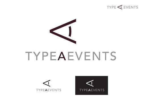
Logo Type
![]()
Symbolic
![]()
Initials
![]()
Unique/Creative
Corporate
Modern
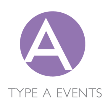
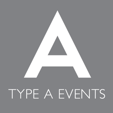
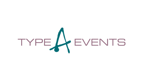
Open to seeing any combinations that will look fresh and modern. Don't want people to say that we simply went with corporate blue. Our sister company uses fuscia as their primary color so, while we don't envision fuscia or pink in this corporate logo, we would like the color scheme to be compliemtnary (at least non-clashing). We have tended to be drawn to deep teal/peacock blue or jade green but don't want to limit ourselves. Do like the idea of having a signature color that we can use as the basis for our graphics, uniforms, client gift backs, etc. We are looked to as consultants who stay on top of the trends with events so we need a look that feels on top of the trends. We like the idea of having a flexible brand that has nice neutrals as secondary colors so we could change out our primary color if that color becomes dated. We are drawn to slate grays, crisp whites, and deep taupes as neutral colors but don't necessarily see all of those combined. We like how Apple and some other fashion/retail brands have used neutrals really well. Might like the richness that "wet paint" or "shiny" look shows? Tend to be drawn to cooler colors. Favorite colors is actually a gray mauve/purple and eggplant...but have never thought those would have a place in a gender-neutral corporate logo design? Will put those notes in here anyway, in case they are food for thought. VERY open.
not sure
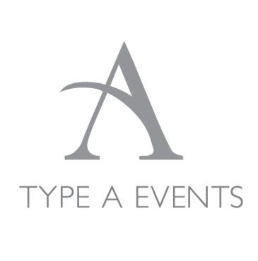
Would like to do something interesting with the A--possibly just a beautifully simple A, maybe A as a type-writer button or a modern version...want to consider the possibility of being able to separate the "A" on its own as a separate logo/mark that would stand on its own and we could use on shirts, logo items, etc.
We like how a number of advertising and public relation agencies have successfully blended corporate professionalism with an air of personality and creativity.
Related Contests