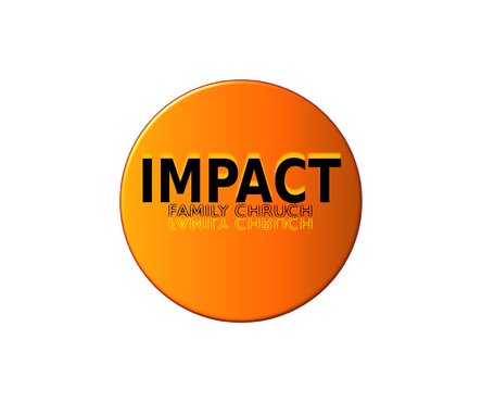
Impact Family Church Logo
Impact Family Church
|
Contest Holder
bbradford
?
Last Logged in : 5157days12hrs ago |
Concepts Submitted
74 |
Guaranteed Prize
215 |
Winner(s) | A Logo, Monogram, or Icon |
|
Live Project
Deciding
Project Finalized

Creative Brief
Impact Family Church Logo
Impact Family Church
Making a difference
No
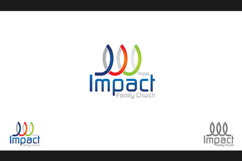
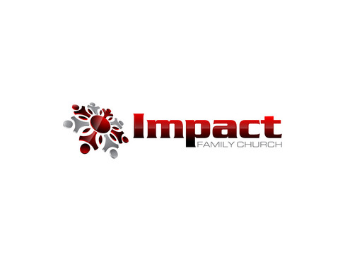
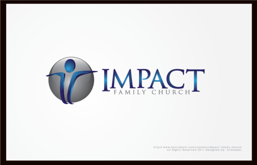
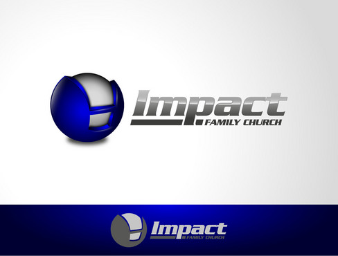
This is for a church, BUT IT IS NOT TRADITIONAL AT ALL. They want to be seen like a cutting edge business that is modern. Do not think of them as a church. NO CROSSES, DOVES, PRAYING HANDS, GLOBES, OR ANYTHING LIKE THAT. The only way you know it's a church is because of the word church. There entire emphasis is on the word IMPACT. They are life changing and modern.
Religion and Spirituality
Logo Type
![]()
Symbolic
![]()
Abstract Mark
![]()
Cutting-Edge
Unique/Creative
Modern
Masculine
No pastels or feminine colors. Use strong and creative colors.
not sure
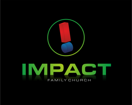
This is one idea to maybe start out on...!MPACT. They want the real emphasis on the word IMPACT through a symbol or writing it out like the explanation point idea. The words "Family Church" should have less emphasis on it...maybe just straight font and smaller then IMPACT. Having the tagline in the logo is optional...it doesn't have to have it. It just depends on the design.
Related Contests