KC Products, Inc. - Business logo change/update
KC Products, Inc.
|
Contest Holder
sharonspence
?
Last Logged in : 5463days3hrs ago |
Concepts Submitted
66 |
Guaranteed Prize
200 |
Winner(s) | A Logo, Monogram, or Icon |
|
Live Project
Deciding
Project Finalized


Creative Brief
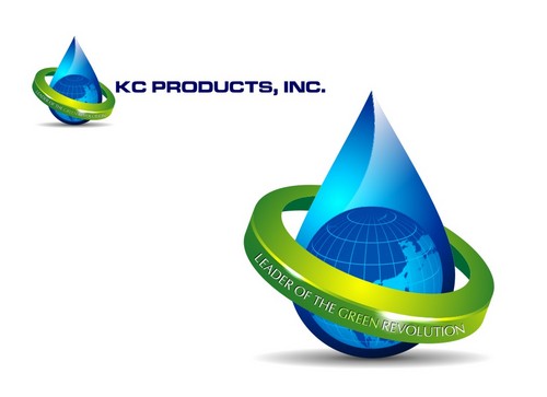
KC Products, Inc. - Business logo change/update
KC Products, Inc.
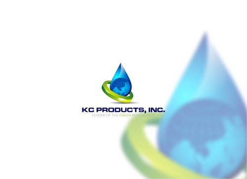
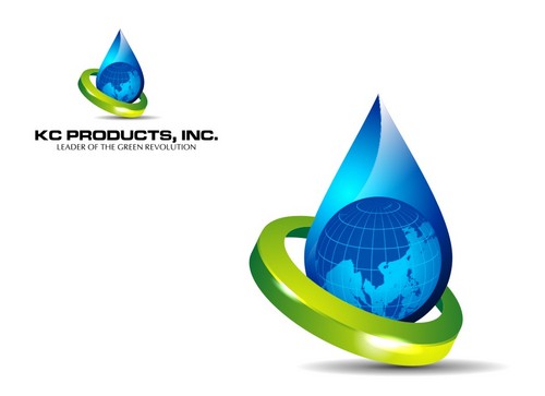
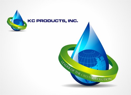
Leader of the Green Revolution
Yes
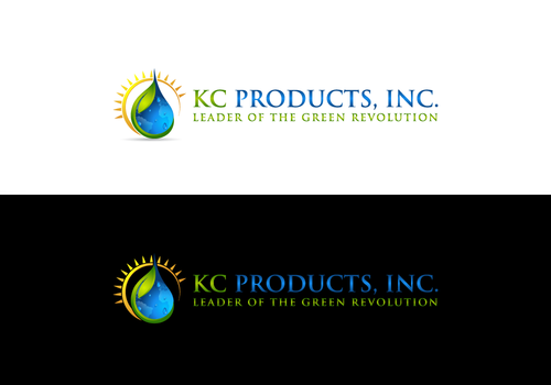
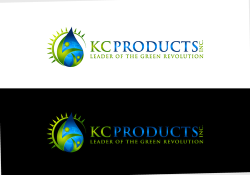
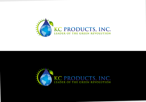
KC Products markets certified environmentally safe cleaner/degreasers for household and industrial users. We are considered the leader of the “green” revolution and were the first company to offer safe cleaners to the market in 1985. This new logo will be an upgrade to our old logo for an overhaul of our current website, sales collateral, plastic spray bottles, adhesive lables on various sized containers, business cards, stationary & envelopes. We would like our logo to be compatible with the diverse market of household consumers and commercial users. We prefer the colors of greens and blues, we like the environmental look of water drops, the earth, but not too cutesy but also not too severe business – a happy medium. We hope to print on paper that is obviously recycled with an off white to tan look, using 2 colors in the logo. We want people to think of nature, sustainability, and safety, yet perceive it to mean our products are powerful and capable of handling the toughest industrial degreasing operations. The logo above is the current one – please change the tag line to Leader of the Green Revolution. kcproductsinc.com Here are some sites that have a similar look/feel or images we are going for... simple but not too abstract, easy to print with not too many small details, but maybe add a glow like there's a light source to the side...
Cleaning
Symbolic
![]()
Abstract Mark
![]()
Clean/Simple
Sophisticated
Corporate
Modern
Outdoors/Natural
High Tech
Green, turquoise, blue, aqua, or any variation of these to be printed on a recycled paper look.
not sure
Here are some ideas we liked online, went to google images for earth, water drop, eco-friendly, blue, green...
Things to avoid: too much detail, too cutesy/playful, too stiff or stuffy...
http://www.daimer.com/green-chemical-company/
http://www.google.com/imgres?imgurl=http://www.dreamstime.com/earth-drop-eco-concept-thumb13801506.jpg&imgrefurl=http://www.dreamstime.com/royalty-free-stock-image-earth-drop-eco-concept-image13801506&usg=__MtrDCl7Yzpj0odXZ5oYXa5F9OpE=&h=350&w=217&sz=47&hl=en&start=0&zoom=1&tbnid=Vg0r8ubneGPieM:&tbnh=121&tbnw=75&ei=d0evTcOkCuXRiALgs-moBA&prev=/search%3Fq%3Dearth%2Bdrop%2Beco-friendly%26um%3D1%26hl%3Den%26biw%3D925%26bih%3D512%26tbm%3Disch0%2C190&um=1&itbs=1&iact=hc&vpx=636&vpy=96&dur=2031&hovh=280&hovw=173&tx=83&ty=226&page=1&ndsp=16&ved=1t:429,r:14,s:0&biw=925&bih=512
http://www.google.com/imgres?imgurl=http://thumbs.dreamstime.com/thumb_374/12369405785gqowX.jpg&imgrefurl=http://www.stockphotos.it/image.php%3Fimg_id%3D8533038%26img_type%3D1&usg=__BaaGwDUksq5hBHnZf9Ua6bhmRjc=&h=316&w=300&sz=33&hl=en&start=64&zoom=1&tbnid=H98hbFGy30uxSM:&tbnh=168&tbnw=165&ei=TUivTefXI-vUiAKfqZW6BA&prev=/search%3Fq%3Dearth%2Bdrop%2Beco-friendly%26hl%3Den%26biw%3D925%26bih%3D512%26site%3Dsearch%26tbm%3Disch0%2C2878&um=1&itbs=1&iact=hc&vpx=139&vpy=83&dur=16&hovh=230&hovw=219&tx=101&ty=146&page=8&ndsp=8&ved=1t:429,r:4,s:64&biw=925&bih=512
http://www.google.com/imgres?imgurl=http://2.bp.blogspot.com/_oq7Y0HiEPo8/S9GeU7X_ytI/AAAAAAAAAF8/A4sypSCQVR4/s1600/drop_of_water___tears_by_ramma7%255B1%255D.jpg&imgrefurl=http://brenda-martin.blogspot.com/2010/04/earth-day-22-april.html&usg=__Ia2GTsGJpwqqCVyaq9MLkBpNBfs=&h=558&w=541&sz=46&hl=en&start=173&zoom=1&tbnid=rBydG5EIlBI1HM:&tbnh=166&tbnw=160&ei=l06vTbOYJ47PiAKH9bWeBA&prev=/search%3Fq%3Dearth%2Bwater%2Bdrop%2Bsustainable%26um%3D1%26hl%3Den%26biw%3D925%26bih%3D512%26tbm%3Disch0%2C8606&um=1&itbs=1&biw=925&bih=512&iact=rc&dur=3843&page=23&ndsp=9&ved=1t:429,r:5,s:173&tx=67&ty=62
Related Contests