Logo for a family company in Japan
solarist
|
Contest Holder
solarist1
?
Last Logged in : 4286days19hrs ago |
Concepts Submitted
622 |
Prize Money
150
|
Winner(s) | A Logo, Monogram, or Icon |
|
Live Project
Deciding
Project Finalized


Creative Brief
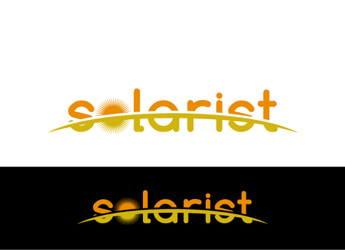
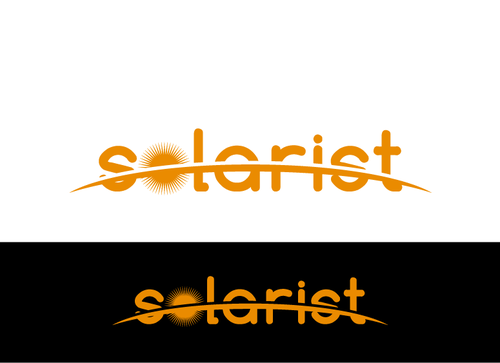
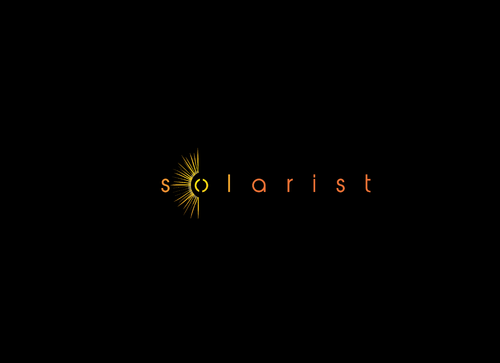
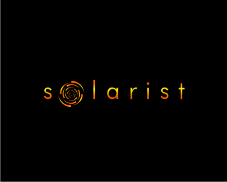
Logo for a family company in Japan
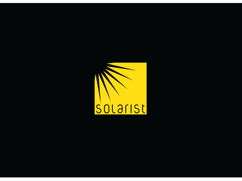
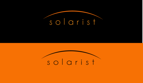
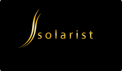
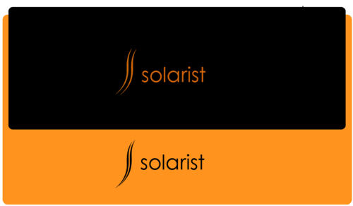
solarist
No
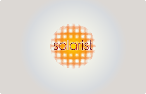
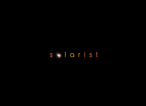
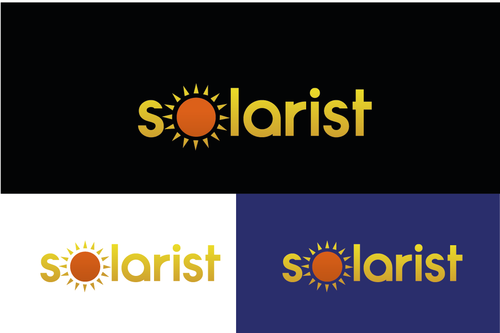
Image of sun and perhaps universe or planets.
International design (not only Japan).
Small family company with miscellaneous activities including:
- Running international aikido (Japanese martial art) seminars.
- Apartment design and rental.
- Vegetarian café.
- Accounting and legal services.
Miscellaneous
Symbolic
![]()
Simple
Colour(s) evoking sun/universe. Possibly also metallic (gold)?
not sure
Simple logo that gives a good first impression.
Related Contests