Logo for a sales / marketing company
Adicio
|
Contest Holder
printmax
?
Last Logged in : 4069days13hrs ago |
Concepts Submitted
34 |
Prize Money
200
|
Winner(s) | A Logo, Monogram, or Icon |
|
Live Project
Deciding
Project Finalized

Creative Brief
Logo for a sales / marketing company
Adicio
No
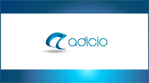
The company has to change their current logo because they are stepping out of their franchise. Very happy with current logo, both in color and style. They like the 3D effect and circular look of the E in front adicio, but this is the part of the logo that is from the franchise. The company delivers sales on the b2c market on behalf of other companies. All sales are done under the respective customers profile, so the logo is only used in the b2b market in communication with new and existing partners. The logo should be simple and elegant, but could also contain intricate elements. This is their underdeveloped website: www.adicio.no
Marketing
Logo Type
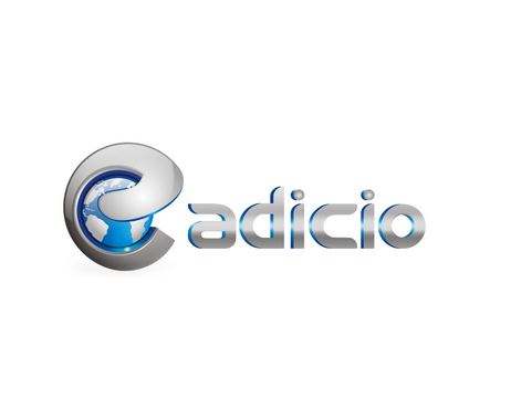
![]()
Abstract Mark
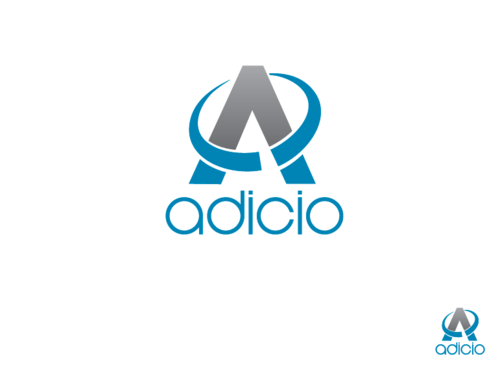
![]()
Cutting-edge
Sophisticated
Simple
Elaborate
Professional
The same teal as in the current logo wouldn't hurt. There are some elements in the office already painted in that color. Feel free to add additional color.
not sure
I'm uploading the current logo. The only absolute requirement is that the E symbol has to be removed.
The logo could be quite similar, but it should also be obvious that it's not the same logo. Feel free to show me something completely different, but keep this in mind.
Related Contests