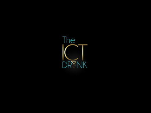
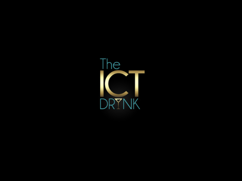
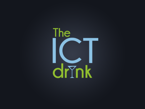
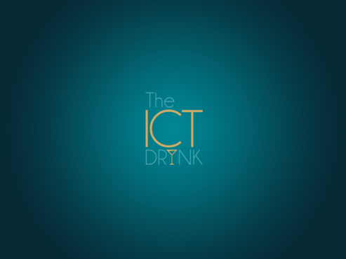
Logo for ICT business networking events
The ICTdrink
|
Contest Holder
kverheyden
?
Last Logged in : 2985days14hrs ago |
Concepts Submitted
24 |
Guaranteed Prize
200 |
Winner(s) | A Logo, Monogram, or Icon |
|
Live Project
Deciding
Project Finalized

Creative Brief
Logo for ICT business networking events
The ICTdrink
No
The ICT Networking Drink is a recurring Networking Only event that was first organized in 2006 by 2 ICT Ladies.
The events are 'invitation Only' and aimed at ICT Executives & Sales professionals looking to extend their relationships or catch up with peers from the industry.
We believe that we can say that after 6 years our events have become the 'must attend' in ICT world and we have now more than 2000 followers, even to the point that we are limiting the amount of members to the LinkedIn group.
On average the ICT Drinks gather about 200 Key Sales & Pre-Sales Professionals with a focus on Mid & Top level Profiles.
More info on the events you can find at www.ICTdrink.be
Events
Logo Type
![]()
Abstract Mark
![]()
Modern
Sophisticated
Simple
Professional
High Tech
2
Just an idea but not binding would be to have a symbol that replaces one letter in the name. The symbol then refers to the kind of activity.
Related Contests


