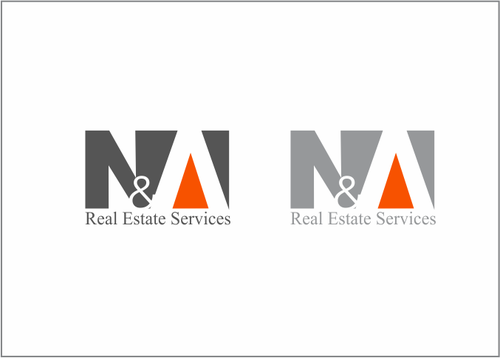
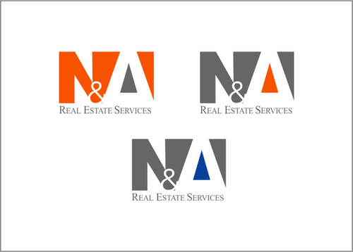
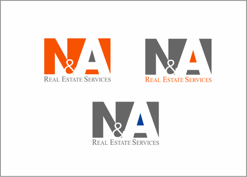
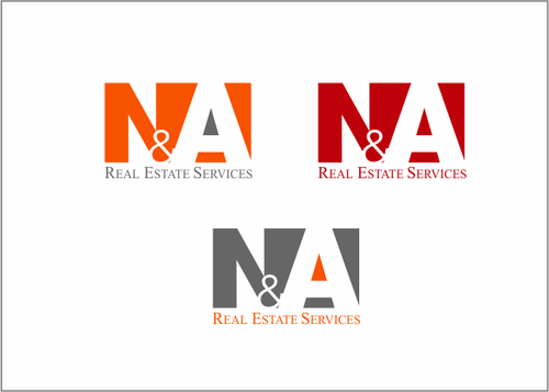
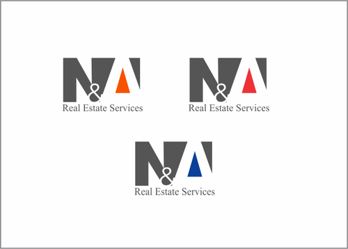
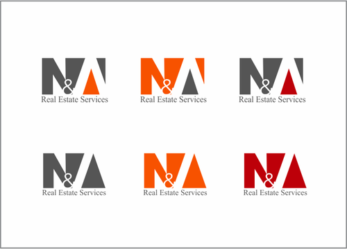
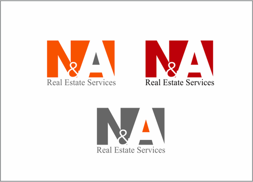
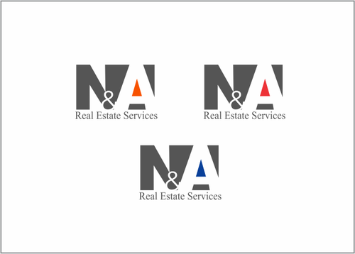
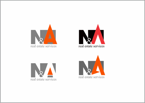
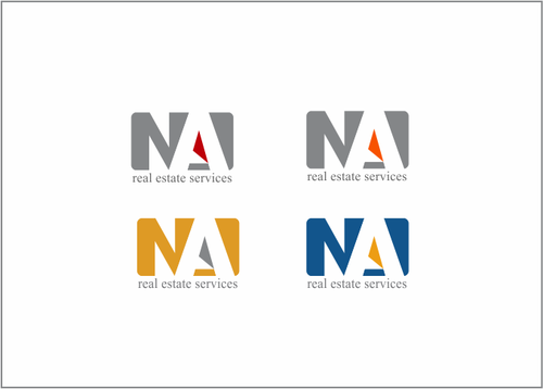
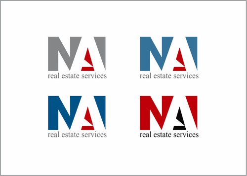
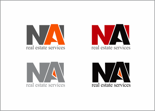
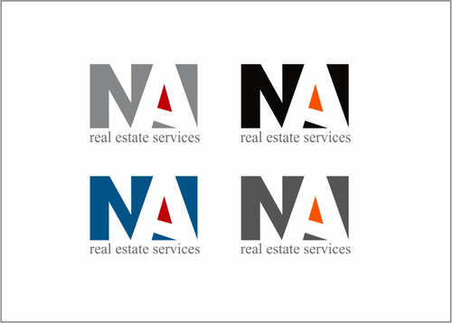
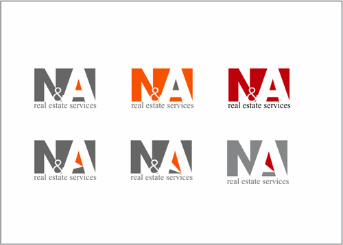
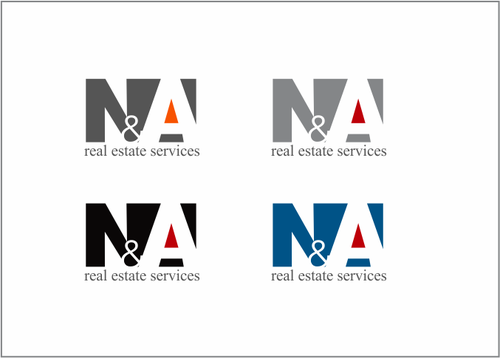
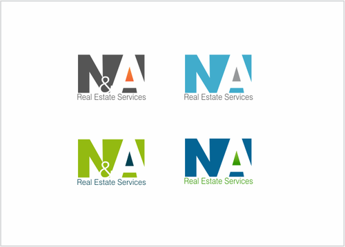
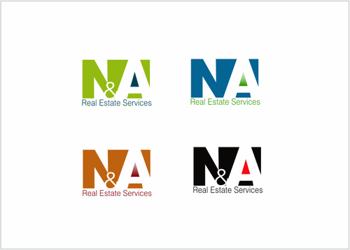
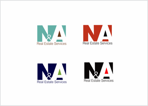
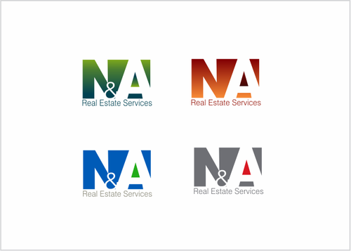
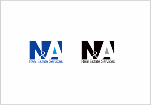
Logo for Real Estate Services company
N&A
|
Contest Holder
cwn42
?
Last Logged in : 4607days15hrs ago |
Concepts Submitted
413 |
Guaranteed Prize
250 |
Winner(s) | A Logo, Monogram, or Icon |
|
Live Project
Deciding
Project Finalized

Creative Brief
Logo for Real Estate Services company
N&A
No
This logo should reflect a company culture of professionalism and confidence. It should not be too busy of a design with a modern feel to it. The logo should only include 2 to 3 color variations and not be overly complicated. Please avoid any logos which incorporate the image of house of structure. The design should be more abstract and targeted towards the commercial real estate industry.
Real Estate
Logo Type
![]()
Abstract Mark
![]()
Initials
![]()
Illustrative
![]()
Modern
Cutting-edge
Sophisticated
Simple
Professional
not sure
Related Contests


