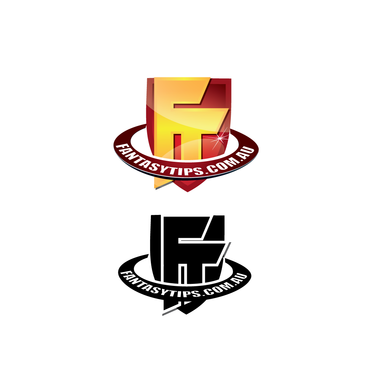
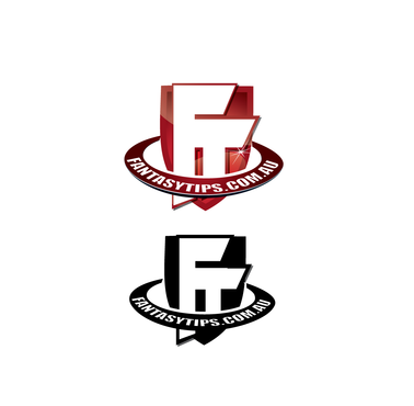
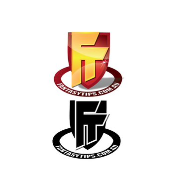
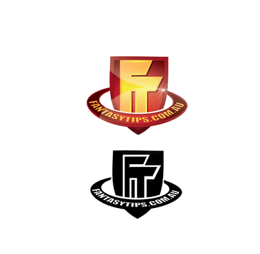
Logo + Stationery Design: Fantasy Sports Company
FantasyTips.com
|
Contest Holder
danmcg
?
Last Logged in : 4657days17hrs ago |
Concepts Submitted
48 |
Guaranteed Prize
210 |
Winner(s) | A Logo, Monogram, or Icon |
|
Live Project
Deciding
Project Finalized


Creative Brief
Logo + Stationery Design: Fantasy Sports Company
FantasyTips.com
No
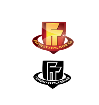
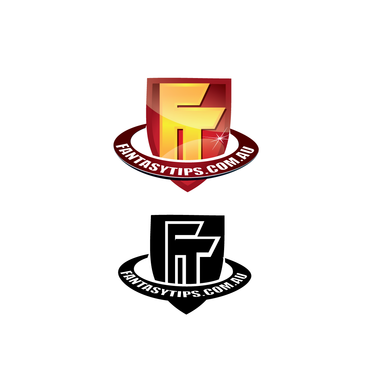
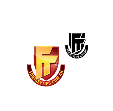
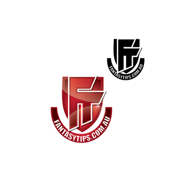
A generic logo for a company that appeals to all online Fantasy Football codes (so not specific for NFL/Football/Rugby/Soccer etc). I like the idea of it being similar to a team emblem. I am trying to target a happy medium between it featuring strong eye catching colors (thinking red and/or yellow) but also capable of being printed in black and white if need be. Idea is to keep it simple, memorable and timeless in design. Vector based format over pixel as this would be used in multiple sizes.
Stationery design should be a fairly straight forward progression from the original logo incorporating the same color schemes. The design of these we would like to be more professional that would appeal to our potential business with investors or other companies as opposed to the clients directly
Sports
Symbolic
![]()
Illustrative
![]()
Character
![]()
Masculine
Traditional
Youthful
Simple
Casual
Red and/or Yellow as these are the most eye catching
not sure
Use sporting team emblems for inspiration. I am also open to the idea of it containing a mascot of sorts if it's is done tasteful. Should appeal to 'the boys'
Related Contests