Napa Smog Test Only
Napa Smog Test Only
|
Contest Holder
napasmog
?
Last Logged in : 4895days2hrs ago |
Concepts Submitted
161 |
Guaranteed Prize
200 |
Winner(s) | A Logo, Monogram, or Icon |
|
Live Project
Deciding
Project Finalized


Creative Brief
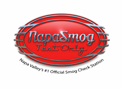
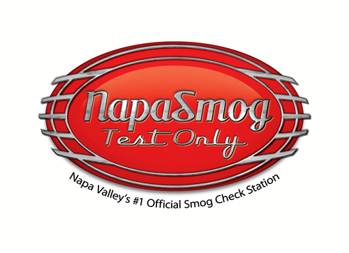
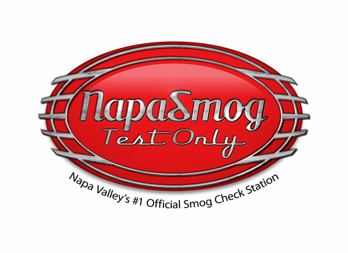
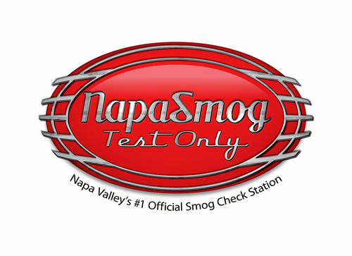
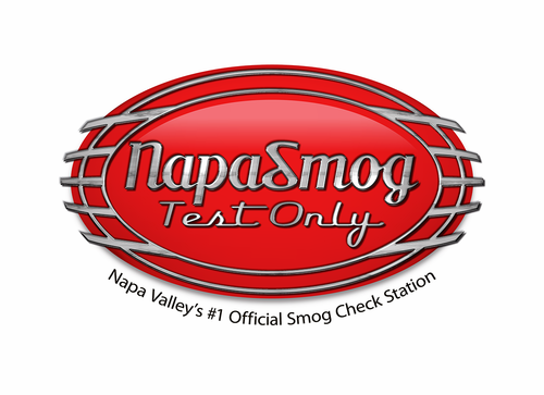
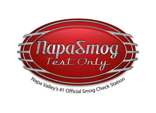
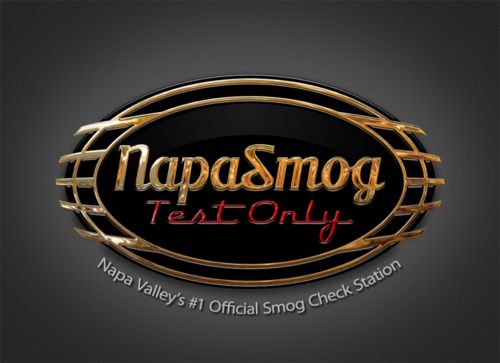
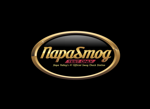
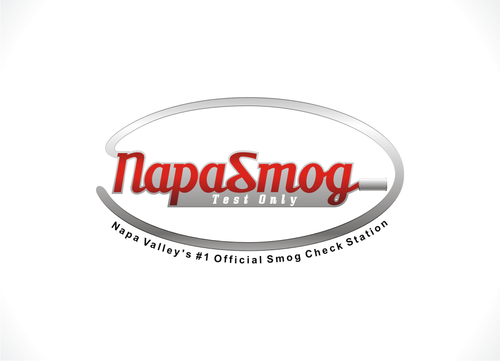
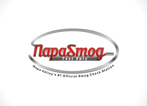
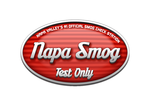
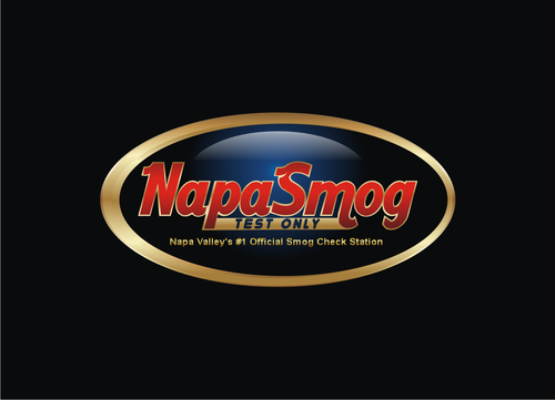
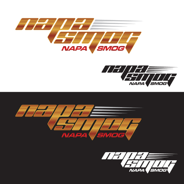
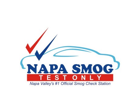
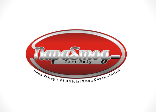
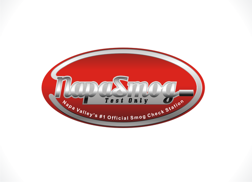
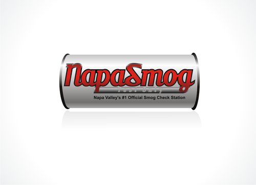
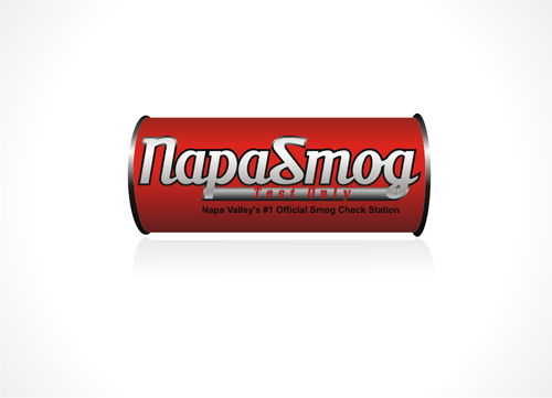
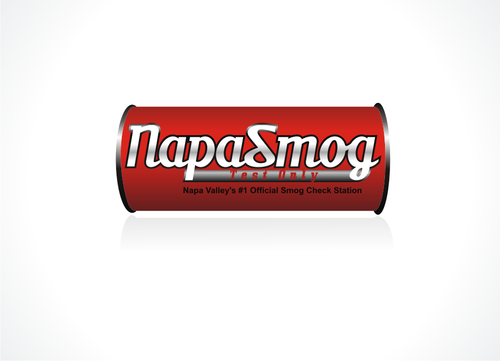
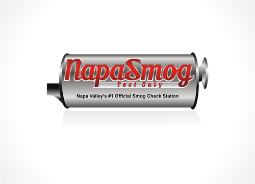
Napa Smog Test Only
Napa Smog Test Only
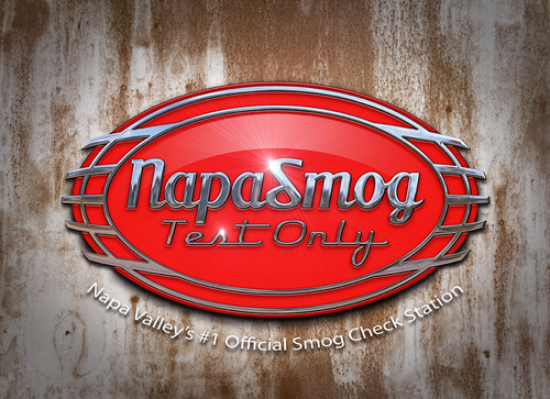
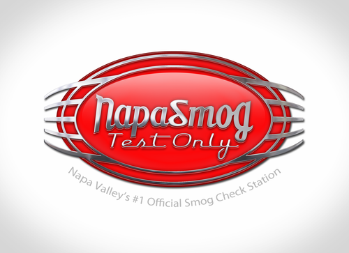
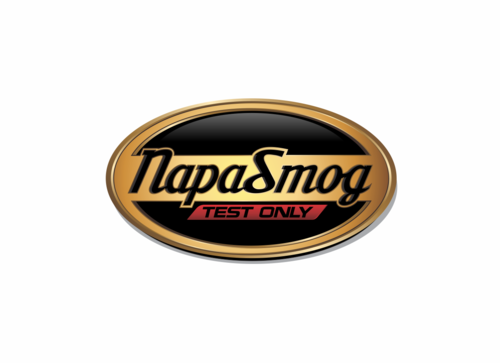
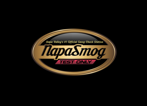
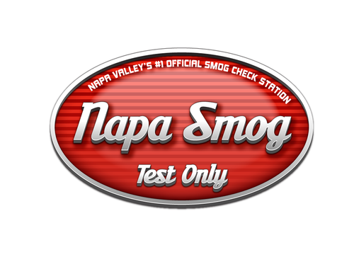
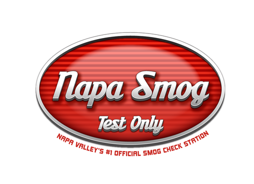
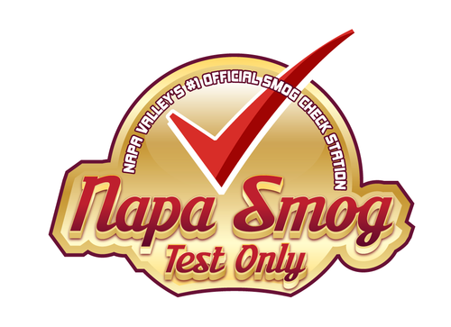
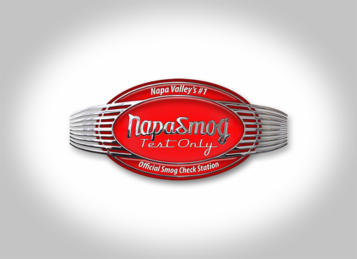
Napa Valley's #1 Official Smog Check Station
Yes
California licenses smog check stations to perform emissions test for cars, trucks, vans, etc. Napa Smog Test Only is one of them - located in a vintage 1950's style gas station in downtown Napa, California. We are a small business.
Automotive
Abstract Mark
![]()
Industry Oriented
Local/Neighborhood
Retro
I have included the signs and logos of the state program as these graphics often are added near our logo - they are red, white and blue so ours must be compatible but not identical. Although the program is "green" (smog removal) I do not want to use a green logo. Could be dark red, burgundy, navy blue, very dark gold - something that works in print and web.
not sure
The ABTS Milk font has some interesting symbols in it that can be added (see samples at myfont.com) to the retro look. It would be nice to have a dimensional feel to the name - metallic or raised in some way. Not too complex because this has to work as a logo on our website, on business cards, in mailer ads, in coupons - some tiny (all badly printed!) and other marketing materials. A completely flat design is not desirable.
The font includes regular, italic and bold versions - I am open to all depending on the graphic treatments added - right now I particularly like it in bold italic. It should be done in upper and lower case for the business name - the tag line can be in all caps if it looks better.
The overall shape of the logo should be a ratio of length to width that is approximately 3:1 since most uses of the logo fit that ratio.
If an automotive element is added to the design, it should not be a specific wheel or car part as we are not doing parts or repairs - just emissions testing.
It is best not to add clouds or smoke or other "smog" elements. Automotive - yes, pollution - no.
Related Contests