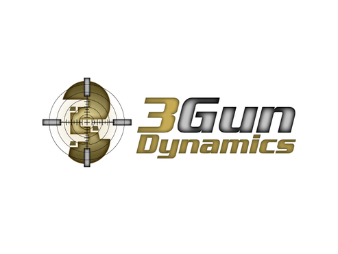
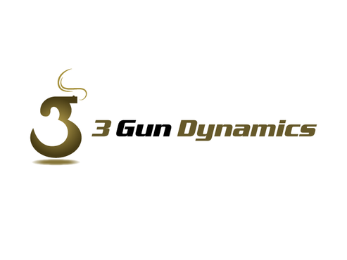
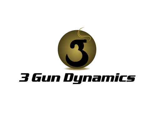
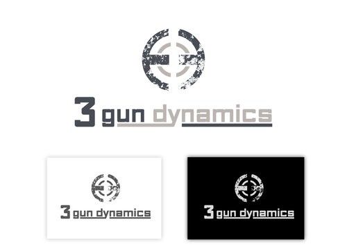
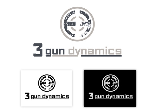
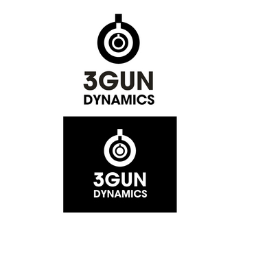
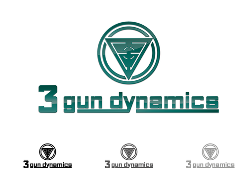
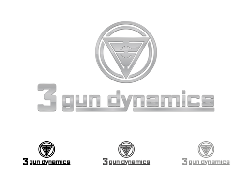
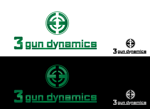
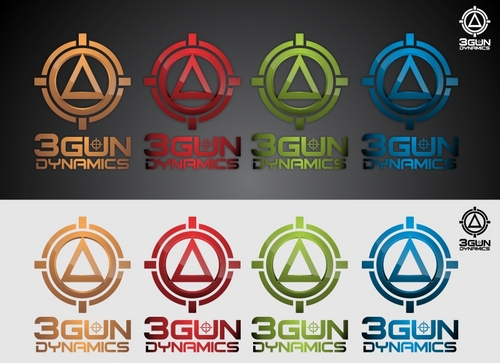
New Logo for 3 Gun Dynamics
3 Gun Dynamics
|
Contest Holder
cshreffler
?
Last Logged in : 5327days19hrs ago |
Concepts Submitted
97 |
Guaranteed Prize
200 |
Winner(s) | A Logo, Monogram, or Icon |
|
Live Project
Deciding
Project Finalized


Creative Brief
New Logo for 3 Gun Dynamics
3 Gun Dynamics
Yes
We are a firearms training company that train people in the use of pistols, rifles, and shotguns. We teach individuals of all skill levels about firearms safety, carrying concealed firearms, employing firearms for personal and home safety, the shooting sports, and the art of marksmanship.
We place a very high emphisis on safety and working with each individual at their skill level to help them improve. All of our instructors are certified, active in shooting sports, and have military or police backgrounds.
We are professional, open-minded, and cutting edge.
Our company name also includes the name of one of the fastest growing shooting sports in the united states called "3 Gun" where individual shooters compete against each other using a combination of pistol, rifle, and shotgun.
Sports
Symbolic
![]()
Abstract Mark
![]()
Web 2.0
![]()
Cutting-Edge
Unique/Creative
Clean/Simple
Modern
Industry Oriented
Serious
Abstract
Please be Creative...
not sure
We like the www.magpul.com logo. It uses a weapon sight idea but is not overly literal. Use of sights or crosshairs is overdone in the industry, but we like magpul's slightly different take on the idea. We also like the symbol's symmetry. Their logo also works great as a patch or as a logo on an instructor's shirt.
We would like our logo to work well on t-shirts and hats.
Related Contests