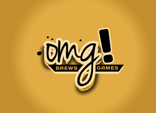
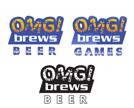
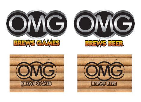
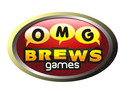
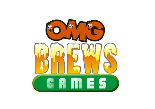
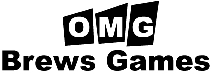
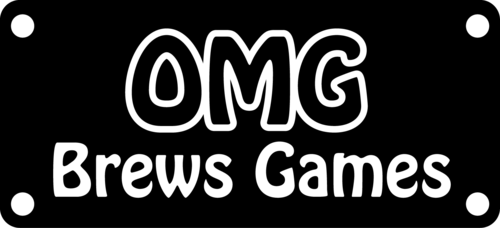
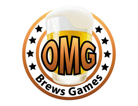
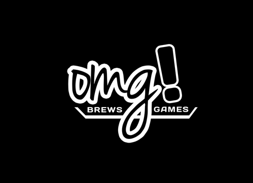
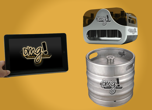
OMG Brews Business Logo
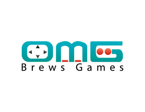
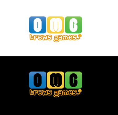
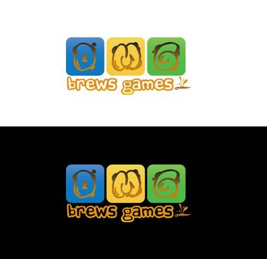
OMG Brews Games
|
Contest Holder
omgbrews
?
Last Logged in : 4179days12hrs ago |
Concepts Submitted
44 |
Guaranteed Prize
250 |
Winner(s) | A Logo, Monogram, or Icon |
|
Live Project
Deciding
Project Finalized
Creative Brief
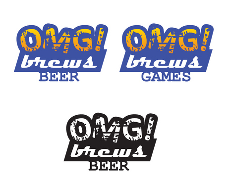
OMG Brews Business Logo
OMG Brews Games
Yes
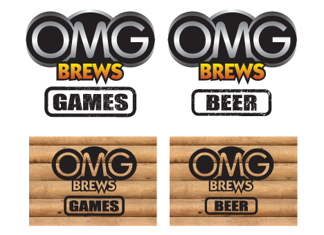
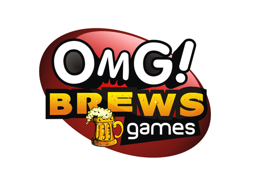
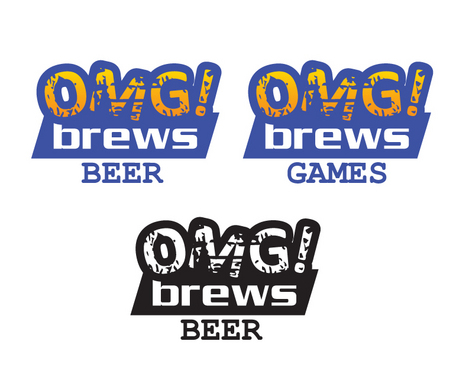
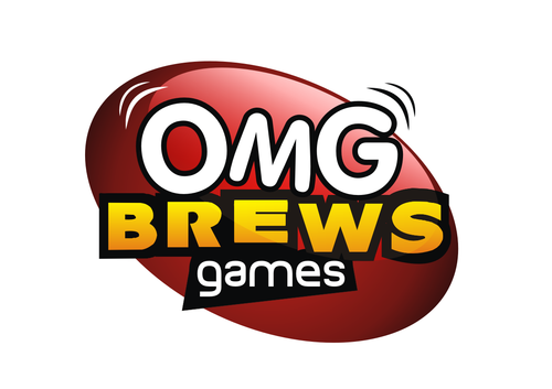
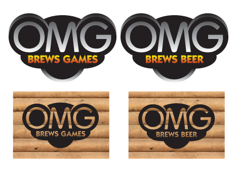
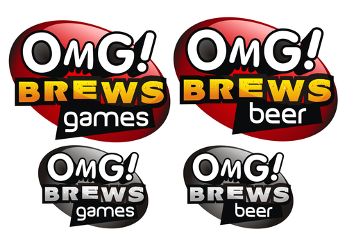
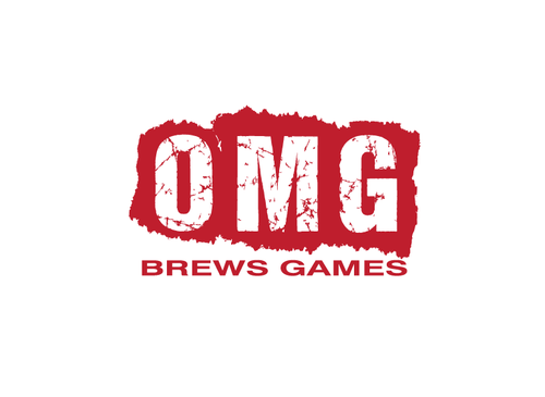
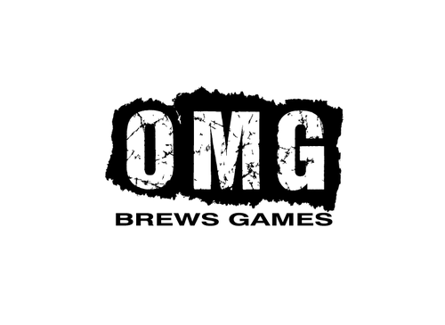
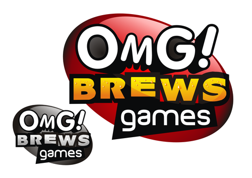
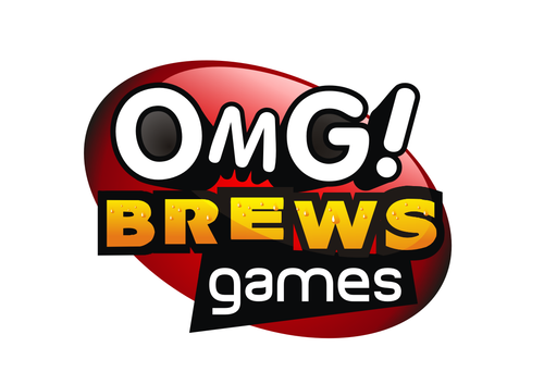
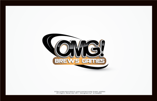
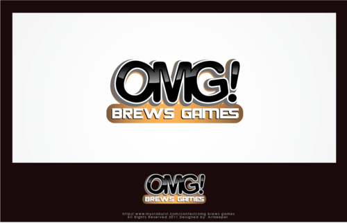
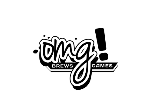
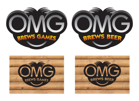
OMG Brews is a small game development company which usually produces tablet- and web-based games, but occasionally also brews beer.
This design will be placed on games' splash screens and on the company web site. A monochrome version will be stenciled onto beer crates and kegs.
Software
Logo Type
![]()
Abstract Mark
![]()
Web 2.0
![]()
Unique/Creative
Fun
not sure
The use of one or more exclamation marks is probably appropriate but not entirely necessary.
It would be nice if the design allowed for the word "Games" to be easily replaced with "Beer" when required.
Related Contests