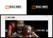
SALES / SUPPORT : +1-877-525-5646   |  


Picturesbyme.com

Picturesbyme - Attila Nyerges Photography

Contest Holder picturesbyme ?

Last Logged in : 1932days9hrs ago

Concepts Submitted

110

Guaranteed Prize
150
Winner(s)

1

A Logo, Monogram, or Icon veildAll design entries can be viewed by other designers.
tick_gray

Live Project

tick_gray

Deciding

tick_blue

Project Finalized


Project: Picturesbyme.com
Industry: Photography Logo
Contest Launched: May 15, 2011
Selected: 1 winning design from 110 concepts
Winning Design by: tiborhantal
Close Date: May 22, 2011


Picturesbyme.com - Photography


Awarded as a winner
Project Report    

Sort by:


#96

#92

#88

#102

#99

#97

#94

#91

#90

#83

#80

#87

#60

#33

#30

#29

#10


Creative Brief


Picturesbyme.com

Picturesbyme - Attila Nyerges Photography

No

I'm a photographer but can't put myself into a little box saying I only do portraits, landscapes, birds.. etc. I am focusing more on portrait and model shots lately.... The logo I am looking for needs to work as a watermark on all types of photos (portraits, landscapes, dark, bright). My website is www.picturesbyme.com, please feel free to browse trough the galleries. I am very flexible about the logo. I would use it as a watermark/logo on the site, favicon if it (or part of it) would work, got one already, kinda like it... Also I like simple things but again this could be a "first sight" thing.. I'm might looking for a long haired blonde then a readhead walks into my life and starts all kinds of sparks.. if you know what I mean... :)
I'd like the logo to be easy to recognize, read, remember. Not that big fan of handwriting fonts, my name is hard to remember already. On the other hand my name doesn't have to be in it but picturesbyme.com should. From childhood had a thing about Asia. I like the yin-yang idea. I did one with fire and ice/water on my site. (http://www.picturesbyme.com/f873601515) Like it but not married to it, it's hard to use it as watermark, too distracting.
Again hard to tell until we'll see some ideas to start from...

Photography

Logo Type
Logo Type

Symbolic
Symbolic

Abstract Mark
Abstract Mark

Initials
Initials

Illustrative
Illustrative

Character
Character

Web 2.0
Web 2.0


Cutting-Edge
Unique/Creative
Clean/Simple
Sophisticated
Modern
Industry Oriented
High Tech
Serious
Illustrative
Abstract
Geometric

no limits, it all depends on the end result.

not sure

Related Contests


Logo for professional photographer (photo & video production)
$200
Prize Money
122
Concepts
Logo for a Photography company
$200
Prize Money
84
Concepts
Drone Photography / Video Company Logo
$200
Prize Money
103
Concepts
The original (branding stamp)
$199
Prize Money
40
Concepts

Discussion


Comments

  • May 23, 2011 9:59 AM
    uzumaki uzumaki
     
    hehehe..^^it's your choise to pick the best one^^ if not my design maybe it's between tiborhantal and jawadd50d..hahaha..:D goodluck guys! love the recent feedback...so true!^^

    Like Icon 0   DislikeIcon 0
  • May 22, 2011 9:32 PM
    picturesbyme picturesbyme
      Project Holder
    2 similar links... riiight... OK. I'll play :) @shuriken ?? New acct? I haven't seen anything from you. If you are a talented designer why didn't you submitted anything? This project could use some originality like yours :), but you are right. Cheers. @Uzumaki look around on this site. I found 100s of similar designs to existing ones. Not the same but they have globes, trees, dogs, houses etc. on them. That's not my main problem. I still like 100. It has all that I was looking for, yin yang, related to photography, easy to read, can be used for favicon, has multiple versions for diff background..etc. What bugs me is the -lack of attention to details, expectations. None reads, listen. -several of the drafts were practically the same. Same idea, same fonts. Look at #55, #52 #30 #29 #1 and a lot more what I have already eliminated. -It seems like several designers have multiple accounts or they have no problem copying others. -I was also harassed during the contest (from the beginning) several times to close early to support the designer. -Customer support is nonexisting, 1 email after 24 hours while it states 12? -No drafts for 3 days? -Lost another one for maintenance? -Support doesn't have the decency to extend? Now that's messed up. What's sad is that there were a couple of drafts I really liked but had no dark/bright versions so I can't use them.. shame that the designers didn't care to make one.. OTOH hats off for the ones who made several versions. Thanks for them! OK. Off to pick one from this original selection... :)

    Like Icon 0   DislikeIcon 0
  • May 22, 2011 8:38 PM
    shuriken shuriken
     
    entry #100 and the rest of it too much like -----> http://www.google.com.ph/imgres?imgurl=http://www.bayandbasincameraclub.org.au/logo/logo300.jpg&imgrefurl=http://www.bayandbasincameraclub.org.au/logo.html&usg=__ameAE9YOaOiqm8o6F4JTCJvbzhQ=&h=300&w=300&sz=69&hl=tl&start=49&zoom=1&tbnid=PahmUxFt2GqT_M:&tbnh=153&tbnw=153&ei=L7nZTYLcBYm8uwOo6-2jBw&prev=/search%3Fq%3Dcamera%2Blogo%26um%3D1%26hl%3Dtl%26sa%3DN%26biw%3D1366%26bih%3D667%26tbm%3Disch0%2C1003&um=1&itbs=1&iact=hc&vpx=146&vpy=201&dur=6707&hovh=225&hovw=225&tx=140&ty=80&sqi=2&page=3&ndsp=18&ved=1t:429,r:0,s:49&biw=1366&bih=667 no originality at all..:P..cheers guys!!!^^

    Like Icon 0   DislikeIcon 0
  • May 22, 2011 8:28 PM
    uzumaki uzumaki
     
    http://www.google.com.ph/imgres?imgurl=http://www.deviantart.com/download/100874994/iceman_photography_logo_V_03_by_3LgoRdo.jpg&imgrefurl=http://www.deviantart.com/deviation/100874994/&usg=__9W-cgQdPoCgm6wuamsLx7acPYqc=&h=2480&w=3508&sz=240&hl=tl&start=0&zoom=1&tbnid=jGmeHpNeHROdOM:&tbnh=124&tbnw=182&ei=5rbZTYvPNY_EvQPwhMmjBw&prev=/search%3Fq%3Dphotography%2Blogo%26um%3D1%26hl%3Dtl%26biw%3D1366%26bih%3D667%26tbm%3Disch0%2C100&um=1&itbs=1&iact=rc&dur=430&sqi=2&page=1&ndsp=24&ved=1t:429,r:14,s:0&tx=107&ty=80&biw=1366&bih=667

    Like Icon 0   DislikeIcon 0
  • May 21, 2011 10:37 PM
    picturesbyme picturesbyme
      Project Holder
    :) I thought Attila (the Hun) would be a hint.. :) The #83 is awesome! only my name is very close to the Y from the "by"

    Like Icon 0   DislikeIcon 0
  • May 21, 2011 10:12 PM
    uzumaki uzumaki
     
    hahaha..lolz...:D all I thought you are a gurl..hehehe..forgive me sir..^^

    Like Icon 0   DislikeIcon 0
  • May 21, 2011 10:10 PM
    picturesbyme picturesbyme
      Project Holder
    #79 OK. The font is better. The only thing about this one is that I am a man so that "me" and part of the logo being pink is a bit (way) too liberal :) - according my Gf. Maybe another - darker blue or darker purple...? Frankly I see logos everywhere now if I close my eyes.. :)

    Like Icon 0   DislikeIcon 0
  • May 21, 2011 9:41 PM
    picturesbyme picturesbyme
      Project Holder
    @uzumaki Pls look at my site for a sec. do you think that pink goes with it or should it be darker. I think a font between the #73 and #63 would work, the last one (76) a bit bold.

    Like Icon 0   DislikeIcon 0
  • May 21, 2011 8:08 PM
    picturesbyme picturesbyme
      Project Holder
    #70 is very close, however just like in an earlier case I was wrong again. #63 - the original - looks a bit better, and if you would have a font a bit closer to that but still more easier to read that would be awesome. 70 is good and all just that font reminds me of school... not the 1st I want my site to remind me every day if you know what I mean.. :)

    Like Icon 0   DislikeIcon 0
  • May 21, 2011 8:03 PM
    picturesbyme picturesbyme
      Project Holder
    @uzumaki Thanks. It's my interest too to get this right, as well as the winner's ;) I'll be still using this logo when the winner already spent the $$s on fancy cars, and private jets.. :) Actually I feel bad I couldn't offer more but this time this is all I had. Once I will be famous I'll be back. In the meantime I thank you for everyone the work. I had a few spark-moment but none really got into flames yet... While I still hope till the last sec. soon I will announce the one we/I liked the most.

    Like Icon 0   DislikeIcon 0
  • May 21, 2011 6:20 PM
    uzumaki uzumaki
     
    hahahaha!:D thumbs up for the PH for his/her consistent feedback!!^^..hehehe not all PH are kind like you!:P

    Like Icon 0   DislikeIcon 0
  • May 21, 2011 2:31 PM
    picturesbyme picturesbyme
      Project Holder
    #68 #69 I like both, 69 is less busy which is better in case I would use it for favicon, yet somehow... hard to explain it but i'd like the customers to have a confident more serious feel that they will get a pro quality photo from the session. While I like the polaroid for its easy recognition it also makes it more toy like..

    Like Icon 0   DislikeIcon 0
  • May 21, 2011 2:30 PM
    picturesbyme picturesbyme
      Project Holder
    #63 :) never mind the comment on the diff backgrounds... I typed faster than I looked

    Like Icon 0   DislikeIcon 0
  • May 21, 2011 1:06 PM
    picturesbyme picturesbyme
      Project Holder
    #63 Might be the best one yet except the font is a bit hard to read. I wonder if you could make some versions to see how it would work on darker/brighter and B&W photos. I like that this is a bit more unique and not just a modded clipart. Thanks for that.

    Like Icon 0   DislikeIcon 0
  • May 21, 2011 8:31 AM
    picturesbyme picturesbyme
      Project Holder
    @aldila87 Your design is cool but maybe too cool. I am not that cool urban shooter dude that logo would perfect for. I explained my idea of it and you can see my ratings go towards more simple versions. Thank you though.

    Like Icon 0   DislikeIcon 0
  • May 21, 2011 8:29 AM
    picturesbyme picturesbyme
      Project Holder
    While I like a few designs I still haven't seen one that I would jump for. Hope more designers will chime in in the last min. Also I mentioned this in private messages: I won't close early for anyone. This project didn't start for 3 days and now the last one is gone for maintenance. I lost 4 days out of 7. I like #56 the most at this moment. If you look at the ap.ring it's perfect. I also like the diff. color. I thought the blue is the best but it has to appeal to women from 15 to 50 and many of my lady friends prefered the purple. I hope more versions will come as this is not usable on black background or on b&w photos and my site is black. I would love to see more versions, a few diff. colors, an ap ring with diff color leaves inside, and app ring with 6 leaves with 6 shades...etc .

    Like Icon 0   DislikeIcon 0
  • May 20, 2011 10:11 PM
    aldila87 aldila87
     
    how bout my design

    Like Icon 0   DislikeIcon 0
  • May 20, 2011 10:33 AM
    picturesbyme picturesbyme
      Project Holder
    #56 that's a good idea. I haven't seen that color coming but it's not bad at all, not too feminine but still... How would it look on a dark image? Would there be a version for dark only or 1 version that works on both?

    Like Icon 0   DislikeIcon 0
  • May 20, 2011 7:01 AM
    picturesbyme picturesbyme
      Project Holder
    #54 I like the idea just not sure about the fonts.

    Like Icon 0   DislikeIcon 0
  • May 20, 2011 1:37 AM
    picturesbyme picturesbyme
      Project Holder
    Thank you for all your hard work so far. I'm still waiting for that Spark but have some very serious favs. The same time I ask my associates, friends frequently about their thoughts. According the latest "poll": - #43 #44 I was wrong the original looks better, minus the ap. ring. - I was told to forget the yin yang in this form, it won't rhyme... makes me sad a bit.. - s.one had an idea to turn 3 of the ap.blades to a lighter, and 3 to a darker shade of grey. Who knows, it might work. - most people liked #46 #29 for all kinds of photos except Black&White - for B&W the favs are: #30 #34 #40. - #46 the y from the "photog." and the y from the "by" are a bit too close. It's that time again here. Good night everyone.

    Like Icon 0   DislikeIcon 0
  • May 19, 2011 1:09 PM
    picturesbyme picturesbyme
      Project Holder
    Thought someone will use that yin yang idea I mentioned in the brief.. I guess none thought it's good... the reason I started that is that I like to show both sides of people (naughty/nice) and things (dark/bright, simple/complicated, natural/photoshopped..etc.) just had no idea how to use that symbol related to photography...

    Like Icon 0   DislikeIcon 0
  • May 19, 2011 12:43 PM
    picturesbyme picturesbyme
      Project Holder
    #41 and #42 is as good as it gets from that idea. #43 looks promising, maybe with the focus area corners on the opposites corners and the name in a diff. color. This is my first project so I have no clue how it works. Would the design include 1 logo in 2 versions that works on both shades (darker, brighter) images like #1 and #35 or I get 1 logo 1 version and that has to work on everything? Hope someone has info on this b/c #41 - while I love it - wouldn't work on black and #42 wouldn't work on white images.

    Like Icon 0   DislikeIcon 0
  • May 19, 2011 12:31 PM
    picturesbyme picturesbyme
      Project Holder
    Because I am doing 5 things - at any given moments :) - I completely forgot to check my inbox here. I apologize (!) to the designers who sent me messages. Since we still have 2 and a half days and I see more and more designs I like I cannot yet finalize the project. Also I would encourage you to ask questions and I'll do my best to answer them as quick as possible.

    Like Icon 0   DislikeIcon 0
  • May 19, 2011 12:26 PM
    picturesbyme picturesbyme
      Project Holder
    Colors: I am a man and the site would need to appeal to all types but mainly to ladies who are interested in a portrait or model shoot. For that reason I don't want it be too masculine but again I am guy and not that crazy about red, pink, green, yellow unless it's a dress on a model :) I know my site has a lot of blue and maybe that's why the yellow fonts, however some of the photos are changing randomly and some will change by me by time so if you think that yellow would look best I would go towards gold like #18 #29.

    Like Icon 0   DislikeIcon 0
  • May 19, 2011 12:19 PM
    picturesbyme picturesbyme
      Project Holder
    #31 #38 Like I said I like both but the w.mark needs to work on all kinds of photo. My site (at zenfolio) automatically places the w.mark on the photo and if the subject is in the middle these are too distracting.

    Like Icon 0   DislikeIcon 0