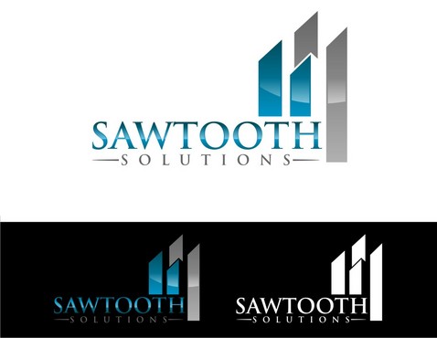
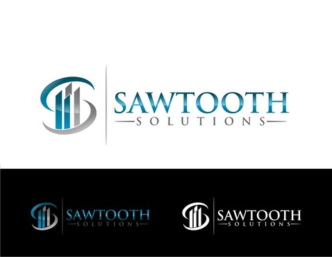
Re-Design of our LOGO (Update the Look)
Sawtooth Solutions
|
Contest Holder
lbepster6
?
Last Logged in : 4450days5hrs ago |
Concepts Submitted
127 |
Guaranteed Prize
300 |
Winner(s) | A Logo, Monogram, or Icon |
|
Live Project
Deciding
Project Finalized

Creative Brief
Re-Design of our LOGO (Update the Look)
Sawtooth Solutions
No
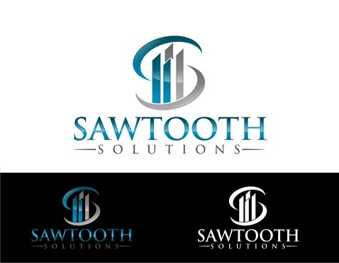
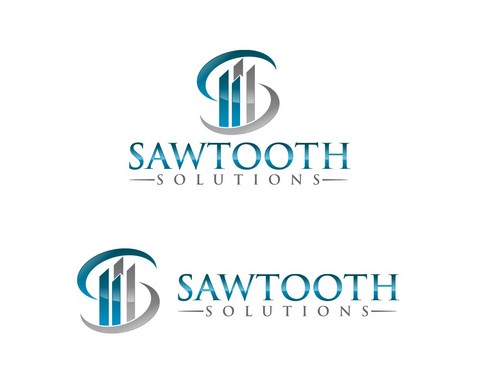
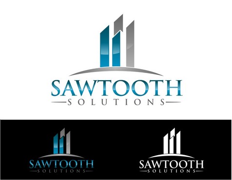
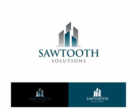
This is a RE-DESIGN. goto our website at www.sawtootham.com to see the current logo. Sawtooth is a firm that offers Investment Advisors back and middle office support, as well as Asset Management. Sawtooth is named after a small (very small) mountain range in Norther Minnesota by Lake Superior. The initial logo is to convey both the nountains and the gently sloping "return" of a clients investment portfolio (say 8% incline and 8% return).
We love the STEEL look and feel, Sawtooth is like a TECH COmpany, but slightly more refined!!
Financial Services
Abstract Mark
![]()
Cutting-edge
High Tech
Rustic
Blues and Cold Steel (like a Saw) Maybe Brushed Steel? Metalic Silver?
not sure
Just want to update this Logo. We have 2 Companies with same Logo, different names. Sawtooth Asset Management and Sawtooth Solutions. Maybe one slightly different for Sawtooth Solutions? I can envision Techy meets Rustic
Related Contests