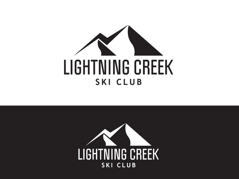
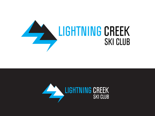
SALES / SUPPORT : +1-877-525-5646   |  


Ski Club Logo

Lightning Creek Ski Club

Contest Holder sueski ?

Last Logged in : 4498days6hrs ago

Concepts Submitted

75

Guaranteed Prize
250
Winner(s)

1

A Logo, Monogram, or Icon veildAll design entries can be viewed by other designers.
tick_gray

Live Project

tick_gray

Deciding

tick_blue

Project Finalized


Project: Ski Club Logo
Industry: Sports Logo
Contest Launched: Nov 15, 2011
Selected: 1 winning design from 75 concepts
Winning Design by: artkeeper
Close Date: Nov 28, 2011


Ski Club Logo - Sports


Awarded as a winner
Project Report    

Sort by:


#55

#33

#25

#18

#74

#68

#63

#60

#59

#54

#47

#40

#27

#10

#62

#57

#14

#75

#73

#72

#67

#66

#65

#64

#61


Creative Brief


Ski Club Logo

Lightning Creek Ski Club

Yes

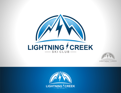
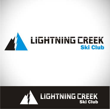
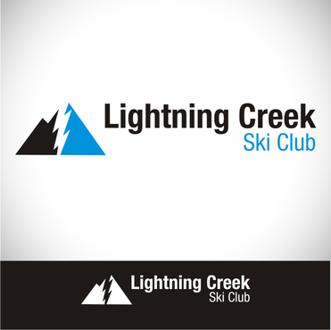
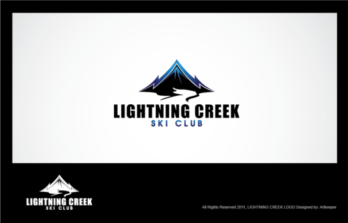
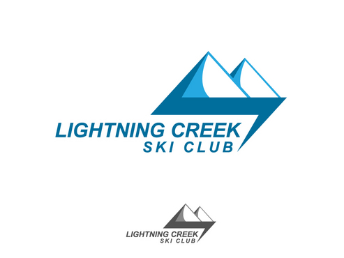
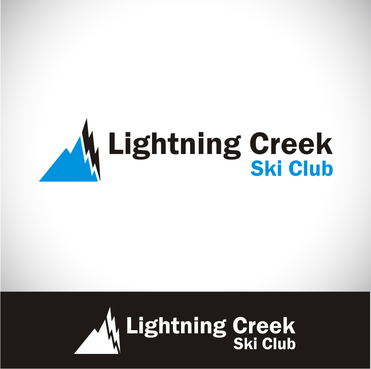
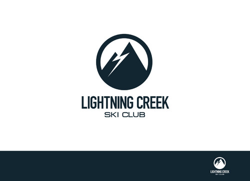
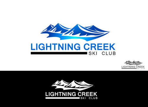
We are looking for a logo for our Downhill Ski Club. Our members are kids aged 4-18 and their families. We are a race club, so fun and fast should be portrayed. We will be putting our logo, on hats, race bibs, stickers, letterhead etc. We want our logo to use have the words "Lightning Creek Ski Club" and also incorporate a lightning bolt.

Sports

Logo Type
Logo Type

Abstract Mark
Abstract Mark


Clean/Simple
Outdoors/Natural
Fun
Youthful

2

Related Contests


Vivint
$300
Prize Money
95
Concepts
Logo for Golf Fitness program
$200
Prize Money
113
Concepts
Logo for a unique soccer training program
$200
Prize Money
36
Concepts
Gladiadores F.C. soccer logo
$200
Prize Money
49
Concepts

Discussion


Comments

  • November 26, 2011 2:48 PM
    sueski sueski
      Project Holder
    #47 I like your design. May I see it without the moon behind the mountains? Thank you

    Like Icon 0   DislikeIcon 0
  • November 22, 2011 8:32 PM
    sueski sueski
      Project Holder
    #54 I really like your design, but I am curious to see it in black and white?

    Like Icon 0   DislikeIcon 0
  • November 21, 2011 10:32 PM
    sueski sueski
      Project Holder
    #36 like how you integrate the bolt and creek. Looks good.

    Like Icon 0   DislikeIcon 0
  • November 21, 2011 10:30 PM
    sueski sueski
      Project Holder
    #6 can you put your mountain from #17 with #6 font please. I like the new taller mountain with a full lightning bolt. Thanks

    Like Icon 0   DislikeIcon 0
  • November 21, 2011 10:28 PM
    sueski sueski
      Project Holder
    #26 can we try a different font. The K's look similar to H's. Like the overall idea.

    Like Icon 0   DislikeIcon 0
  • November 20, 2011 10:05 PM
    sueski sueski
      Project Holder
    Could we see #18 without the little Lightning bolt between the word "Lightning" and "creek"?

    Like Icon 0   DislikeIcon 0
  • November 20, 2011 11:23 AM
    sueski sueski
      Project Holder
    #17 The mountain and bolt are better, but the font could still use some work.

    Like Icon 0   DislikeIcon 0
  • November 18, 2011 6:38 PM
    sueski sueski
      Project Holder
    #6 would you please make the mountain taller to create a point at the bottom of the lightning bolt and try a couple different fonts on Lightning Creek. Thanks, looks good

    Like Icon 0   DislikeIcon 0
  • November 18, 2011 3:11 PM
    sueski sueski
      Project Holder
    #14 and #15 can we see these with less contrasting colors. Love the skier, good form!

    Like Icon 0   DislikeIcon 0
  • November 18, 2011 11:44 AM
    sueski sueski
      Project Holder
    Keep them coming guys, we are excited to see what you can do!! Just think, one day one of our skiers will be a world class racer! ( actually one of our alumni already is!!!!)

    Like Icon 0   DislikeIcon 0
  • November 18, 2011 11:42 AM
    sueski sueski
      Project Holder
    #9 could we try a different skier?

    Like Icon 0   DislikeIcon 0
  • November 18, 2011 9:06 AM
    sueski sueski
      Project Holder
    Can we change up the font on #4 and #5 and maybe have a bit more space between the words "lightning" and "Creek"

    Like Icon 0   DislikeIcon 0
  • November 18, 2011 9:03 AM
    sueski sueski
      Project Holder
    I like the clean and clear look of #6 and #7

    Like Icon 0   DislikeIcon 0
  • November 17, 2011 4:59 PM
    sueski sueski
      Project Holder
    #3 could you switch the lines of text around ( "Lightning Creek" on top) and spell Lightning correctly. Also the mountain looks a bit like a wave.

    Like Icon 0   DislikeIcon 0
  • November 17, 2011 1:25 PM
    sueski sueski
      Project Holder
    We would like the Lightning Bolt to be more prominent on #1. and the Skiers proportions are a bit off. Arms, legs, head etc

    Like Icon 0   DislikeIcon 0