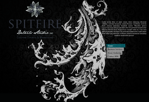
Spitfire Details Studio Website
looking for wow/drama
|
Contest Holder
MCarden
?
Last Logged in : 4364days5hrs ago |
Concepts Submitted
73 |
Guaranteed Prize
430 |
Winner(s) | Web Design |
|
Live Project
Deciding
Project Finalized


Creative Brief
Spitfire Details Studio Website
looking for wow/drama
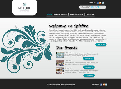
Events
www.spitfiredetails.com
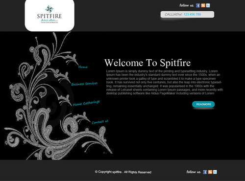
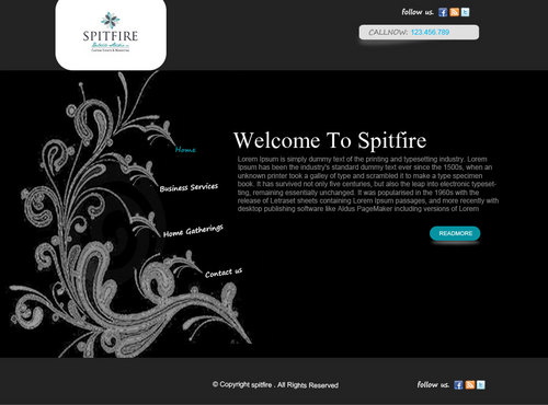
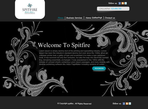
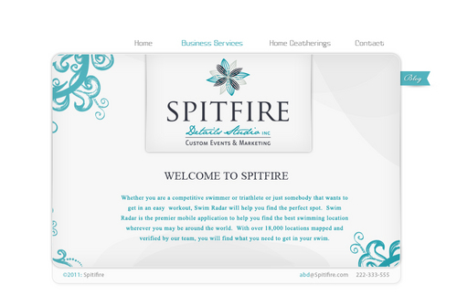
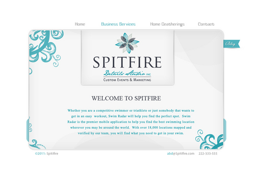
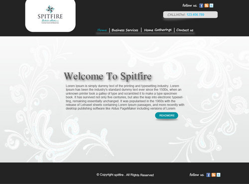
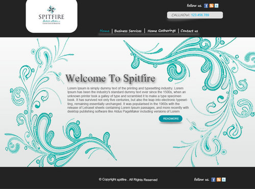
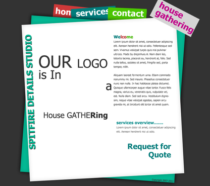
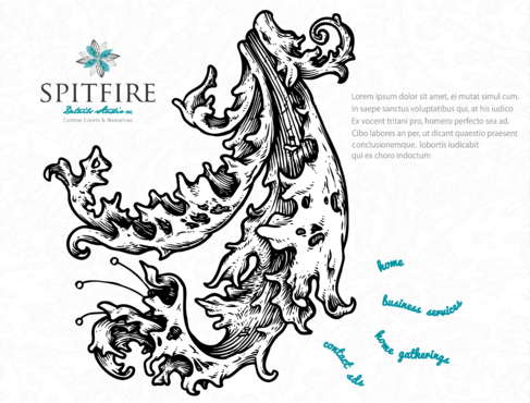
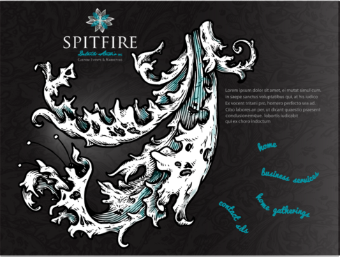
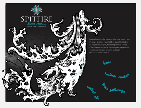
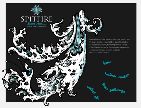
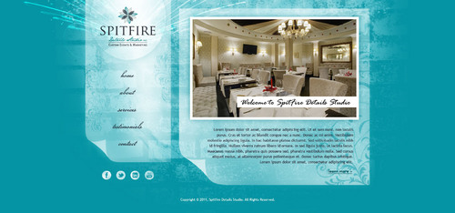
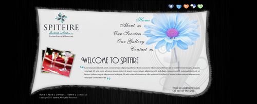
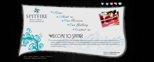
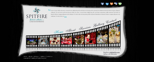
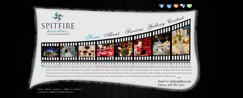
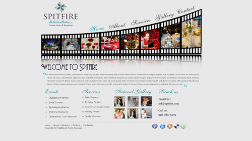
Based in Greater Boston, Spitfire Details Studio is a boutique custom events and marketing firm.
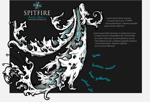
Looking for dramatic layout/bold. Clean and simple...DRAMA/showstopper! I like texture would prefer navigation to be unique - located in a new place/different layout -- unexpected I WANT A VERY UNIQUE LAYOUT Don't like: anything ordinary/hate wehn things feel "flat"
Unique/Creative
Clean/Simple
Sophisticated
Modern
Elegant
Black
Teal (the exact teal of my logo)
White and dark Grey accents (from my logo)
right side
http://www.kimberlycoles.com/
http://www.amoderngarden.com/
http://www.emotionslive.co.uk/
drama wins. I will not have much "copy" cluttering up my website, The look of the website needs to be a showstopper. other websites: http://www.popmatik.co.uk/ (unique layout) http://www.evanescenceuk.co.uk/index4.php http://www.ngenworks.com/
Related Contests