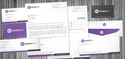
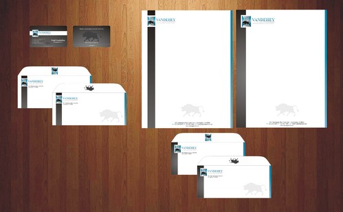
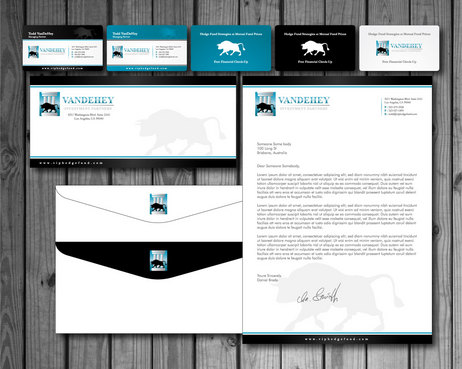
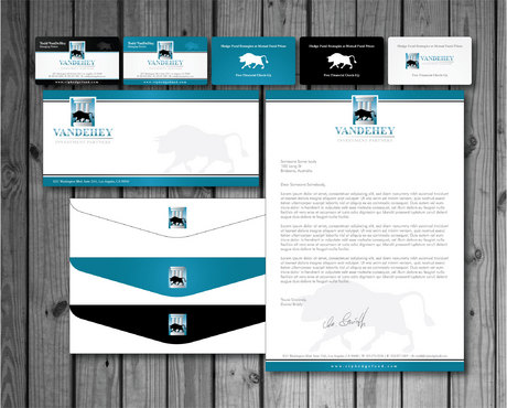
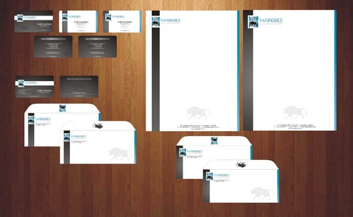
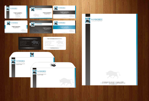
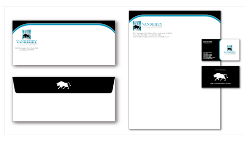
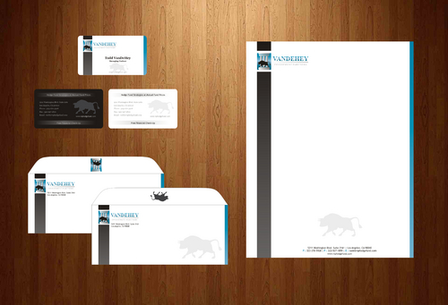
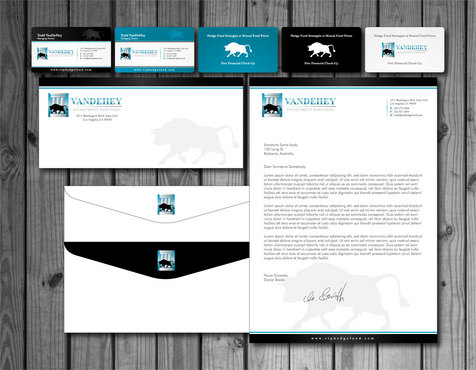
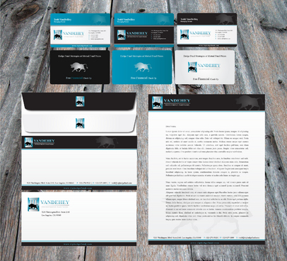
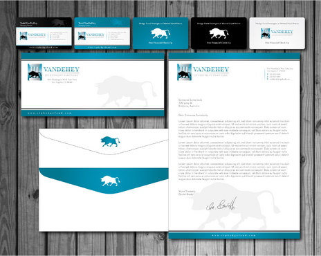
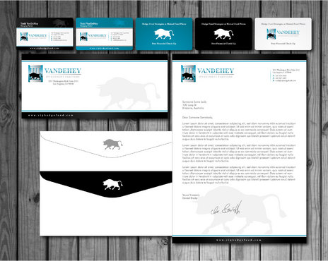
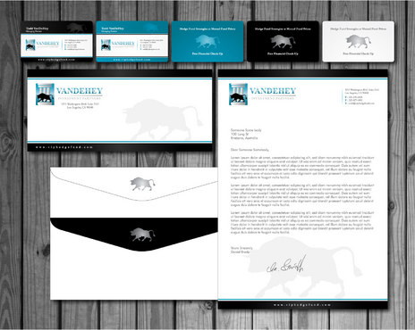
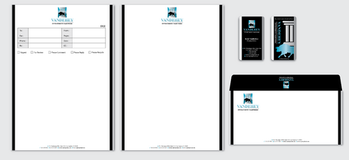
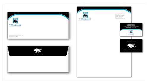
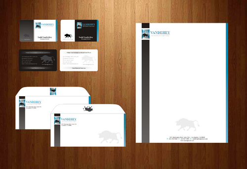
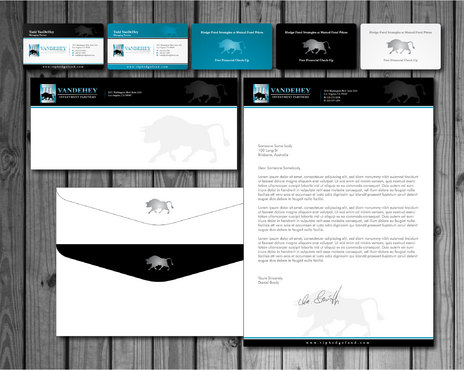
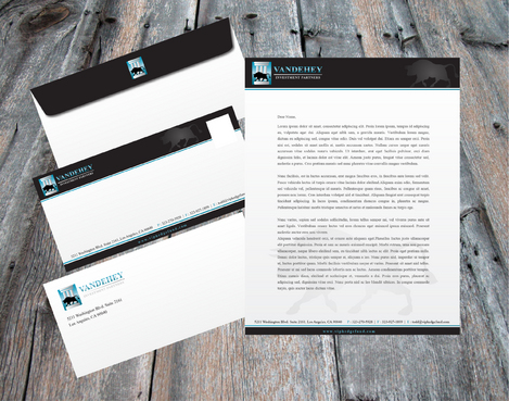
Stationary and Business Cards VIP Hedge Fund
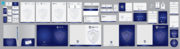
Stationary, Envelopes, Business Cards
|
Contest Holder
toddvandehey
?
Last Logged in : 5261days10hrs ago |
Concepts Submitted
124 |
Guaranteed Prize
150 |
Winner(s) | Business Cards and Stationery |
|
Live Project
Deciding
Project Finalized


Creative Brief
Stationary and Business Cards VIP Hedge Fund
Stationary, Envelopes, Business Cards
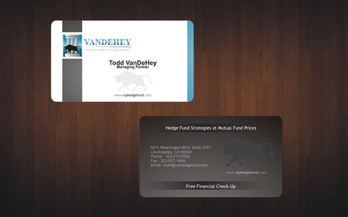
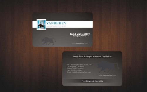
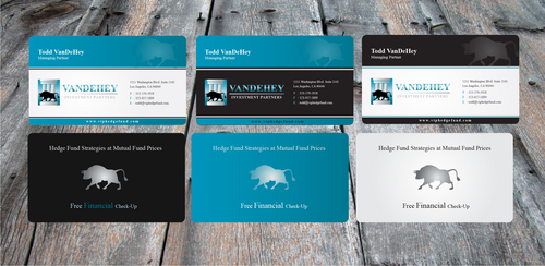
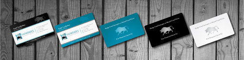
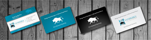
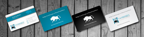
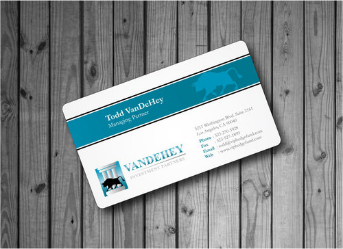
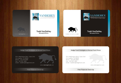
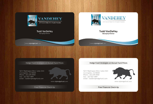
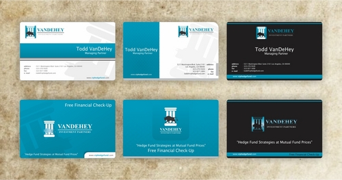
I need double sided standard sized Business Card [3.5" x 2"]
Use standard fonts
Cutting-Edge
Corporate
Traditional
Professional
Todd VanDeHey
Managing Partner
5211 Washington Blvd. Suite 2161 Los Angeles, CA 90040
323-270-5928
323-927-1899
todd@viphedgefund.com
viphedgefund.com
Design should be similar to the informational side of the business card (with bull silhouette) I had designed previously (uploaded), but with colors matching my website colors of black+white+blue (see previous contest and also uploaded).
Should contain the following: -Company Logo (uploaded) -The Slogan "Hedge Fund Strategies at Mutual Fund Prices" -And the offer "Free Financial Check-Up"
Financial Services
Related Contests