The Laundry Cafe
The Laundry Cafe
|
Contest Holder
tyroneakins1
?
Last Logged in : 572days3hrs ago |
Concepts Submitted
267 |
Guaranteed Prize
400 |
Winner(s) | A Logo, Monogram, or Icon |
|
Live Project
Deciding
Project Finalized


Creative Brief
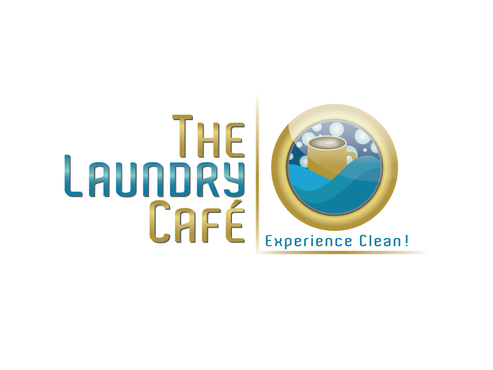
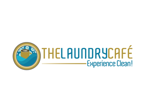
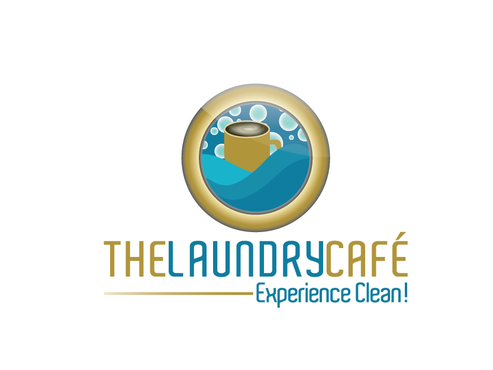
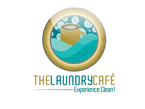
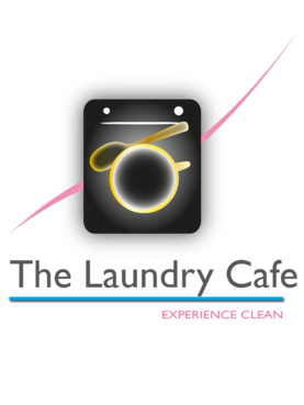
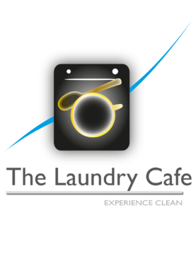
The Laundry Cafe
The Laundry Cafe
Experience Clean!
Yes
The Laundry Cafe is an upscale, technologically advanced laundromat providing customers with free wifi, the most efficient washers and dryers, cafe seating with coffee and other snacks and beverages in a comfortable environment.
Cleaning
Logo Type
![]()
Symbolic
![]()
Initials
![]()
Web 2.0
![]()
Cutting-Edge
Unique/Creative
Clean/Simple
Modern
Local/Neighborhood
High Tech
Rich teal (open to multiple shades), blue, and gold.
3
Name and logo will be used for outdoor store signage, as well. Must pop and be noticed. Thanks!
Related Contests