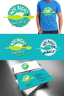
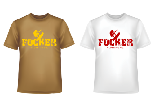
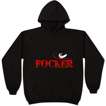
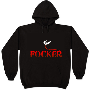
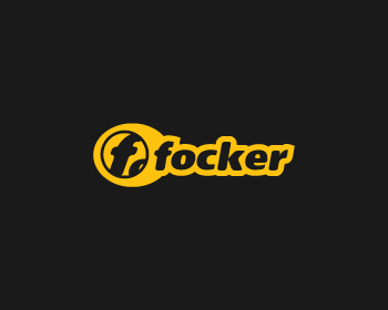
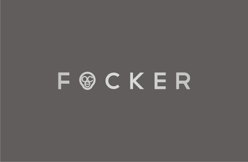
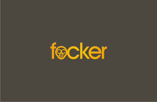
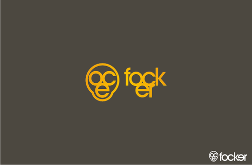
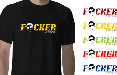
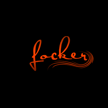
apparel logo/business logo - Focker
Focker
|
Contest Holder
tomosouthy
?
Last Logged in : 2630days2hrs ago |
Concepts Submitted
70 |
Guaranteed Prize
200 |
Winner(s) | A Logo, Monogram, or Icon |
|
Live Project
Deciding
Project Finalized

Creative Brief
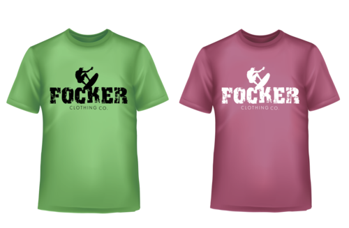
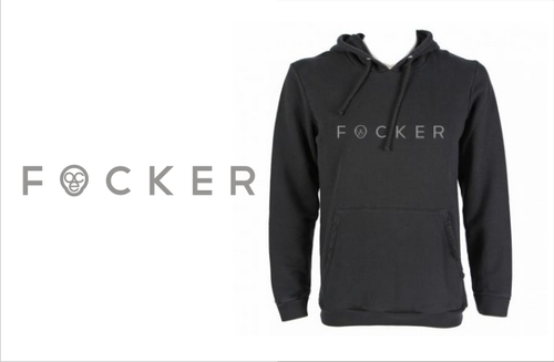
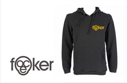
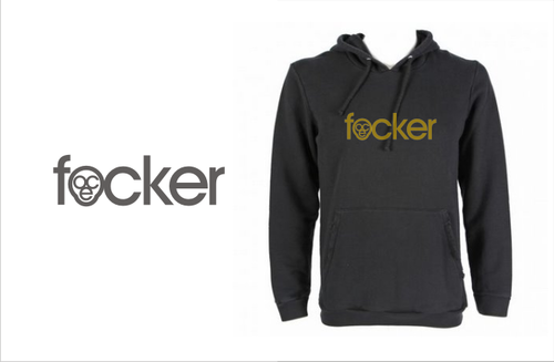
apparel logo/business logo - Focker
Focker
clothing co.
No
Apparel range
current and fun
Aimed at students/young adults (mostly male)
Can include the tag line but not a necessity.
Apparel
Logo Type
![]()
Symbolic
![]()
Abstract Mark
![]()
Initials
![]()
Cutting-Edge
Unique/Creative
Modern
Industry Oriented
Fun
Youthful
Abstract
any colors that suit a dark background
not sure
The design needs to be suitable for screen printing and embroidery.
Related Contests