Business Logo - Migration Line
Migration Line
|
Contest Holder
vc0151
?
Last Logged in : 5137days8hrs ago |
Concepts Submitted
172 |
Guaranteed Prize
300 |
Winner(s) | A Logo, Monogram, or Icon |
|
Live Project
Deciding
Project Finalized

Creative Brief
Business Logo - Migration Line
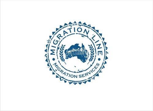
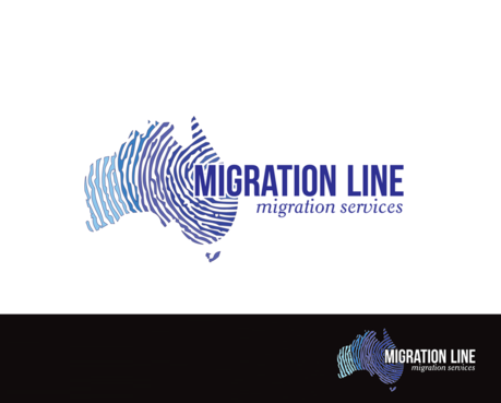
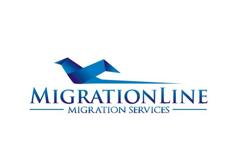
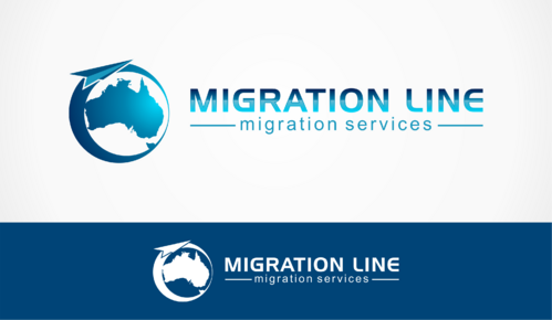
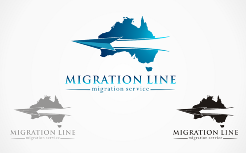
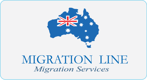
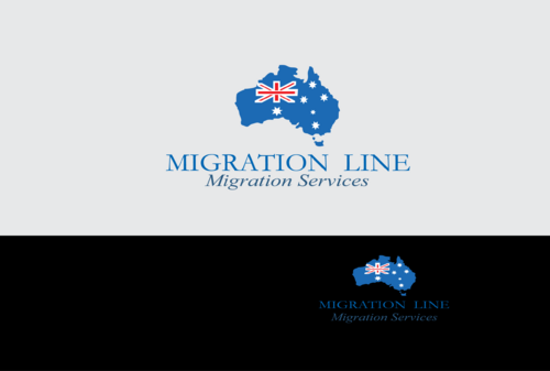
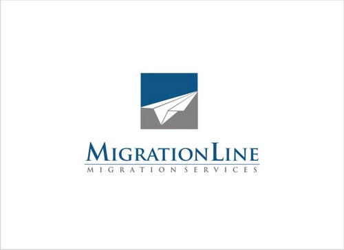
Migration Line
migration services
Yes
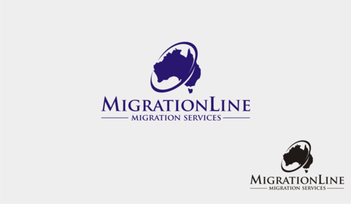
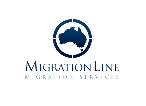
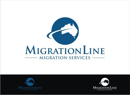
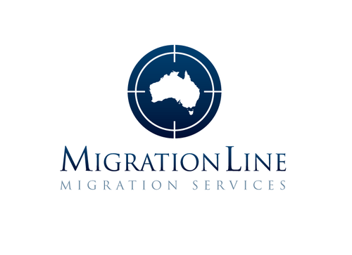
The design is for Migration Line, a company of registered Australian Migration Agents who's goal is to provide migration advice and assistance to people applying for a visa to enter Australia.
Our clients are mostly based outside Australia and range from skilled professionals, students, tourists, performers, family members and anyone else seeking to come to Australia.
Consulting
Logo Type
![]()
Symbolic
![]()
Abstract Mark
![]()
Web 2.0
![]()
Cutting-Edge
Unique/Creative
Sophisticated
Corporate
Modern
No preference. However the logo needs to recognisable if printed in black and white.
not sure
Please do NOT use symbols that will give the logo a travel agency feel.
We are looking for more of an immigration/passport/visa feel to it.
We are open to the idea of the text "Migration Line" being one word. Maybe to have the word "migration" in one color and the word "line" in another or the M and L being capitals.
Please note, which ever technique is used, the name should have a clear distinction that it is "Migration Line" and NOT "Migrati Online" (we've had people missreading our name).
Related Contests


