Gold Buyer Logo Design
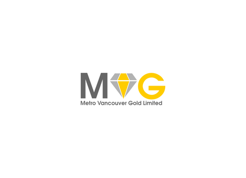
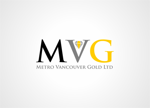
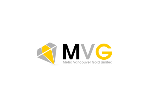
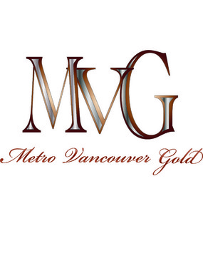
Metro Vancouver Gold Limited
|
Contest Holder
smoosh
?
Last Logged in : 4876days18hrs ago |
Concepts Submitted
125 |
Prize Money
250
|
Winner(s) | A Logo, Monogram, or Icon |
|
Live Project
Deciding
Project Finalized

Creative Brief
Gold Buyer Logo Design
Metro Vancouver Gold Limited
Yes
We are a precious metals buyer (gold, silver, platinum) and we also deal in antique jewellery, high end watches and diamonds.
The logo will be used on our upcoming website (being designed now), on our business cards and stationary as well as embroidered on clothing.
We do use the company initials (MVG) as well. If you would like to incorporate this in to the logo, that would be fine.
Jewelry
Symbolic
![]()
Abstract Mark
![]()
Illustrative
![]()
Clean/Simple
Corporate
Modern
Illustrative
Masculine
Artist's choice
not sure
We do not wish to have a full gold logo. I find it too literal. Use of the color gold in the logo is acceptable.
Related Contests