SALES / SUPPORT : +1-877-525-5646   |  


Modern Technical services consulting firm

Cobrin Engineering

Contest Holder spidermonkey ?

Last Logged in : 1604days20hrs ago

Concepts Submitted

653

Guaranteed Prize
250
Winner(s)

1

A Logo, Monogram, or Icon veildAll design entries are veiled from other designers till the end of the contest.
tick_gray

Live Project

tick_gray

Deciding

tick_blue

Project Finalized


Project: Modern Technical services consult ...
Industry: Consulting Logo
Contest Launched: Oct 22, 2016
Selected: 1 winning design from 653 concepts
Winning Design by: Graphicon
Close Date: Nov 08, 2016


Modern Technical services consulting firm - Consulting


Awarded as a winner
Project Report    

Sort by:


#394

#393

#370

#331

#330

#324

#284

#234

#225

#224

#223

#186

#185

#184

#183

#169

#140

#138

#56

#52

#27


Creative Brief


Modern Technical services consulting firm

Cobrin Engineering

No

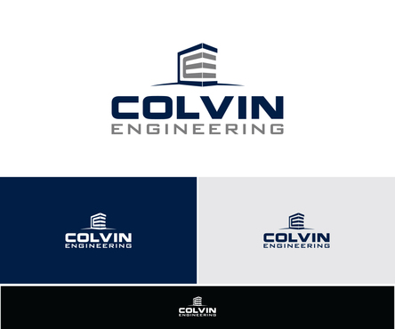
The logo should represent the initials of the company, the letters C and E. I am interested in finding a logo that is a cool shape or design of those letters integrated into a shape, or connected or blended together in a creative way.

Consulting

Abstract Mark
Abstract Mark

Initials
Initials


Modern
Simple
Professional

I am considering a two color design, using combinations of black and another color like red, blue, orange, purple. I prefer the colors to be consistent throughout, and not fade lighter or darker or between the two colors.

2

I would like the logo have depth and dimension to it, and not have a "flat" feel to it. It needs to have a crisp and clean feel to it, and should look as good in color and black and white.

Related Contests


Discussion


Comments

  • October 30, 2016 11:15 AM
    spidermonkey spidermonkey
      Project Holder
    I'm interested in seeing what kind of interesting industrial type fonts my look cool.

    Like Icon 0   DislikeIcon 0
  • October 29, 2016 3:54 PM
    spidermonkey spidermonkey
      Project Holder
    I'm wanting to see what other creatives might be floating out there. I dont want the limitations of my design brief stop you from submitting other ideas. If you think it is creative or looks good, please sibmit it. Also, please get creative with more color combinations. Keep up the good work.

    Like Icon 0   DislikeIcon 0
  • October 29, 2016 11:56 AM
    spidermonkey spidermonkey
      Project Holder
    I jave upgraded the project by extending the deadline by 3 days, increased the prize, and am guaranteeing to pick a winner.

    Like Icon 1   DislikeIcon 0
  • October 28, 2016 6:16 PM
    spidermonkey spidermonkey
      Project Holder
    The name of this business will be Colvin. Not Cobrin. Please update designs accordingly. Thank you.

    Like Icon 0   DislikeIcon 0
  • October 25, 2016 7:51 PM
    spidermonkey spidermonkey
      Project Holder
    One other thought i had was forming the C from a wave shape, kind of like the Quicksilver surfing logo. Id like to see some designs with that theme. Thanks again for all of your hard work.

    Like Icon 0   DislikeIcon 0
  • October 25, 2016 1:30 PM
    spidermonkey spidermonkey
      Project Holder
    The consulting I provide is for the construction and building industry. I am interested in seeing designs utilize shapes that might convey that image. #174 does this, in that it has the look of a building.

    Like Icon 0   DislikeIcon 0
  • October 23, 2016 9:01 PM
    spidermonkey spidermonkey
      Project Holder
    Don't be discouraged by having only one or two stars. I'm leaving room for increasing the stars as the designs continue to evolve.

    Like Icon 0   DislikeIcon 0
  • October 23, 2016 8:59 PM
    spidermonkey spidermonkey
      Project Holder
    I appreciate everyone's hard work on my project so far. I like quite a lot of what I am seeing so far. I will get responses to your messages as soon as possible.

    Like Icon 0   DislikeIcon 0
  • October 23, 2016 2:13 PM
    spidermonkey spidermonkey
      Project Holder
    I am also interested in logo designs based only around the letter C.

    Like Icon 0   DislikeIcon 0
  • October 23, 2016 2:03 PM
    spidermonkey spidermonkey
      Project Holder
    I prefer that the logo does not incorporate a gear in the design.

    Like Icon 0   DislikeIcon 0
  • October 23, 2016 9:59 AM
    spidermonkey spidermonkey
      Project Holder
    I would like to see what #95 looks like if the segment connected to the shape in the center of the design were aligned with the angle of the implied cube, at 30 degree angle.

    Like Icon 0   DislikeIcon 0
  • October 23, 2016 8:17 AM
    spidermonkey spidermonkey
      Project Holder
    I have added some additional images of logos i think are kind of what i am thinking.

    Like Icon 0   DislikeIcon 0
  • October 23, 2016 12:20 AM
    Arehman Arehman
     
    Sir please check your private messages. right top corner

    Like Icon 0   DislikeIcon 4
  • October 22, 2016 11:35 PM
    spidermonkey spidermonkey
      Project Holder
    So far, number 4 is the closest to what i have in mind, but im hoping for more depth, abstractness to the logo.

    Like Icon 0   DislikeIcon 1
  • October 22, 2016 10:05 PM
    spidermonkey spidermonkey
      Project Holder
    I am adding some logos and projects that have a similar feel to what i have in mind.

    Like Icon 1   DislikeIcon 0