Alan Peckolick – When Typography Takes Center Stage In Graphic Design
If you’re a design enthusiast, you may know about the demise of a world renowned graphic designer Alan Peckolick. He is one of the leading sources of inspiration for typographers because just like Saul Bass’s ingenuity and flair in design, Peckolick had an artistically elevating aesthetic sense especially when typography takes center stage in graphic design.
Alan Peckolick’s Life And Career
Peckolick was born in 1940 in Bronx, New York to middle-class working family. This was no ordinary time, it was the midst of WW2. Soon after which the world took a revolutionary turn in terms of art and design. Many things were happening, such as a shift from modernism to post-modernism. By the time Peckolick grew up, he already had a knack for drawing and appreciation for everything art and design. With formal education, he truly understood his potential and style.
After graduating in 1964, he worked as first an assistant with Herb Lubalin then his partner. During his career he won several awards, and the designer has been featured in design books. Peckolick is known for designing famous logos for brands like Revlon, New York University and Pfizer.
Peckolick’s Passion For Typography
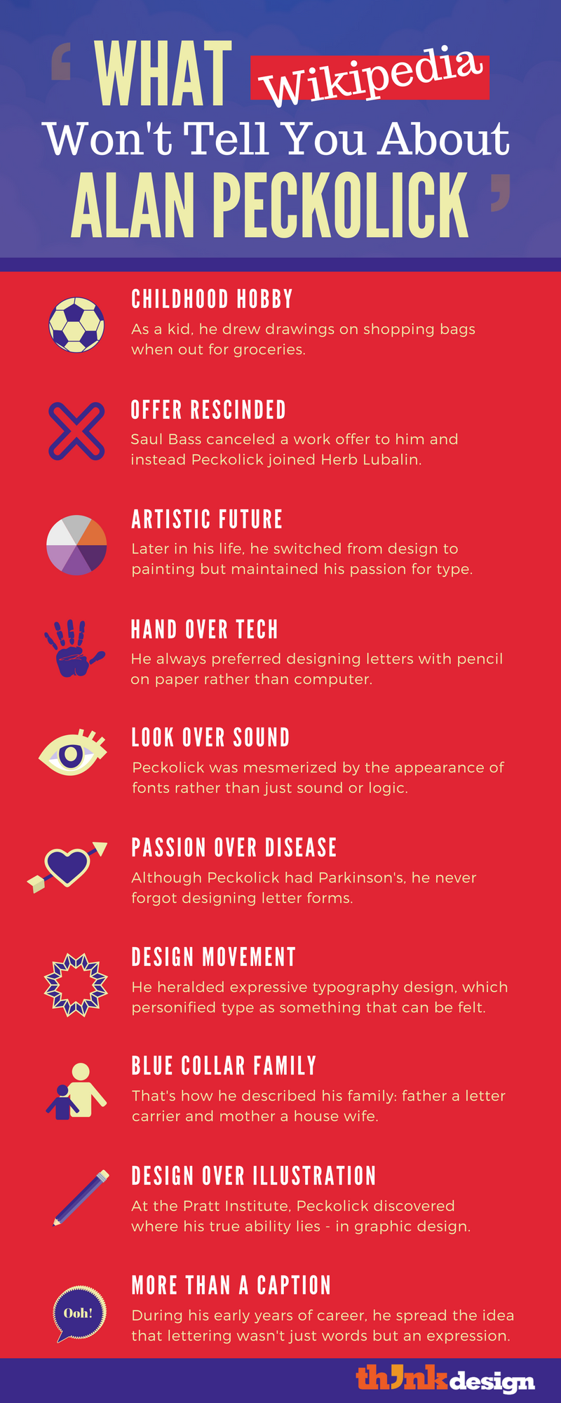
Despite his Parkinson’s disease Peckolick maintained his honesty with his passion – he never let go of it. According to his wife his ailment never rose to a point he would forget about design. His fascination with the appearance of words aroused when he switched from illustration to a graphic design program at Pratt Institute. It gave his creative knack a sense of direction and he fell in love with typography. The designer once said, in an interview to HuffPost, “It wasn’t the sound of the word that intrigued me but the look of the word. I saw each letterform as a piece of design.”
Graphic designer Neville Brody is also one such unique person whose commitment with type acts as a stimuli of motivation for younger generations. I am sure Peckolick’s typography won’t die, in fact over the years its recognition and importance will skyrocket.
Type Design Sense Of Alan Peckolick
These designers are not ordinary, in the sense, they like experimenting rather than using what’s already on the table. Peckolick’s typography isn’t simply about the way it looks, but also about what it expresses emotionally and how letterforms unite into a unified design. Some of his iconic works for the logo of Revlon, Pfizer and New York University have stood the test of time for several years.
By examining his graphic design work, somethings are quite evident about his style. At this point, I expect you to know the anatomy of typography. In case you don’t, here’s a diagram to help you.
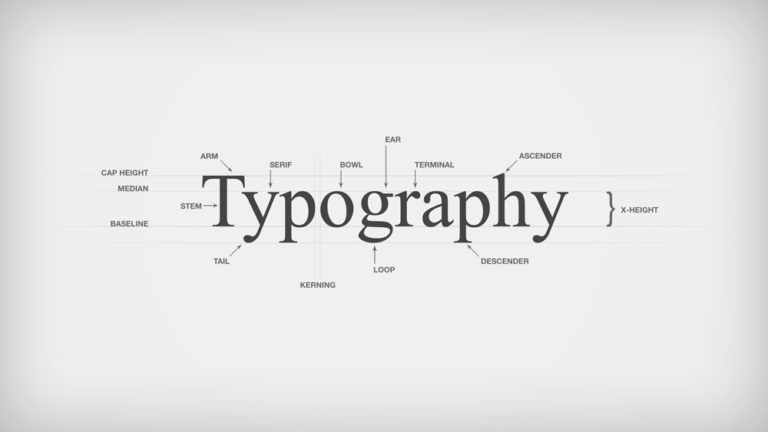
Image Source
1) Emphasis On Tracking And Kerning
If you see the posters and logos designed by Peckolick, the space between the letters is very less. In many cases the tails, legs and arms of the letters are attached to one another in the word. In other cases, the stems are closely placed together on the canvas. Such typography appears tight and compact.

Image Source
2) The Many Types Of Serif
If you were unaware, there are basically two kinds of serif fonts. While Garamond is the plain serif, Watermelon is the extended version. Typography by Peckolick varies in nature when it comes to serifs. The serif in Peckolick’s type can vary – sometimes it’s Slab, Script or Didot.
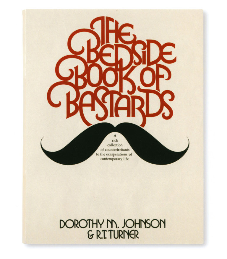
Image Source
3) Excessive Use Of Blue And Red
While the designer used black (which is not a color in fact) and other hues like beige, brown and yellow for example – his inclination was mostly towards blue and red. If you see his graphics, you’ll see tints and shades of these two colors or something complementing them.
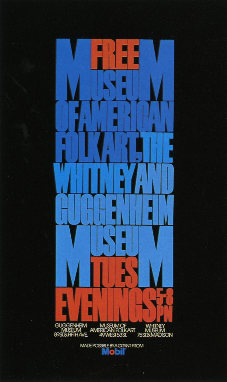
Image Source
4) Hierarchy With Typeface And Size
For any design to be functional, it has to be readable and for this it needs hierarchy. Peckolick brought logic to his posters, book covers and annual reports with the variation in font and size. Even if the secondary text is above the primary or there’s no order, you know which is which instantly.
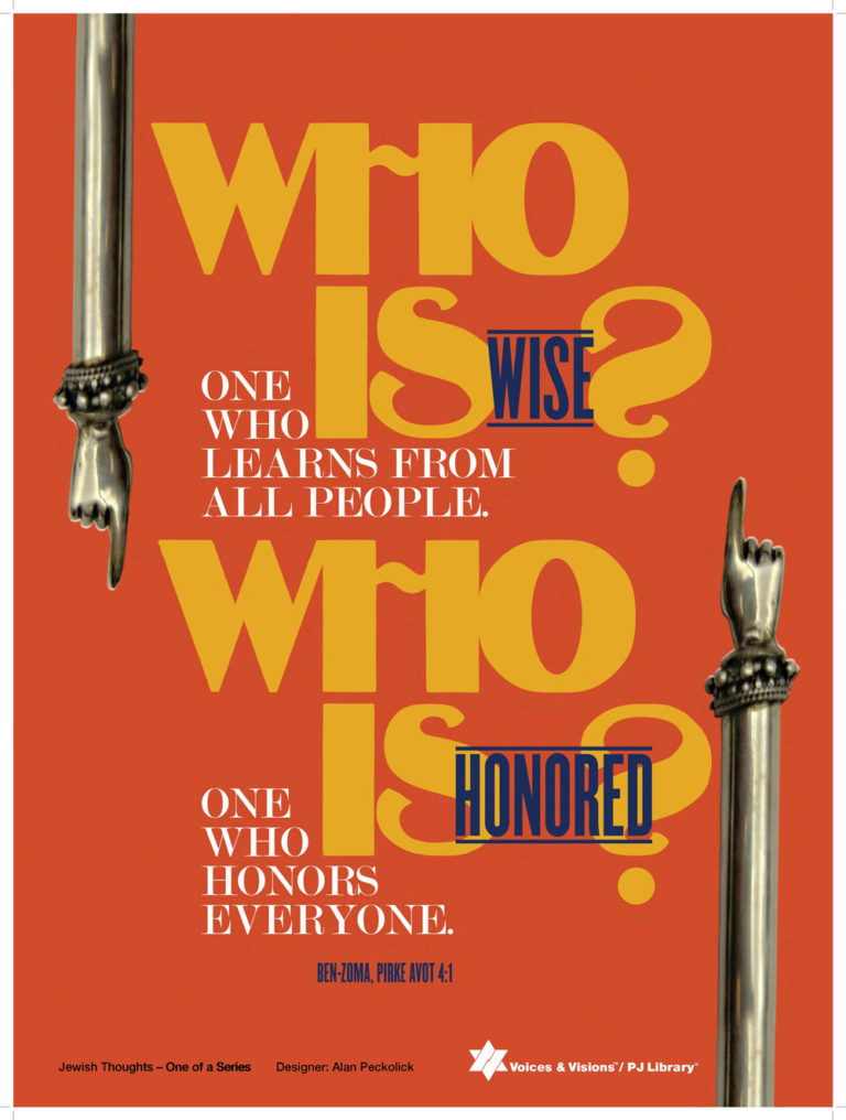
Image Source
5) Hand-Made Typefaces
Peckolick’s typography is unique and in most of his graphic designs stands prominent against a solid background color. All of his typefaces resonate the idea of experimentation and fun. It seems like type was his profession and entertainment.
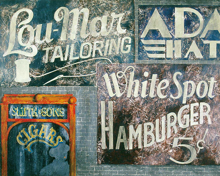
Image Source
So when typography takes center stage in design, branding and marketing – everything becomes appealing, legible and emotionally strong. Death of human beings is inevitable but design stays forever. To date artists like Andy Warhol, Massimo Vignelli and Alan Peckolick (in this case) are remembered because they shed a new light on conventional designs. Their ideas are extraordinary and inspirational. I hope we keep Peckolick’s idea of typography alive.