Uncovering Symbolic Brand Stories – Logo Animations With A Narrative

Feature Image Source: Airbnb
We live in a time when brands offer more than just a business value proposition. They offer a sense of belonging and connectivity and the process starts even before the customer notices a brand. A simple logo identity is what brands are aiming for. Perhaps that’s the biggest challenge for designers. Besides the exception of a few brands that have become cultural icons, all others seem to be lost in the clutter with too many symbols. Hence the brands who want to be recognized universally are now tying up their logo identities with brand stories. Here’s a list of eye-catching logos with animations you should definitely check out.
Airbnb Uses A Song In Their Chronicle
The brand story is well presented in the new symbolic logo which is why the idea caught on and Airbnb’s vision of belonging became universally recognized. This was not possible without a clear brand identity that could maintain uniformity. When belo (the logo symbol for Airbnb) was introduced, it instantly became the talk of the town. While most people were quick to associate it with controversy, the idea from the makers was to create a symbol that could be drawn by anyone and was easy to identify anywhere irrespective of language and geographical boundaries. If the universality of the symbol is to be analyzed, it would emerge as a real success. Now check out how the symbol is cleverly merged with the brand story.
Johns Hopkins University’s Amazing Discovery
Now here’s another logo that was redesigned to create synergy with the brand. They have incorporated the story of their identity quest in their brand story to explain the roots as well as the future prospects of this research university. The final design for the main university logo is based on existing iconography and is rooted in the official academic seal. The book represents knowledge and discovery, the globe symbolizes the university’s worldwide reach, and the crest of Lord Baltimore indicates the university’s connection to its community. Here’s the logo formation story.
Seimens Healthineers Revitalized With New Energy
Seimens healthineers is a medical technology company that serves as one of the largest suppliers to healthcare industry and a trendsetter in medical imaging, laboratory diagnostics and health IT. The typeface and color palette is impressive and communicates the message fairly. It is pulling off nicely in a san serif font. However, the brand is unable to create a connection with the dots that appear pointless because there is no meaning associated with them. They appear as a symbolic identity to complement the wordmark logo. On a side note, those dots could also point towards the universe of healthcare system but that’s something we are making up on our own now. Or perhaps they left it unexplained to the viewer’s imagination.
Karhoo – Where Oos Do The Talking
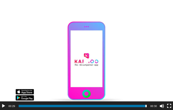
Karhoo, the cab comparison app, gives you the flexibility to choose and book your cab based on the features that matter most. Well, they are new but know the art of storytelling using the logo symbol. First of all, I would like to congratulate them for a simple but clever use of symbol. Note how the symbol is derived from the wordmark and fits in to their plot. Besides the brand story, the same mark is used to present the process making Karhoo a friendly and convenient app for the users. A beautifully simple world of graphic ‘wheels’ in all of their sizes, behaviors and colors that scream ‘choice’. There’s something in there for everyone.

Image Source: designweek.co.uk
EFL All Set For The New Sport Season
EFL is a league competition featuring professional association football clubs from England and Wales. To get the story behind this little masterpiece, you will have to zoom in. Count the dots which is the exact number of teams. The dots in turn are forming a pattern to reveal 3 divisions. The fact that it’s a sound-driven animation with the dots pulsating at the right pace makes it look more energetic. In no way does the logo fails to capture the soul of the sport. Let’s take a look!
Quest Diagnostics In A Dotted World
Derived from the world’s largest database of clinical lab results, Quest diagnostic insights reveal new avenues to identify and treat disease, inspire healthy behaviors and improve health care management. They have recently changed their logo by giving it a more vibrant olive green color with a tinge of gradient that offers a spark of illumination. However, once again, like most recent rebrands, Quest also makes use of circles to narrate their brand story.
The Super Busy Mark Of 500px
500px is a photo community and marketplace designed to enhance and support the creative process for creators and buyers. More than 6 million creatives use the 500px platform to improve, showcase and monetize their work. In the quest to look creative, 500px complicated their mark. Visually it looks impressive and the circle animation give away the lens movements but it’s difficult for someone who doesn’t know what 500px is, to understand the brand message. They wanted it simple and sophisticated but the mark ended up looking busy. Check out the brand message clarifying the idea behind this choice.
Quirky Reshuffles Its Mark
Quirky brings inventors’ ideas to life and to market through an open process where community members provide ideas, which are then voted on, and each week the top five are discussed by the Quirky team to see which ones they’ll develop. The brand recently replaced their childish looking handwritten wordmark logo with a symbolic identity. The Q and & actually denote the merger of quest and quality. The quirky community is an uplift platform for young inventors and the brand color scheme is perfectly representing that.
Seagate’s Little Whirlpool
Seagate is the global leader in data storage solutions, developing amazing products that enable people and businesses around the world to create, share and preserve their most critical memories and business data. This certainly isn’t a groundbreaking visual revolution in design, but it absolutely is a solid and appropriate redesign executed well in animation. Note how Seagate’s letter ‘S’ is forming a wave to demonstrate the flow of data. Their idea is to create space for human experiences, lots and lots of them and the whirl of information graphic is the perfect way to demonstrate that.
MTG Challenges Convention
Modern Times group is an international entertainment broadcasting group that decided to rebrand after changing its name from Viasat World to MTG world. The finalized logo mark is certainly going against convention by merging three letters. The color palette is convincing with a simple sans serif font but that ‘T’ needs to get out of that ‘M’. The animation for the logo is sound and captures the visual narrative of the logo mark.

